
We design and deliver bold, visually engaging experiences that help brands stand out in crowded environments and leave a lasting impression. Our work packs a punch and cuts through the visual noise and is as diverse as the industries we represent. We’ve concepted and produced work from national mining expos to high end shopping centre activations.
FOR ALMOST THREE DECADES, REDHOTBLUE’S AWARD-WINNING TEAM HAS HELPED BRANDS ELEVATE THEIR PRESENCE AND COMMAND ATTENTION WHERE IT MATTERS MOST. IF YOU’RE LOOKING TO POSITION YOUR BUSINESS AS A LEADER, IT STARTS WITH BEING SEEN AND REMEMBERED.
LET’S START THE CONVERSATION…
MACKAY SAFETY SOLUTIONS
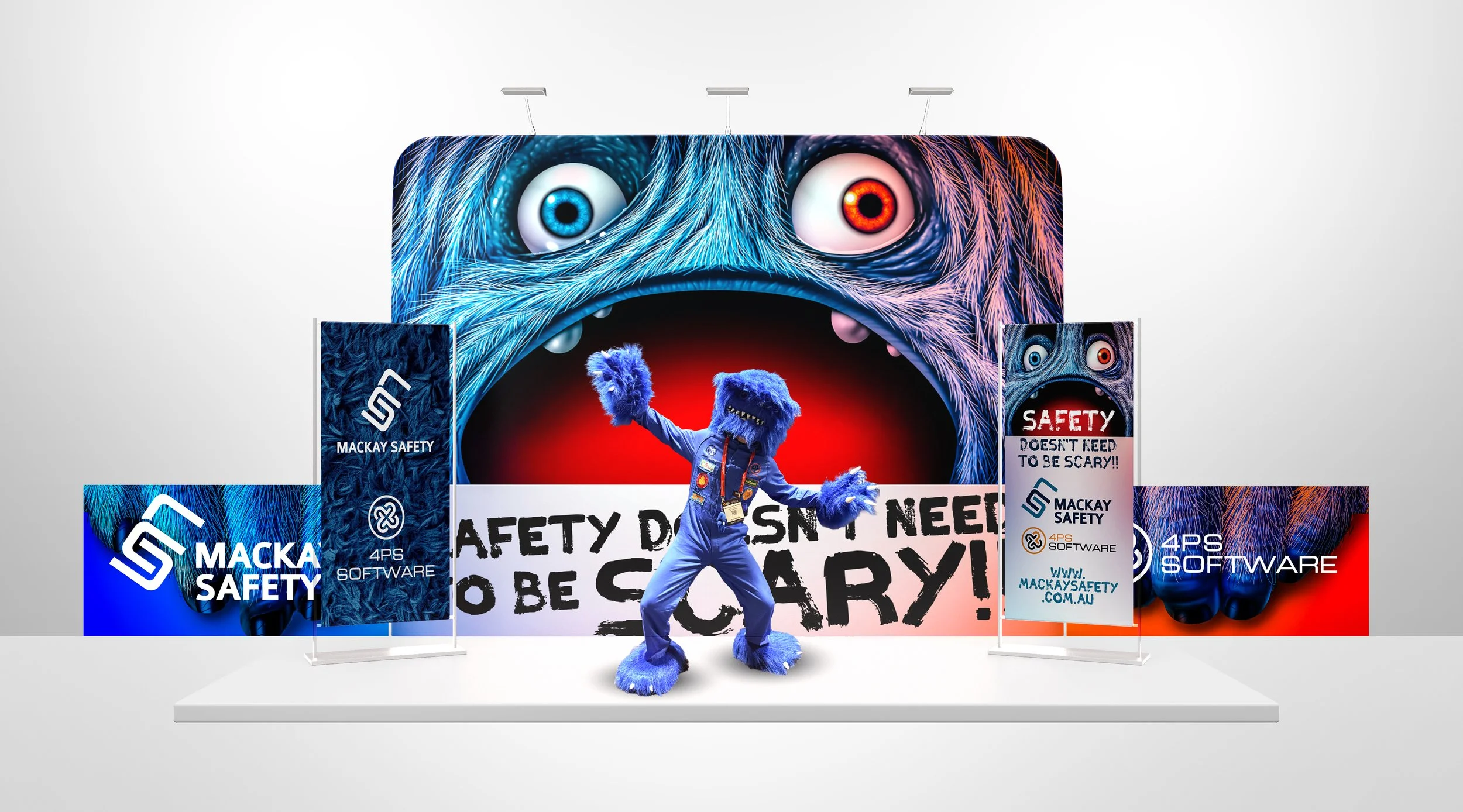
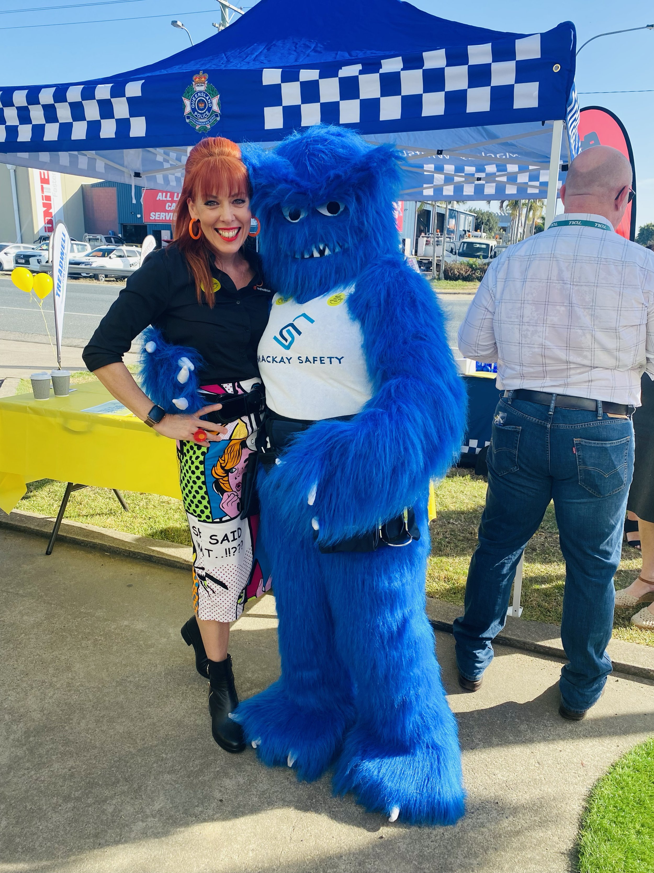
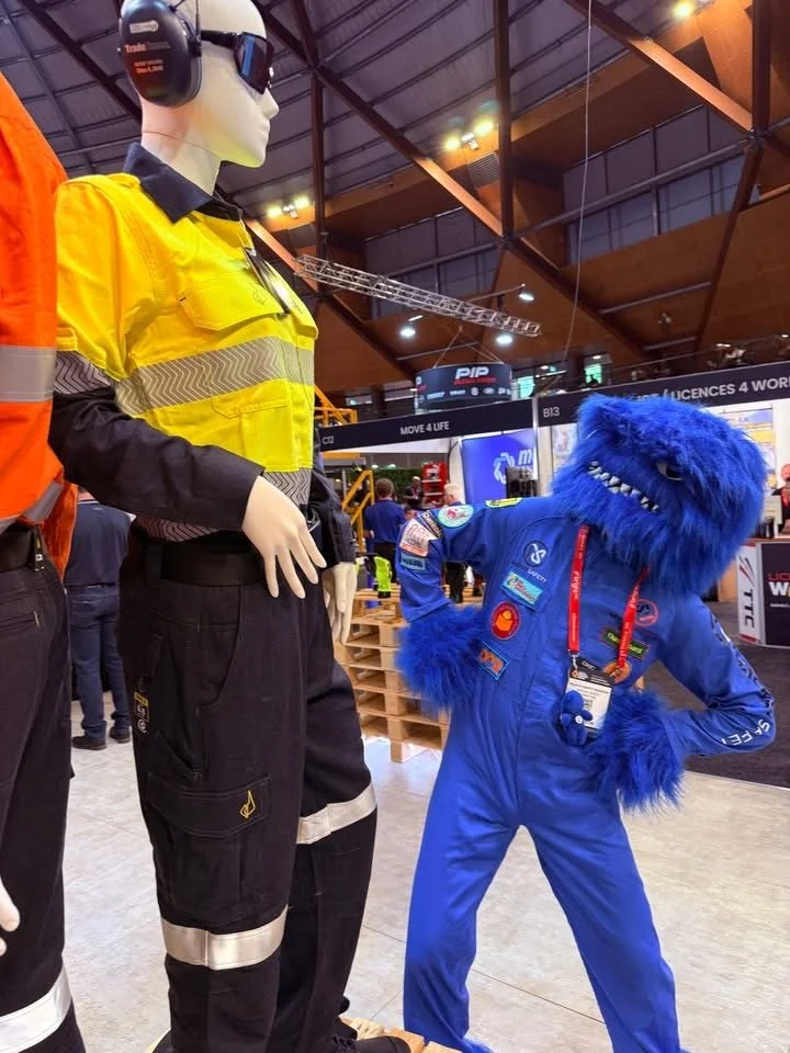
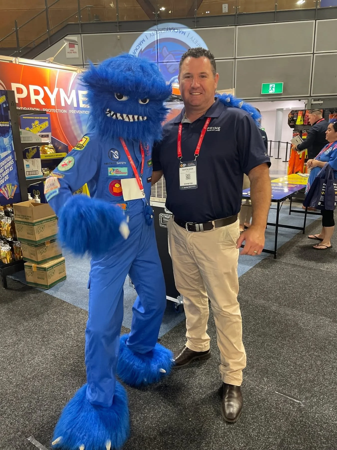
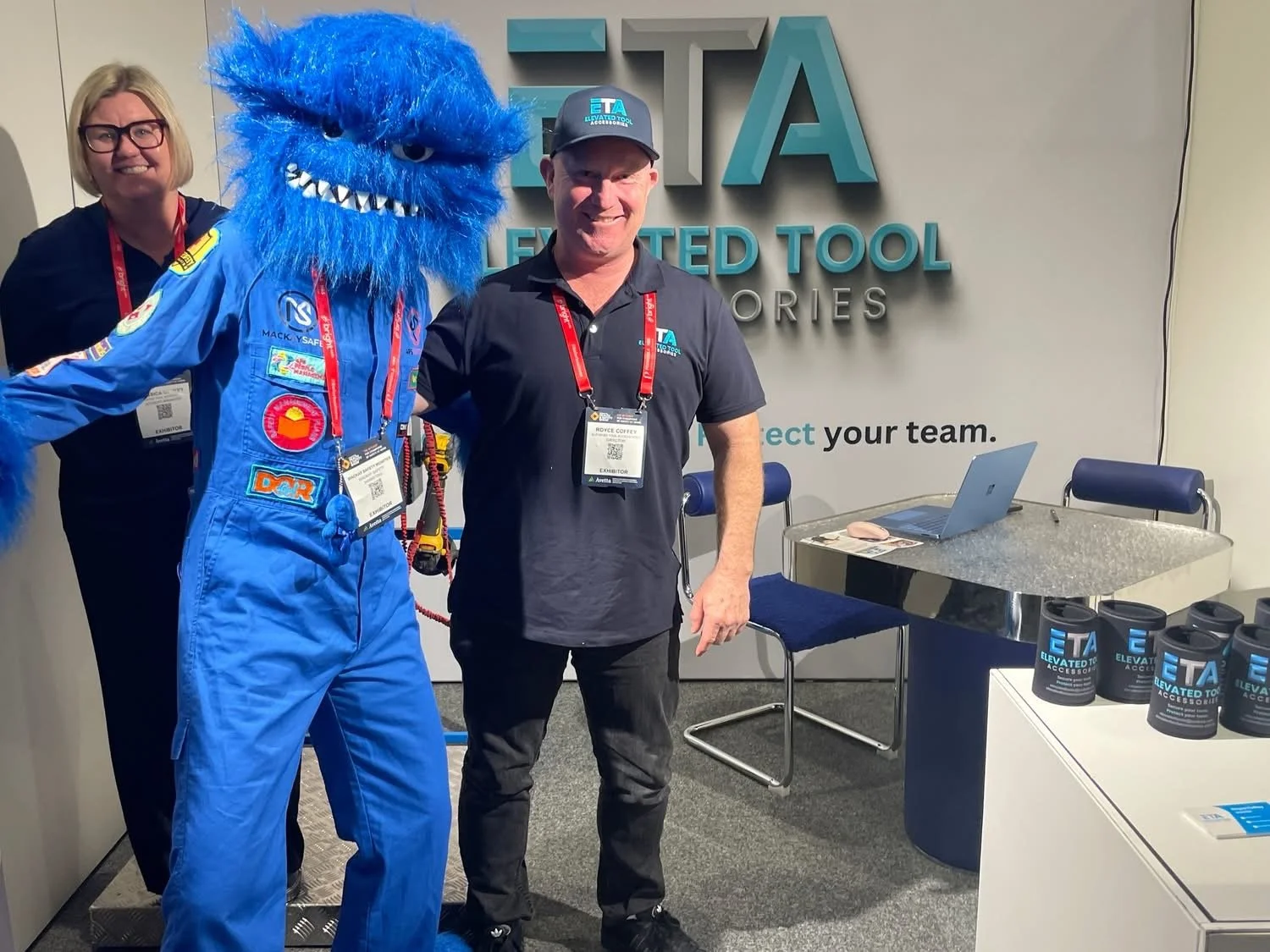
Mackay Safety Solutions needed a bold concept that would cut through the noise at QME and leave a lasting impression long after the event ended.
We created a campaign known as “Safety is a Monster” a powerful visual idea brought to life through large-format booth displays and an unmissable roaming mascot. Rather than waiting for visitors to come to the stand, we took the message directly into the crowd. Branded in full, the Safety
Monster moved through the expo floor, stopping attendees in their tracks and turning curiosity into conversation.
Now in its fourth year, the Safety Monster has become a recognisable brand asset, regularly requested at events across Queensland and proof that when an idea connects, it keeps working long after the show is over.
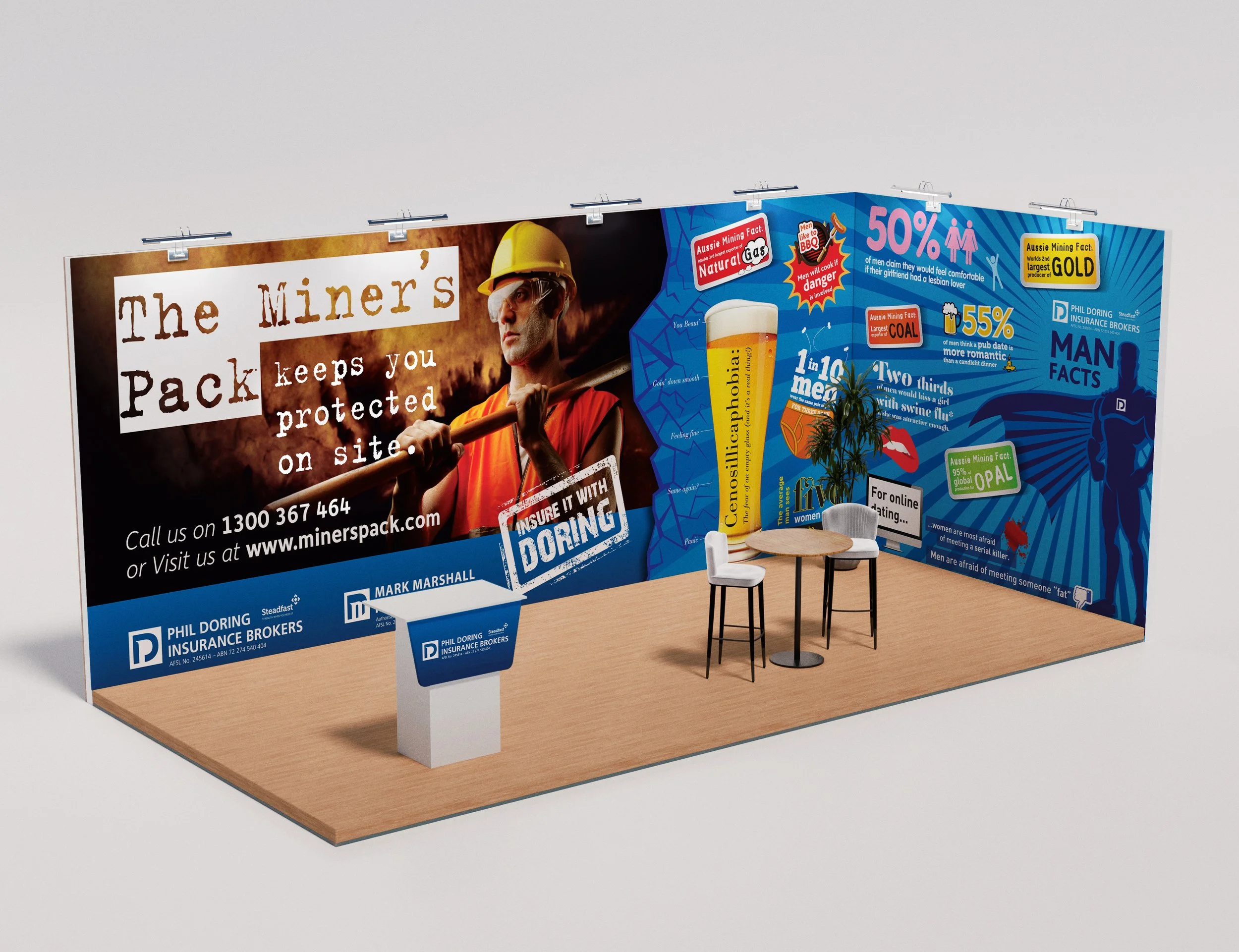
DORING INSURANCE BROKERS
When Doring Insurance Brokers set their sights on a specific audience, young males in the mining sector, QME became the ideal stage to launch their new product, The Miners Pack.
Instead of defaulting to predictable mining imagery, we developed a
concept and booth elevation designed to genuinely connect with the
intended demographic. Bold, relatable and impossible to ignore, the stand was built to draw the right people in.
Humour became the hook. By leading with personality and relevance, we opened the door to conversations about a topic often dismissed by younger audiences - insurance. The result? A booth that didn’t just attract attention, but created meaningful engagement where it mattered most.
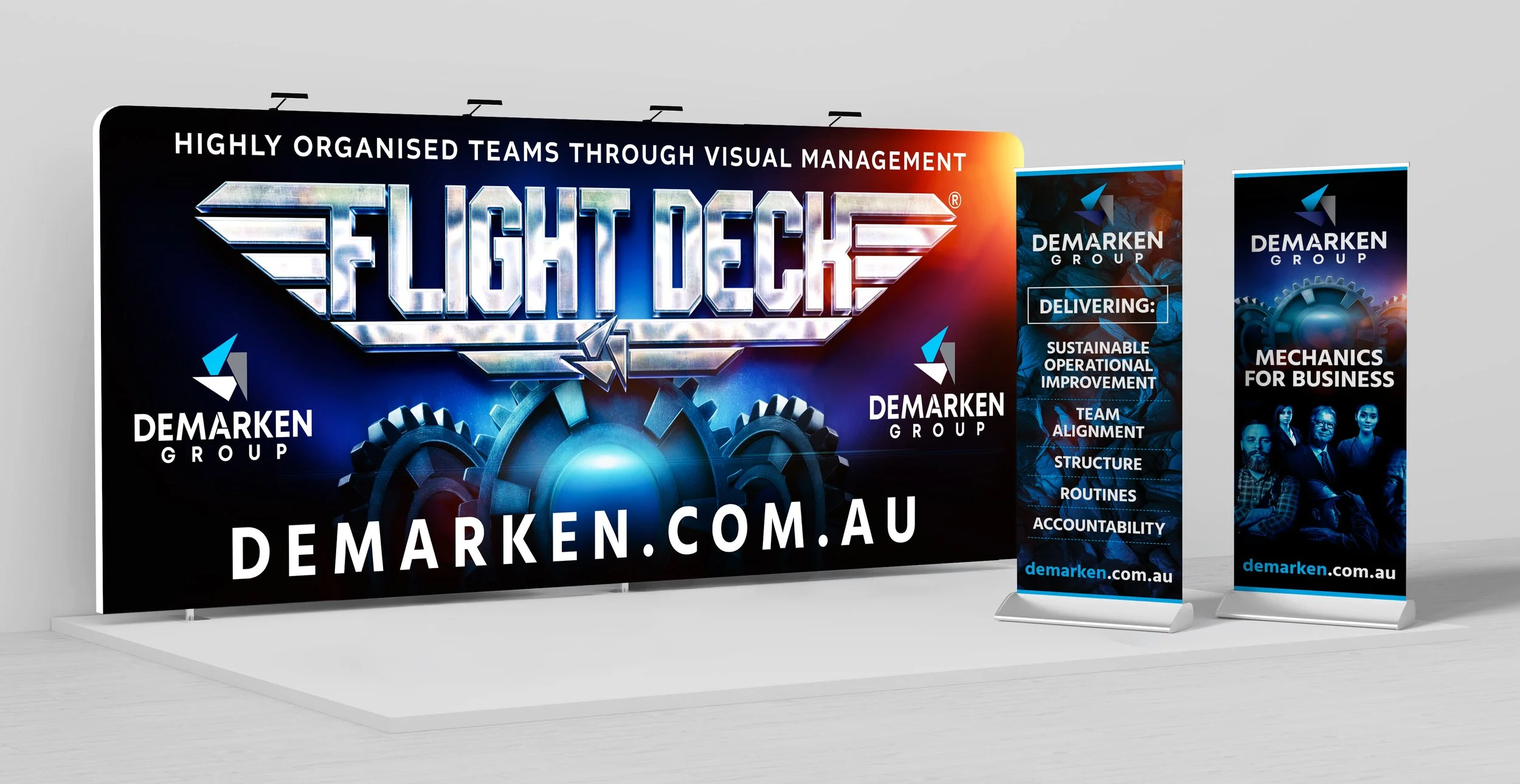
DEMARKIN GROUP
In a busy, heavy-industry expo environment, launching a new concept isn’t easy. Noise is everywhere. Attention is limited. And if your message isn’t instantly clear and compelling, it’s lost.
When Flight Deck a visual management system designed to align teams around workflow and deadlines made its debut over 10 years ago, it needed more than a standard booth. It needed a concept that would command attention and communicate value in seconds.
We built an entire brand world around a bold Top Gun-inspired theme, complete with a strong logo and cohesive visual identity. The concept immediately resonated with the predominantly male audience attending the expo, creating curiosity, conversation and memorability.
ONE INDUSTRIES
For a startup introducing an innovative product in a conservative market, standing out isn’t optional it’s essential. Our vision was to bring One Industries booth to life with a design that sparked curiosity and engagement.
Inspired by the concept of rotation, a perfect reflection of the client’s product, the display featured large-scale, immersive backdrops and an animated video that ensured the booth was unforgettable.
The results speak for themselves: a flood of high-quality leads and multiple major client wins, proving that a booth with a strong concept doesn’t just attract attention it drives real business.
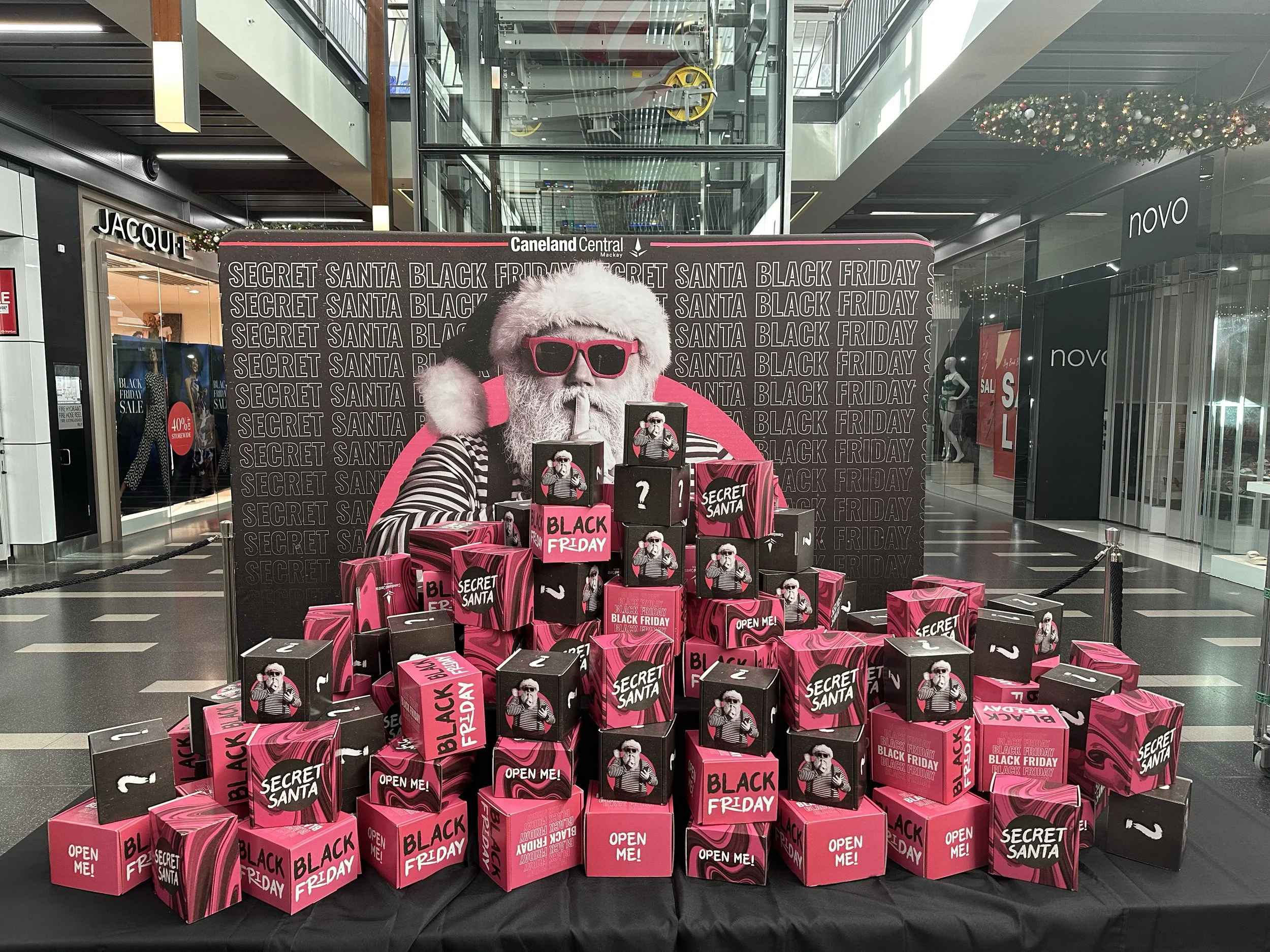
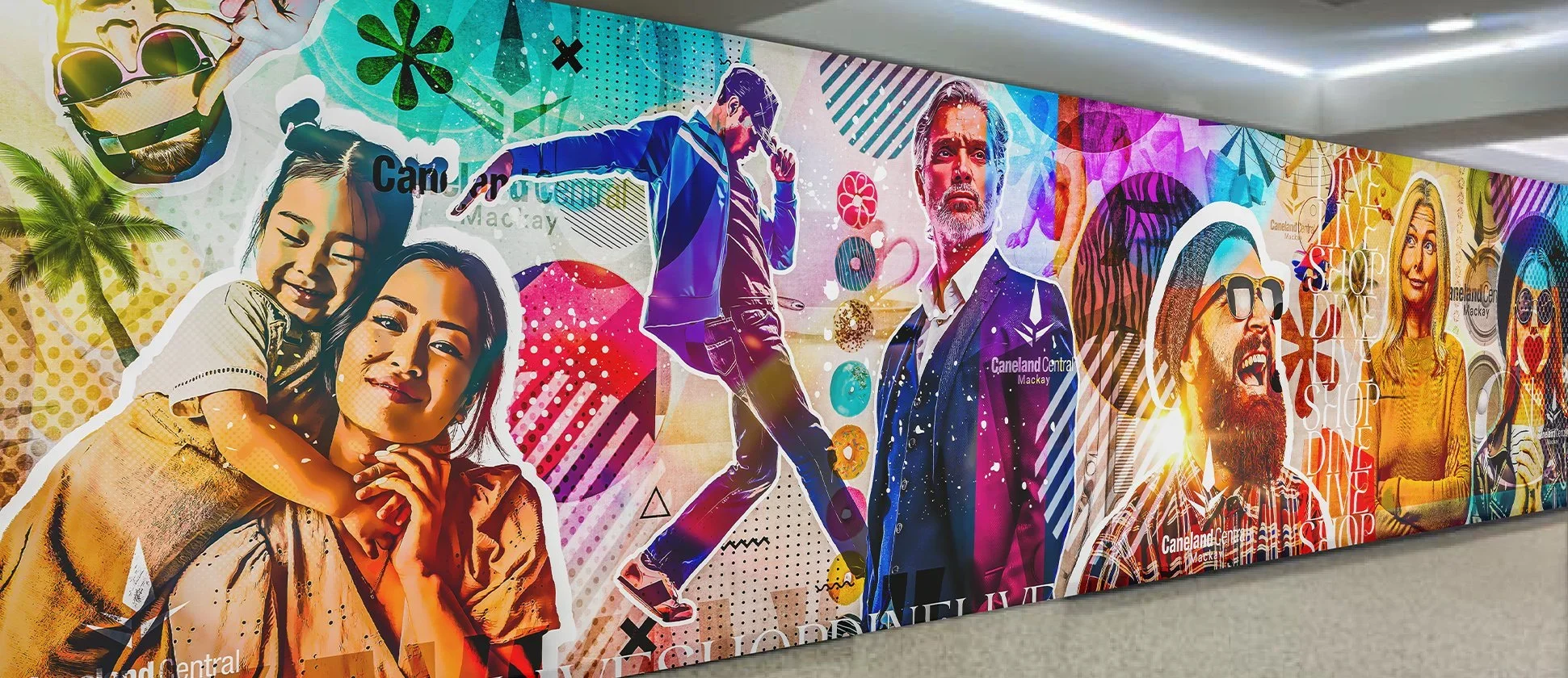
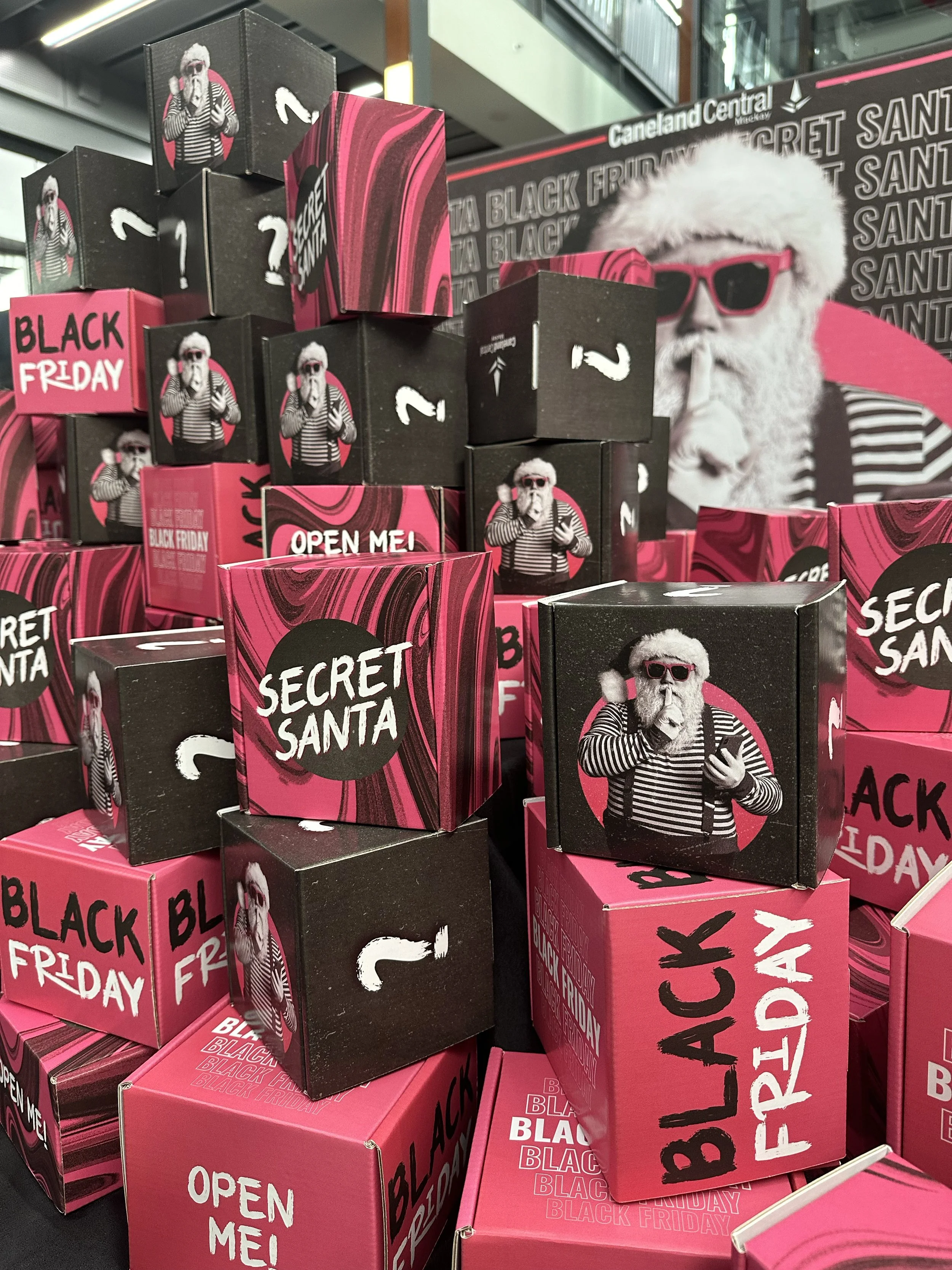
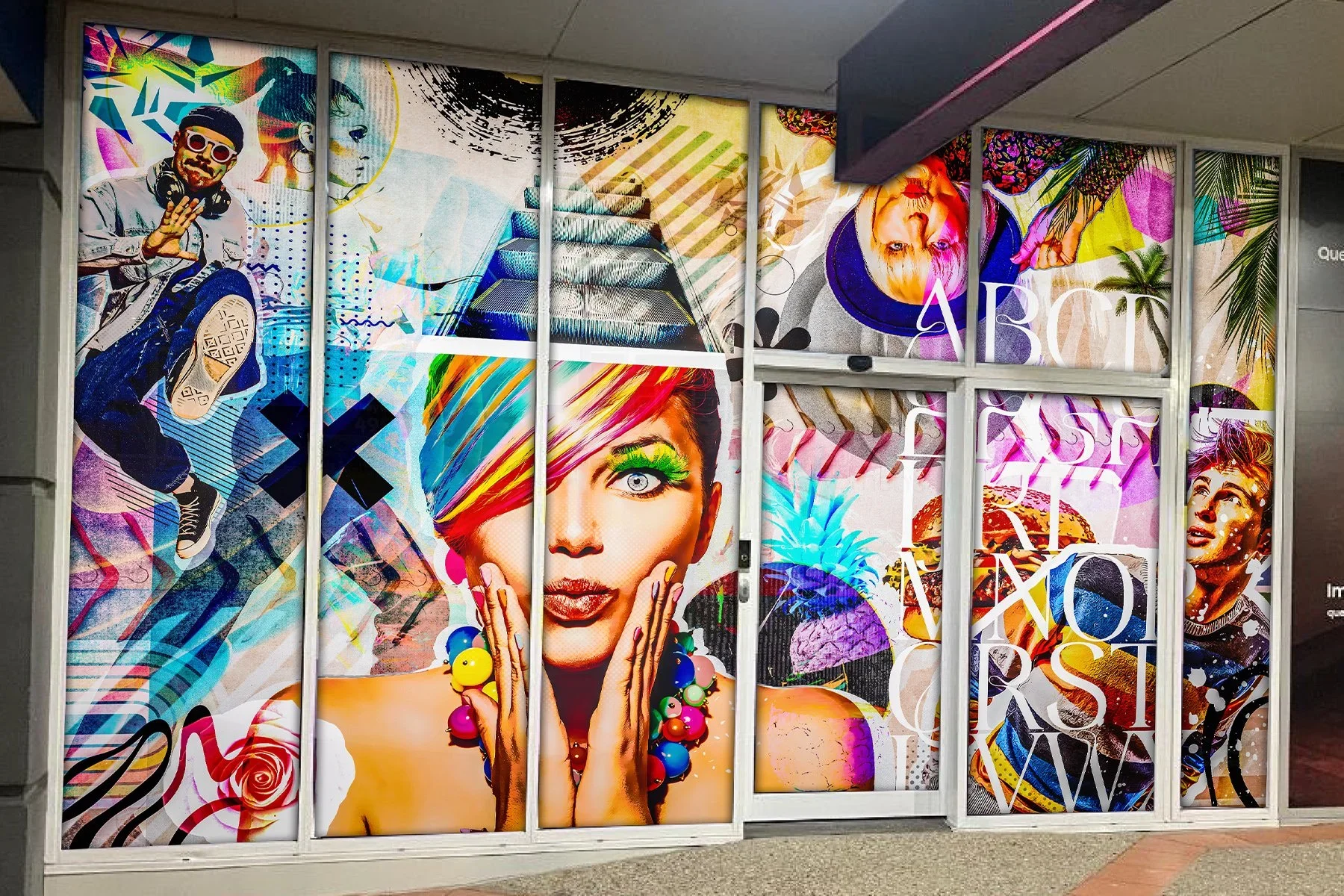
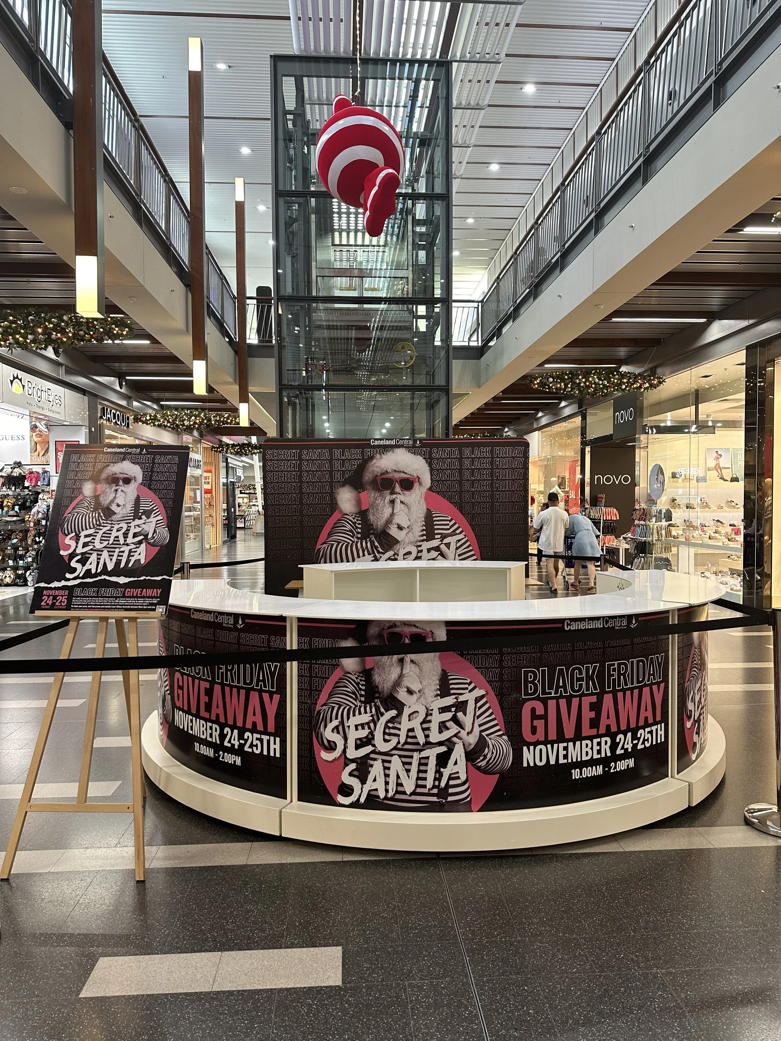
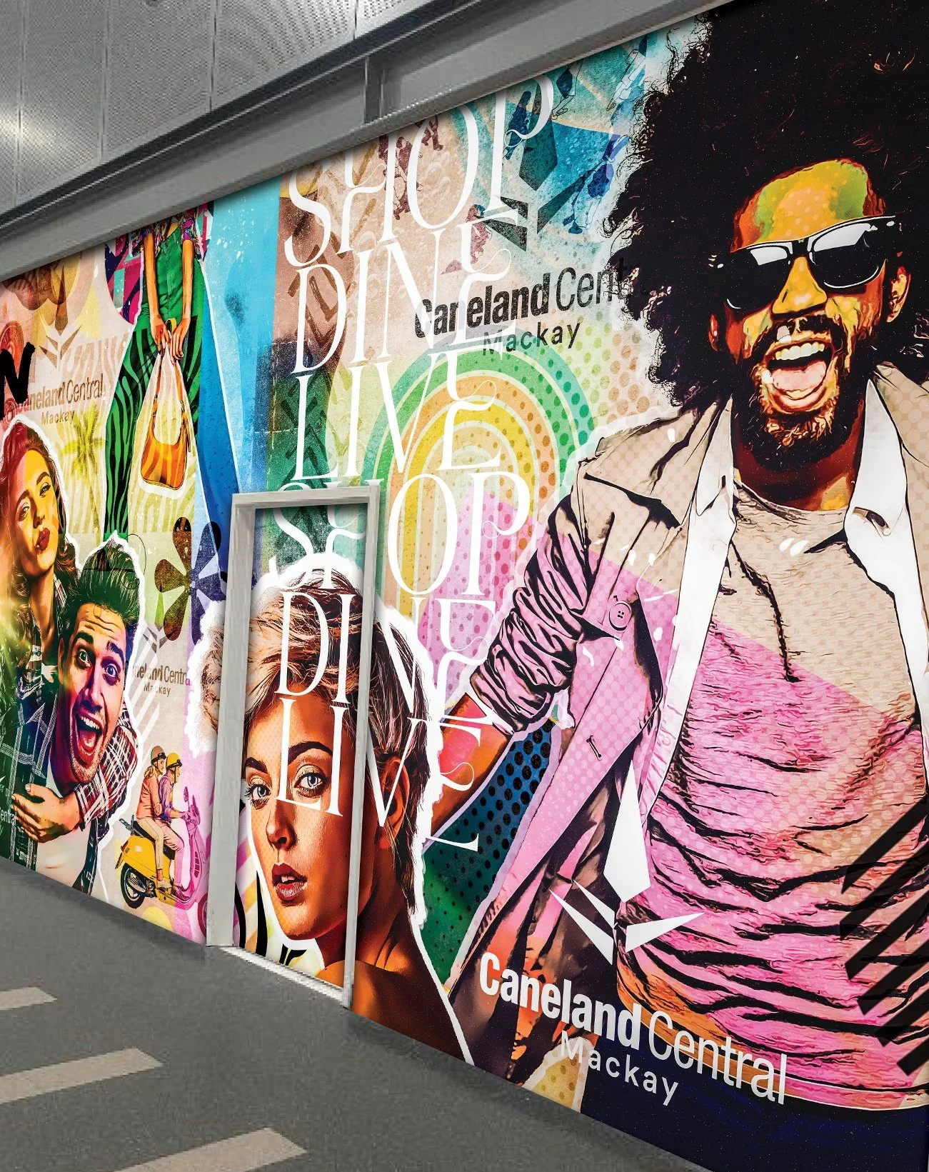
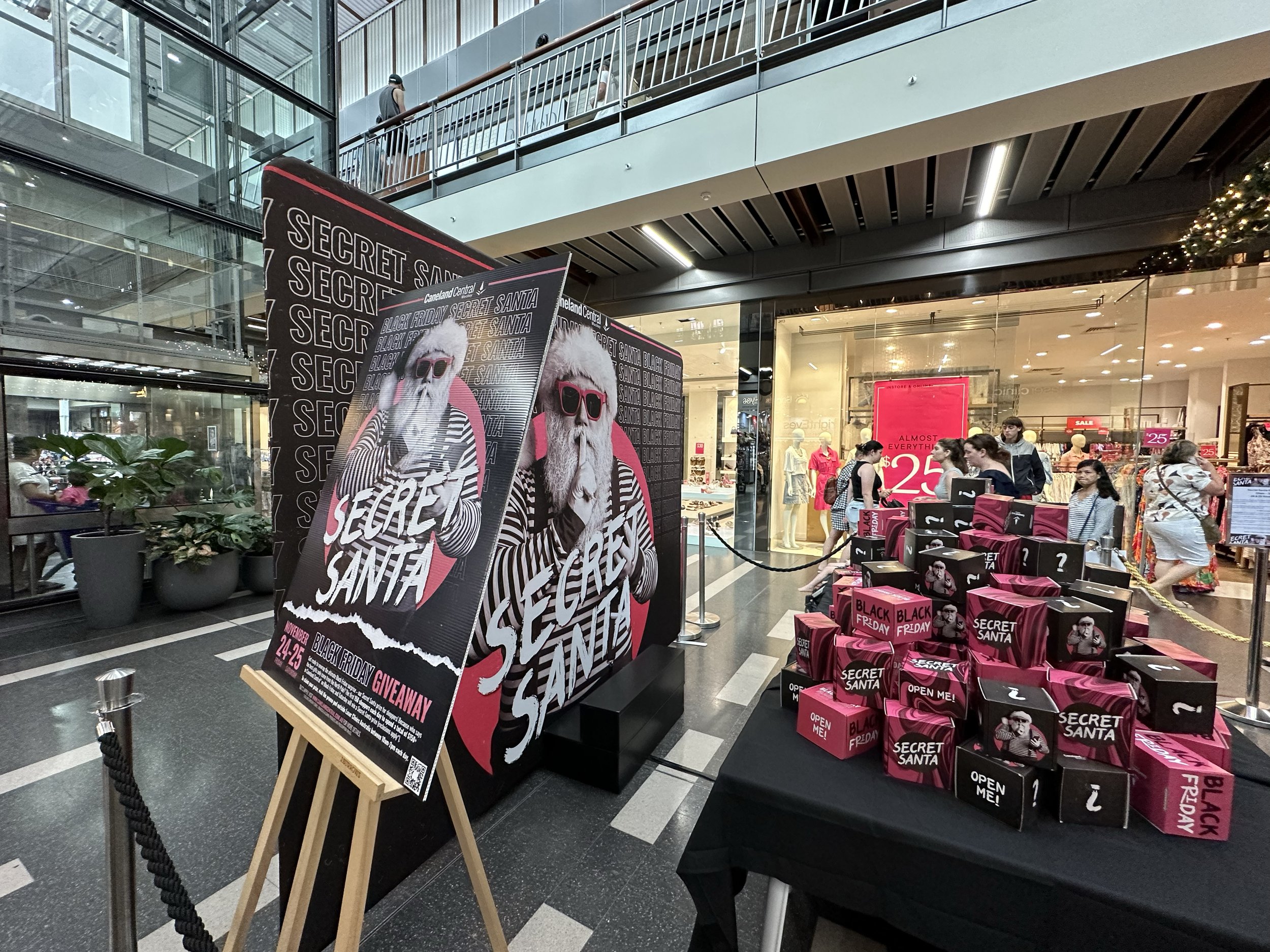
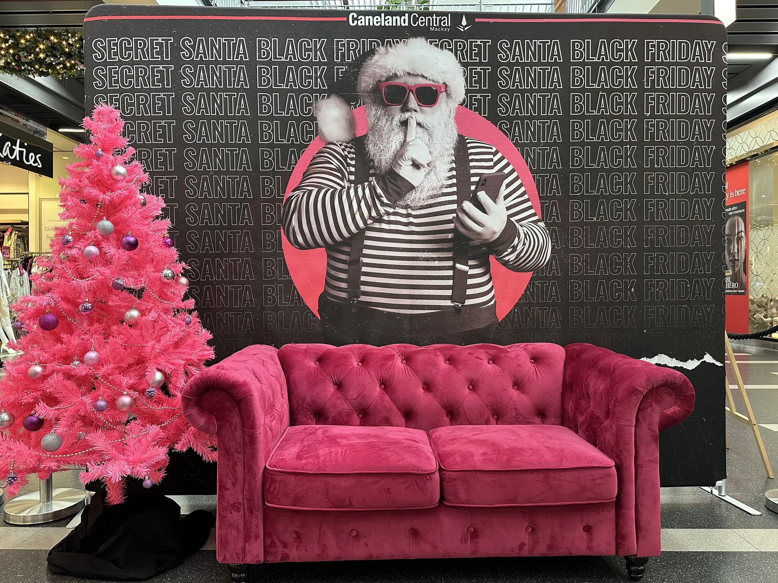
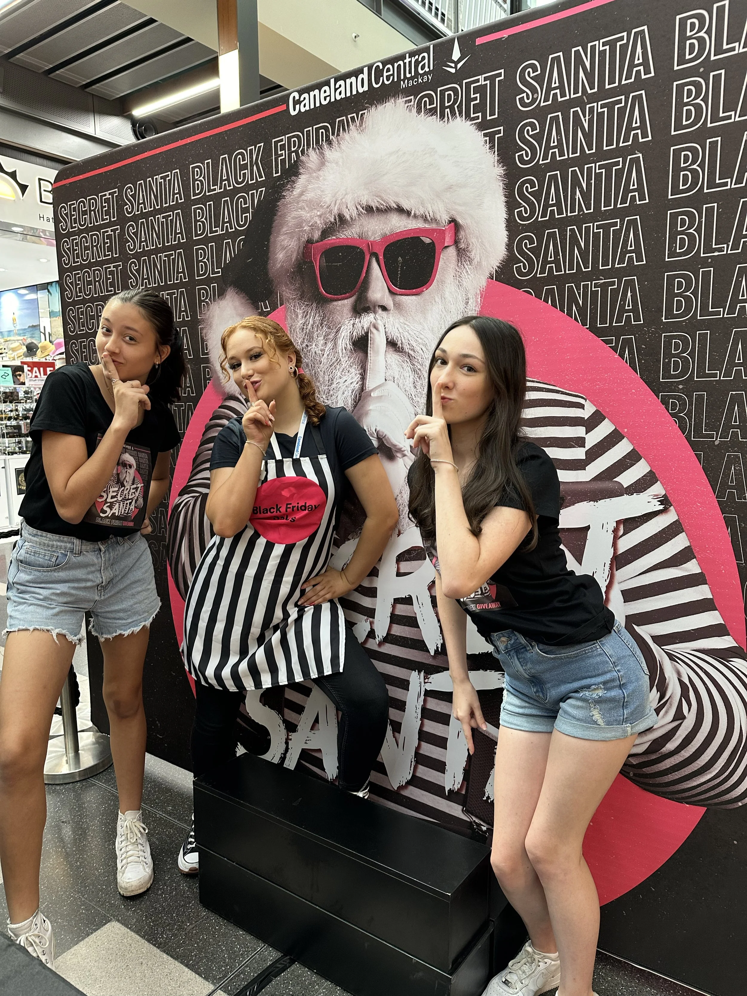
CANELAND CENTRAL - LEND LEASE / SENTINEL GROUP
As a major regional shopping centre, Caneland Central needed more than marketing support they needed a creative partner capable of delivering bold concepts that drive customer engagement, build loyalty and elevate the overall aesthetic experience.
Over more than a decade, we’ve delivered exactly that. From immersive, floor-to-ceiling installations to fully integrated promotional campaigns, spanning concept development, design, production and delivery. Our work has consistently transformed space into experience.
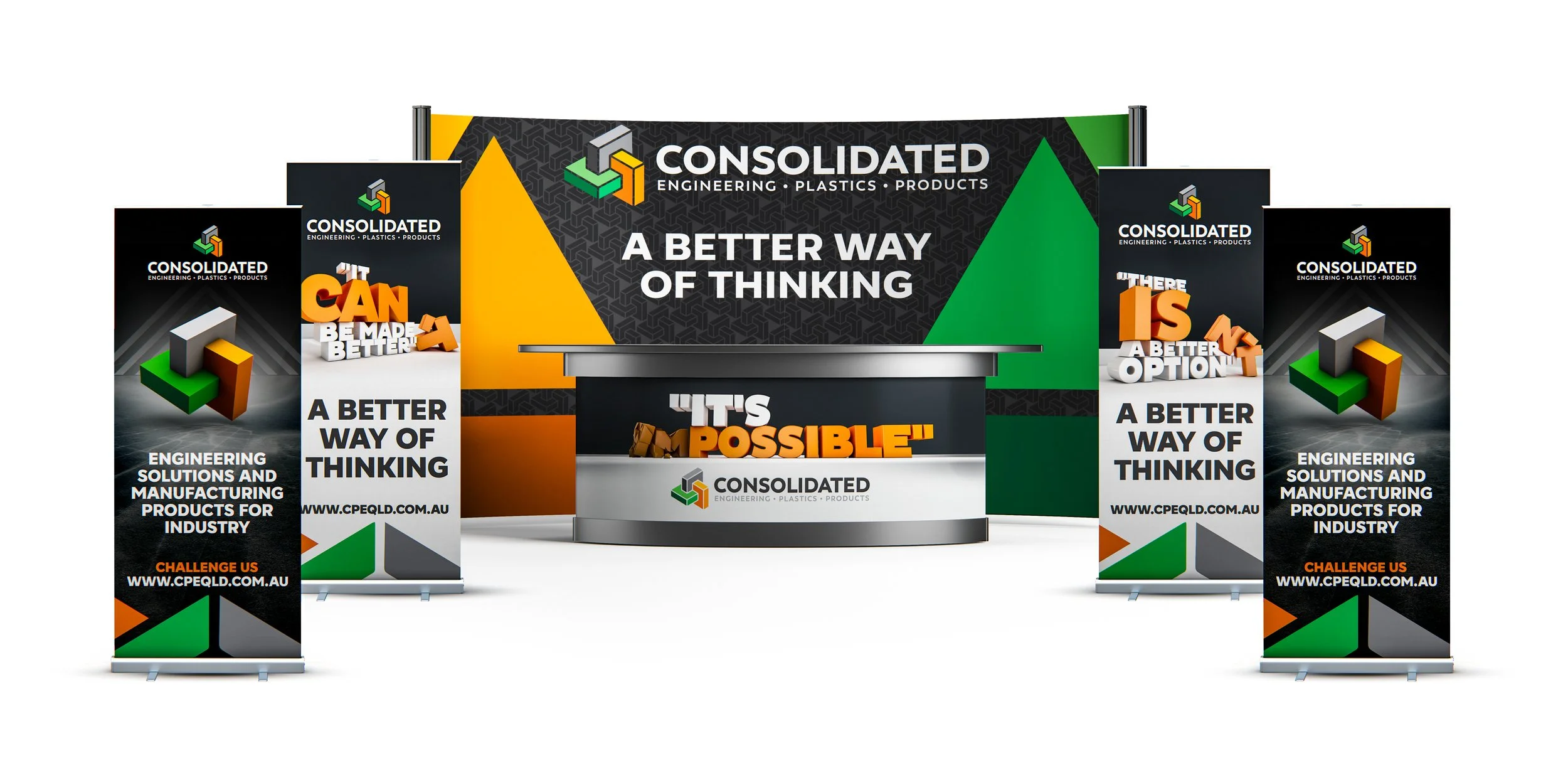
CONSOLIDATED PLASTICS
In crowded, hard-hitting industry expos, blending in is the fastest way to be forgotten. For a company like Consolidated Plastics, a regular exhibitor in a highly competitive space it was critical their display stood head and shoulders above the competition.
Operating in an industry often overlooked due to traditional production methods, they needed to attract first and sell second.
Previously, their stand attempted to showcase every product and service at once. The result? Busy, underwhelming visuals that struggled to engage and were easily lost among louder competitors.
We took a strategic, stripped-back approach, sharpening the message, elevating the visuals and designing a concept built to stop traffic. The outcome wasn’t just a stronger presence; it was a stand that cut through the noise and generated meaningful, qualified leads.
You get one chance at a first impression
- MAKE YOURS COUNT.
Stand out. Make an impact. Attract your ideal audience to your booth.
Booking your appointment is the first step towards elevating your booth beyond the ordinary—so you don’t just show up, you stand out, attract attention, and lead the floor with confidence.