Client Showcase
Intelligent creativity shapes everything we do at redhotblue, meaning that every idea is purposeful and strategically driven. Our case studies demonstrate how each piece of work contributes to the bigger picture, to improve growth and long-term success for our clients.

The Brief
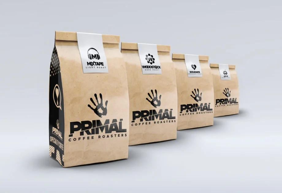
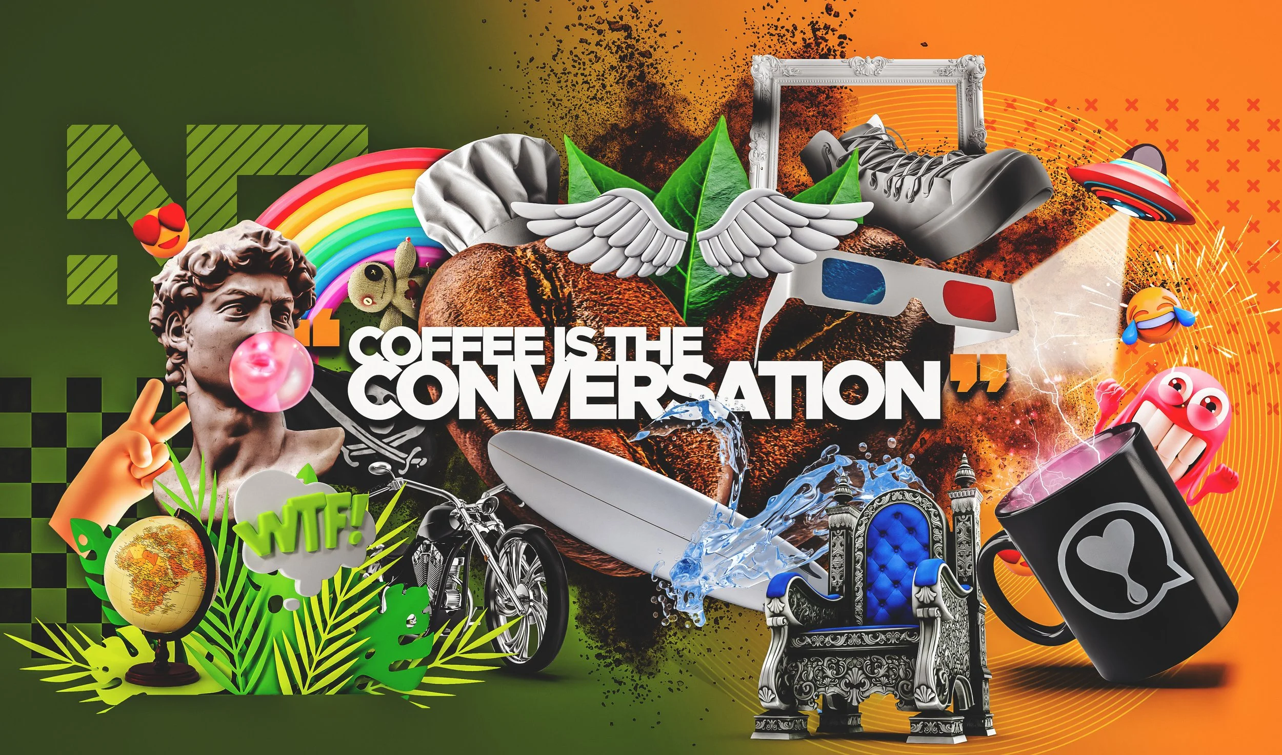
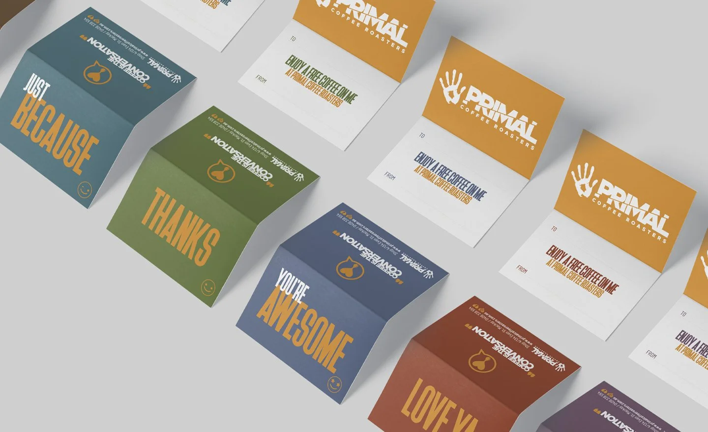
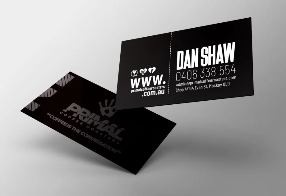
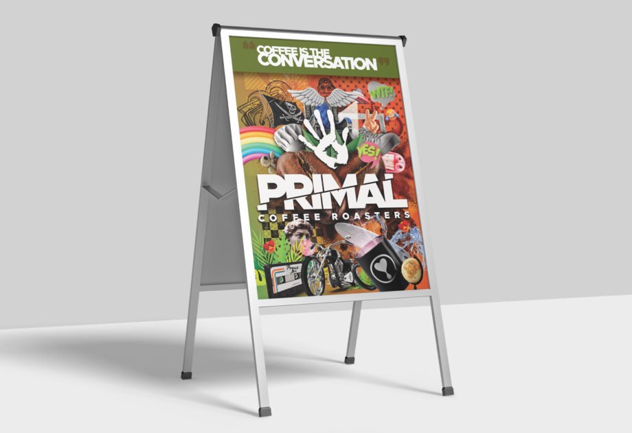
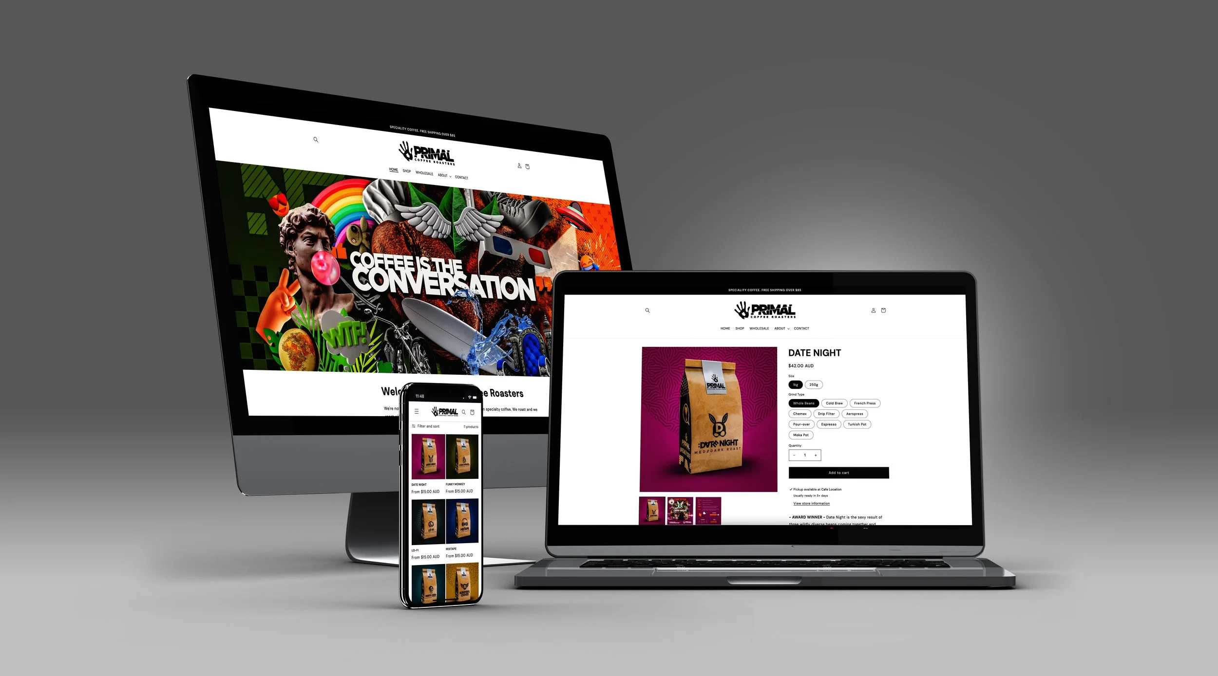
Primal came to redhotblue with an existing brand name and logo, which we used as a foundation for our work. As a family-owned, grassroots business, they wanted their brand to feel personal and hands-on. The team at Primal lives and breathes their craft, and their vision was to showcase the origins, stories, and craftsmanship poured into every blend, driven by their core belief that “coffee is the conversation.” They weren’t looking for something overly sleek or corporate, like the bigger franchises. Instead, they wanted a brand that embraces individuality and celebrates the uniqueness of their blends with a warm and down-to-earth feel.
Project Highlights
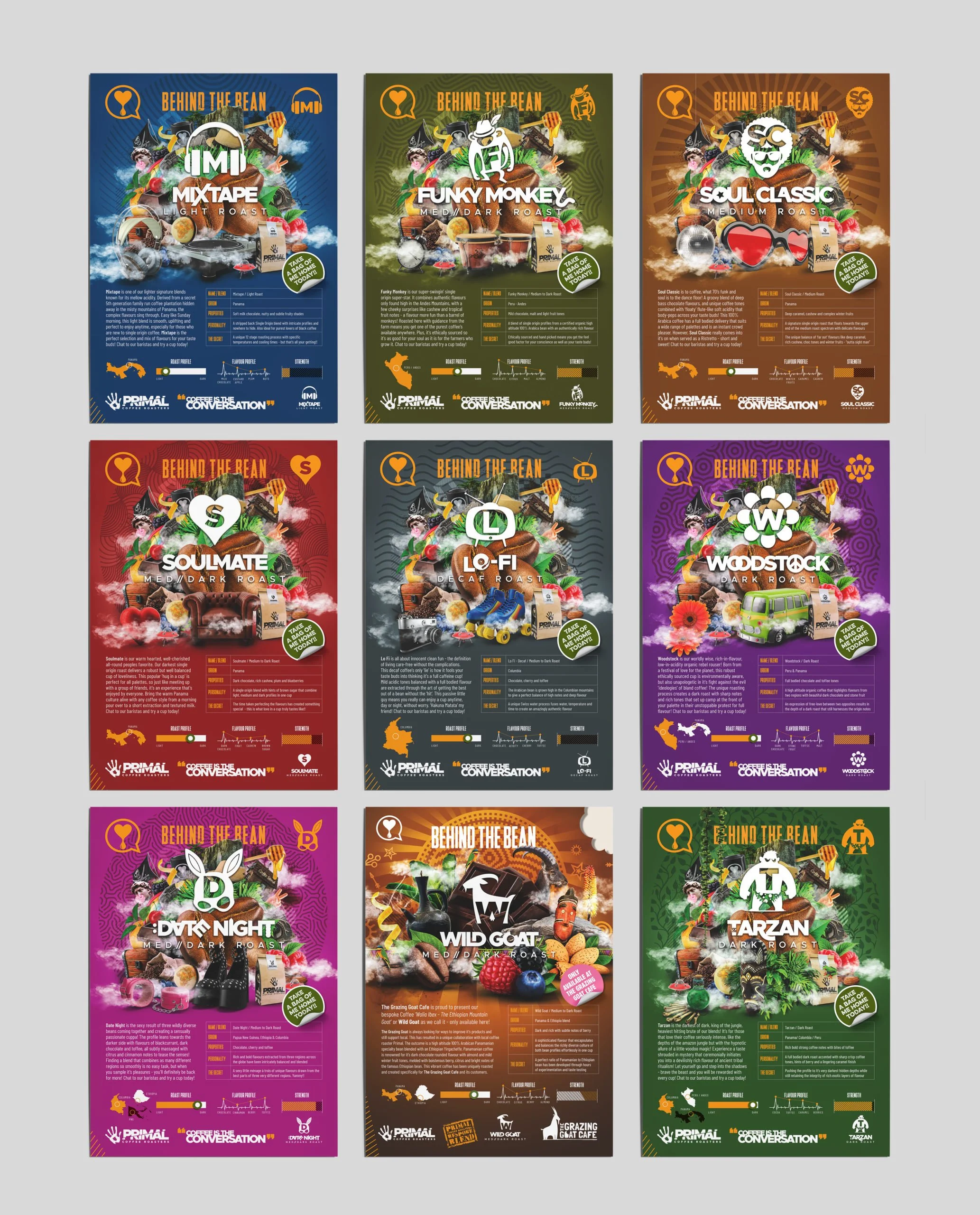
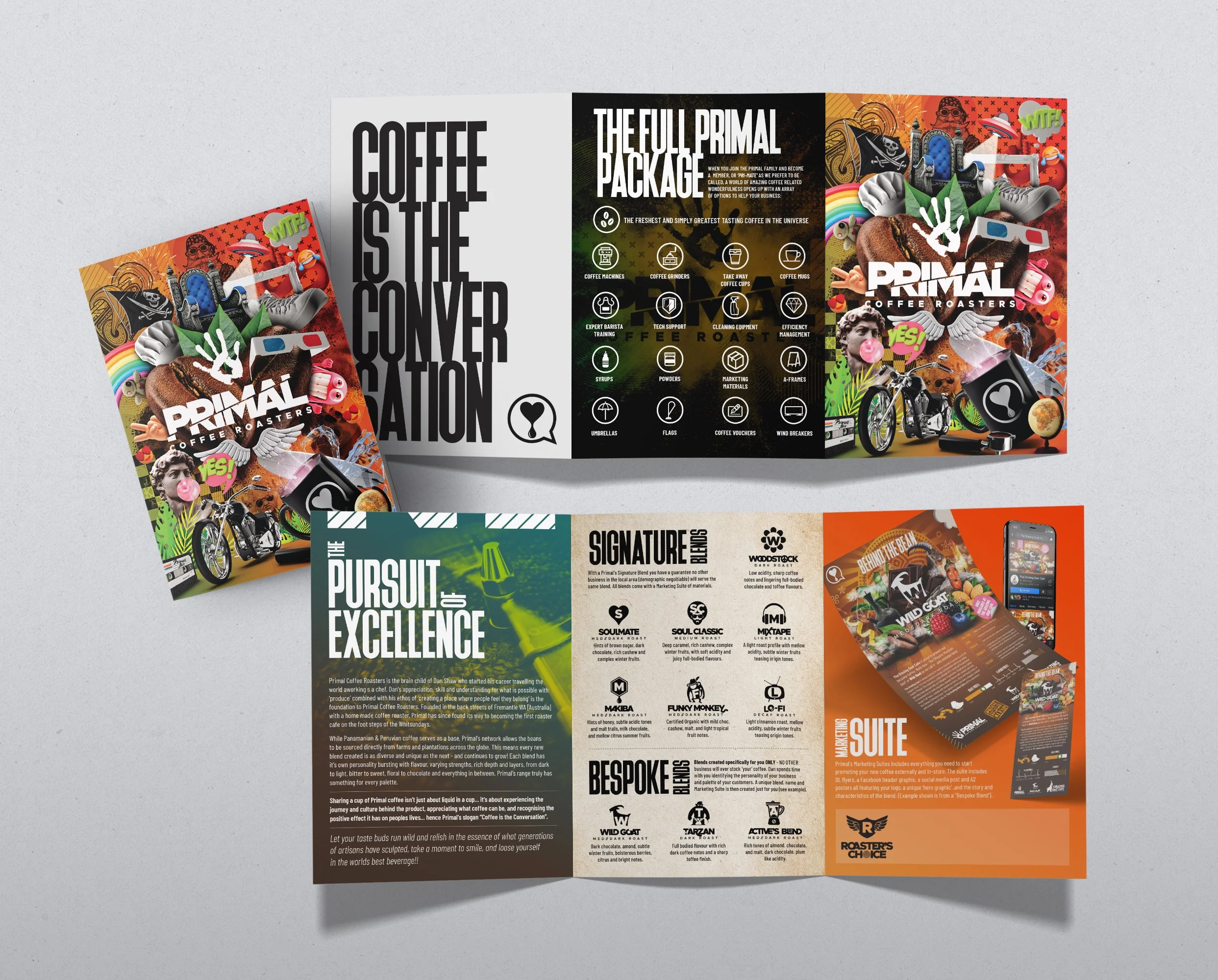
The redhotblue team thoughtfully layered design elements to visually narrate the story behind each coffee blend, making every product feel distinct and cohesive. The vibrant imagery captures attention and radiates energy, reflecting the owner's excitement and passion for coffee. At the suggestion of our Creative Director, the logo was crafted from a direct print of the owner’s hand, a nod to his hands-on involvement in the business and a way to further personalise the brand. The angled split through the typography represents the balance between creativity and science that defines Primal Coffee’s approach. While the subtle inclusion of the owner’s children’s initials as part of the graphic elements pays homage to the family values that form the brand’s foundation.


The Brief
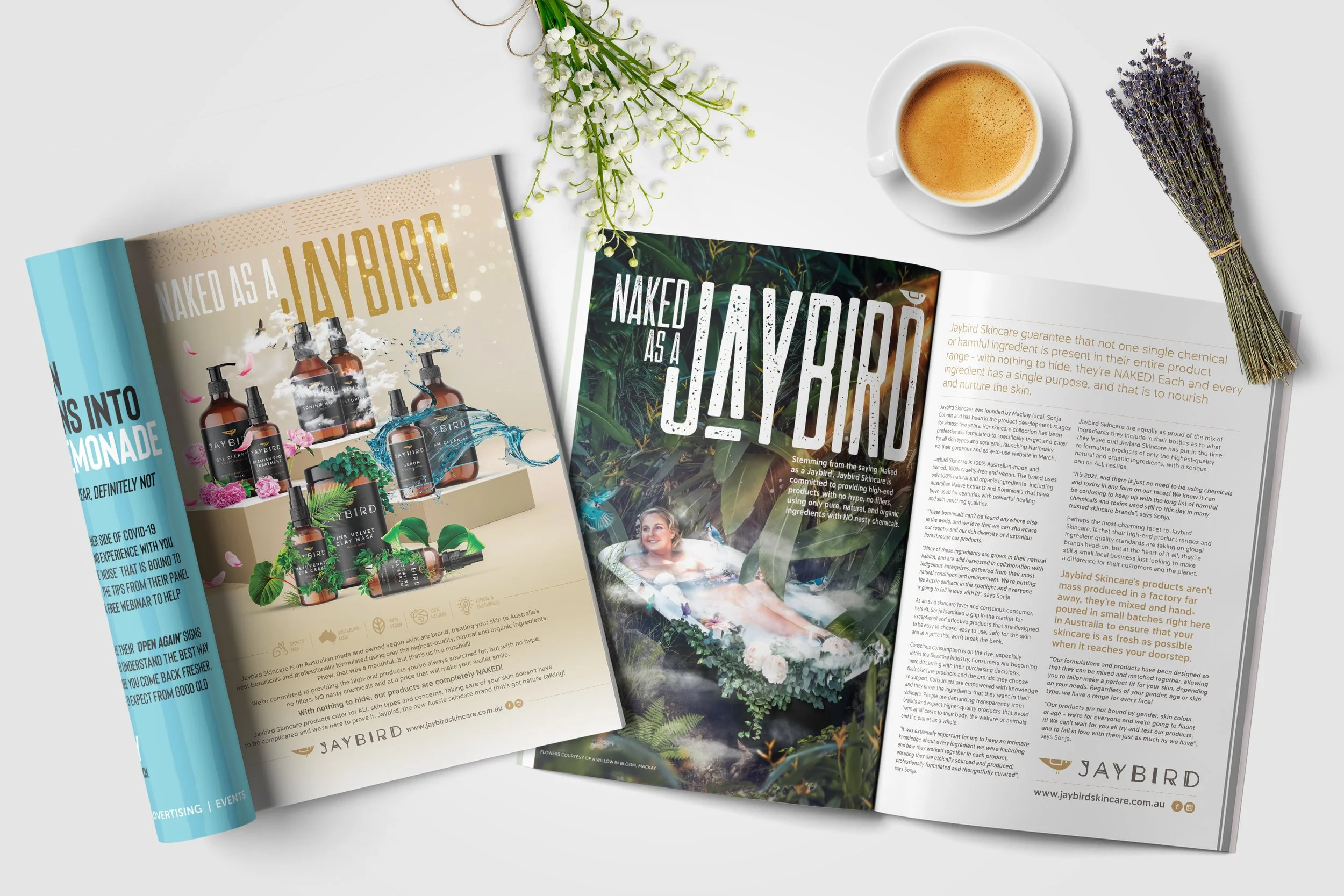
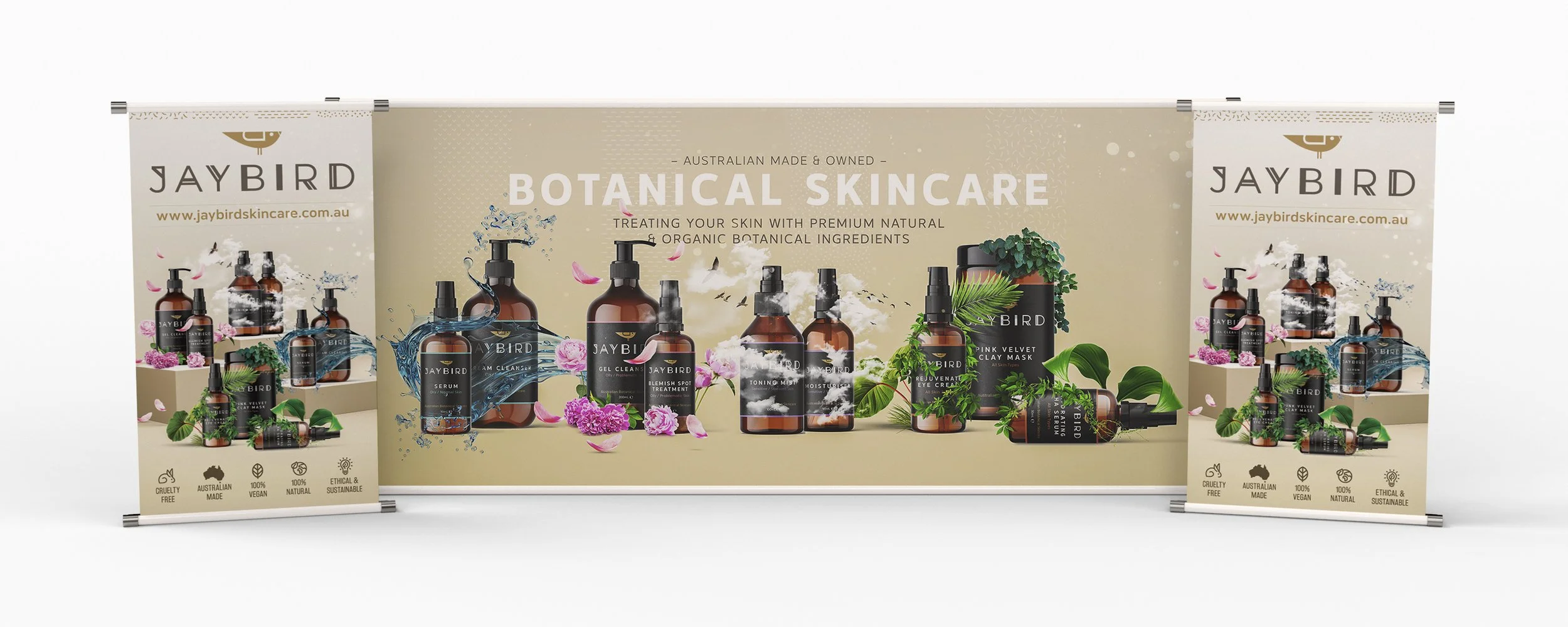
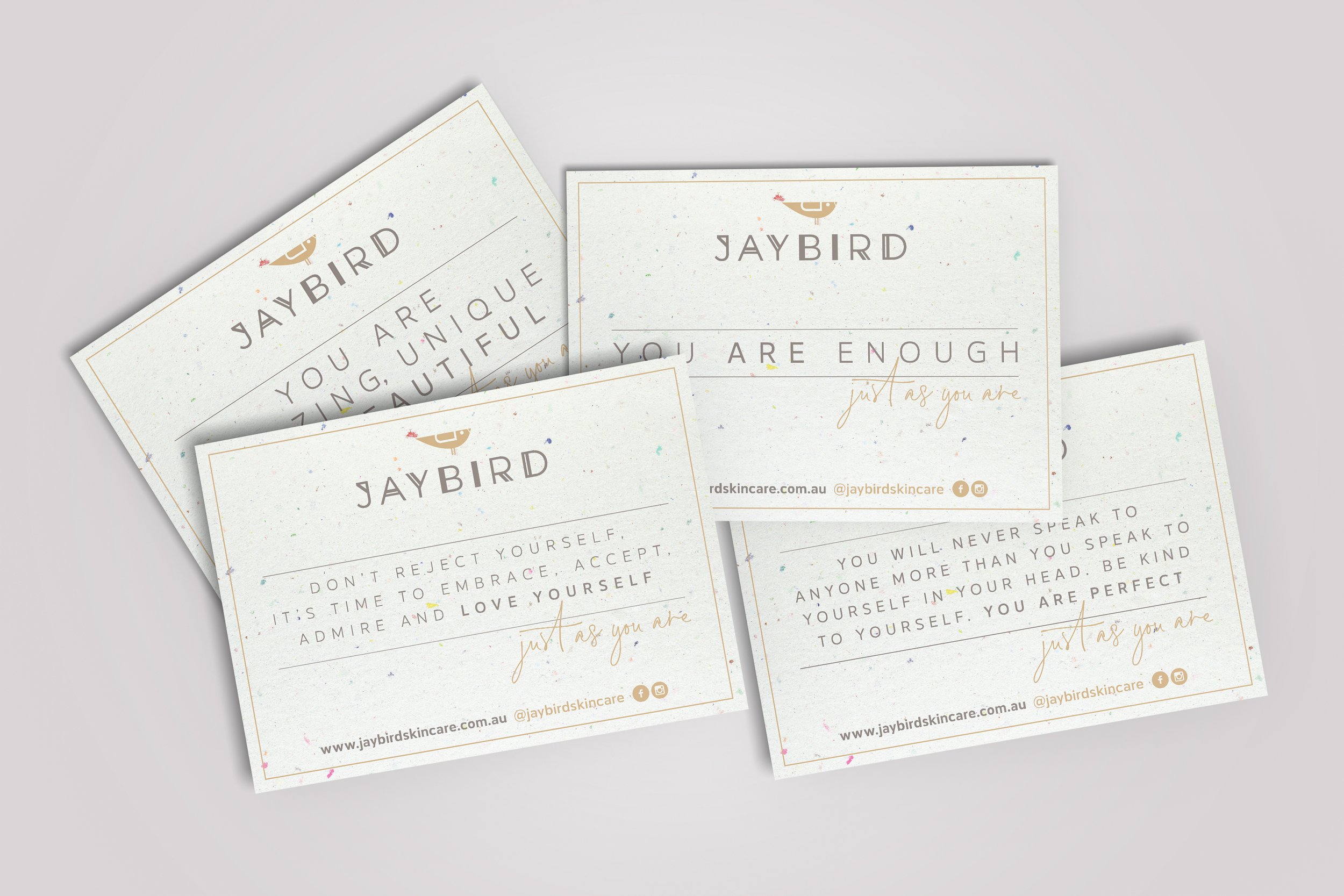
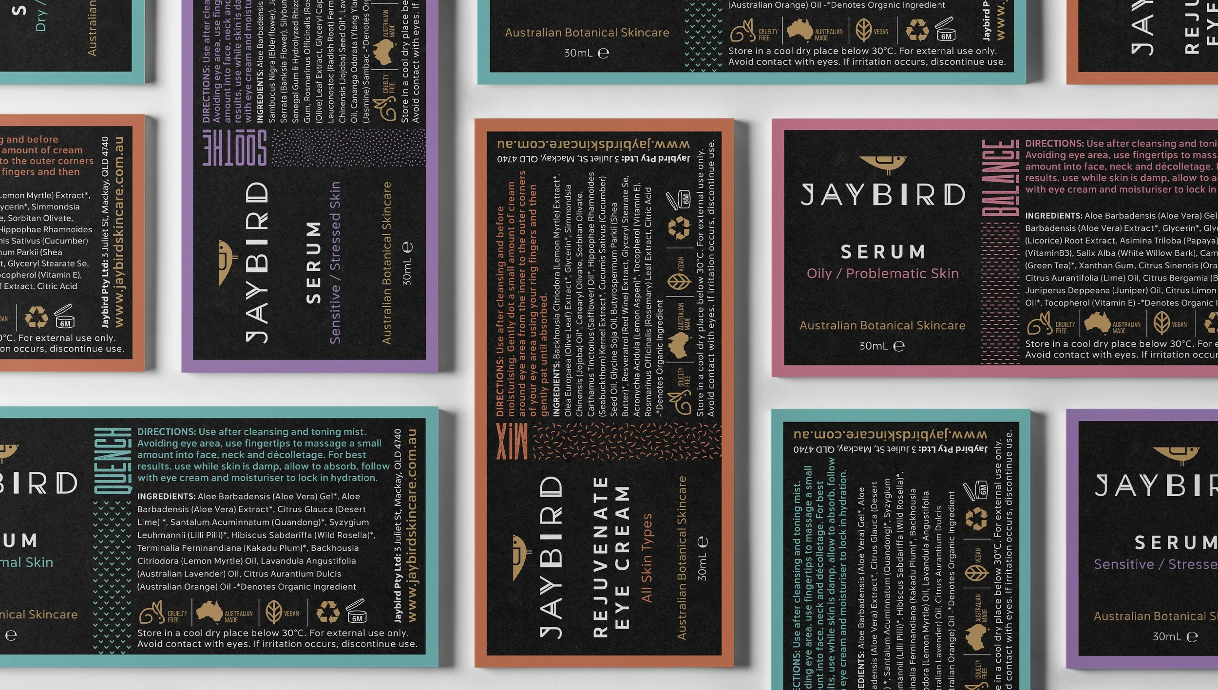
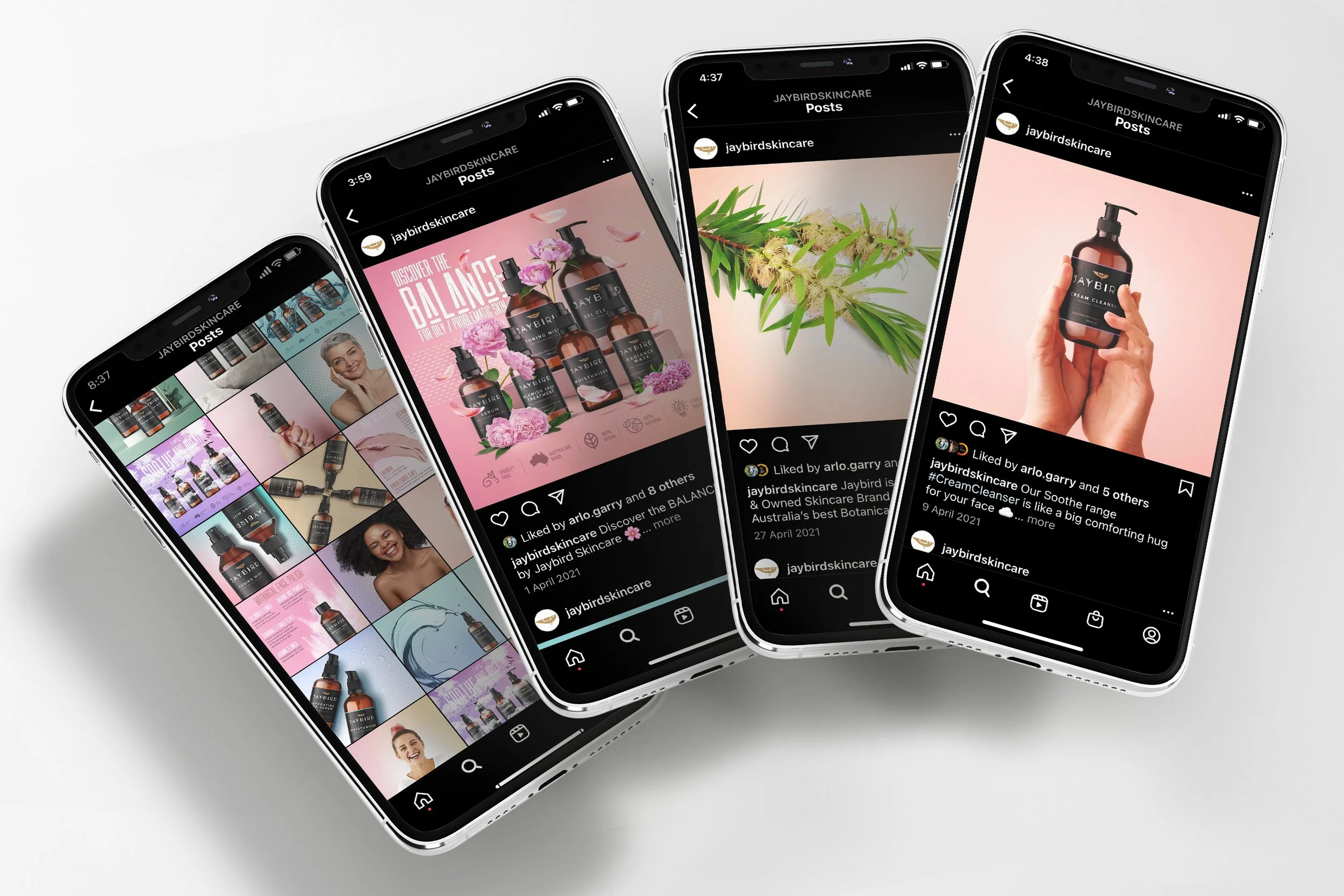
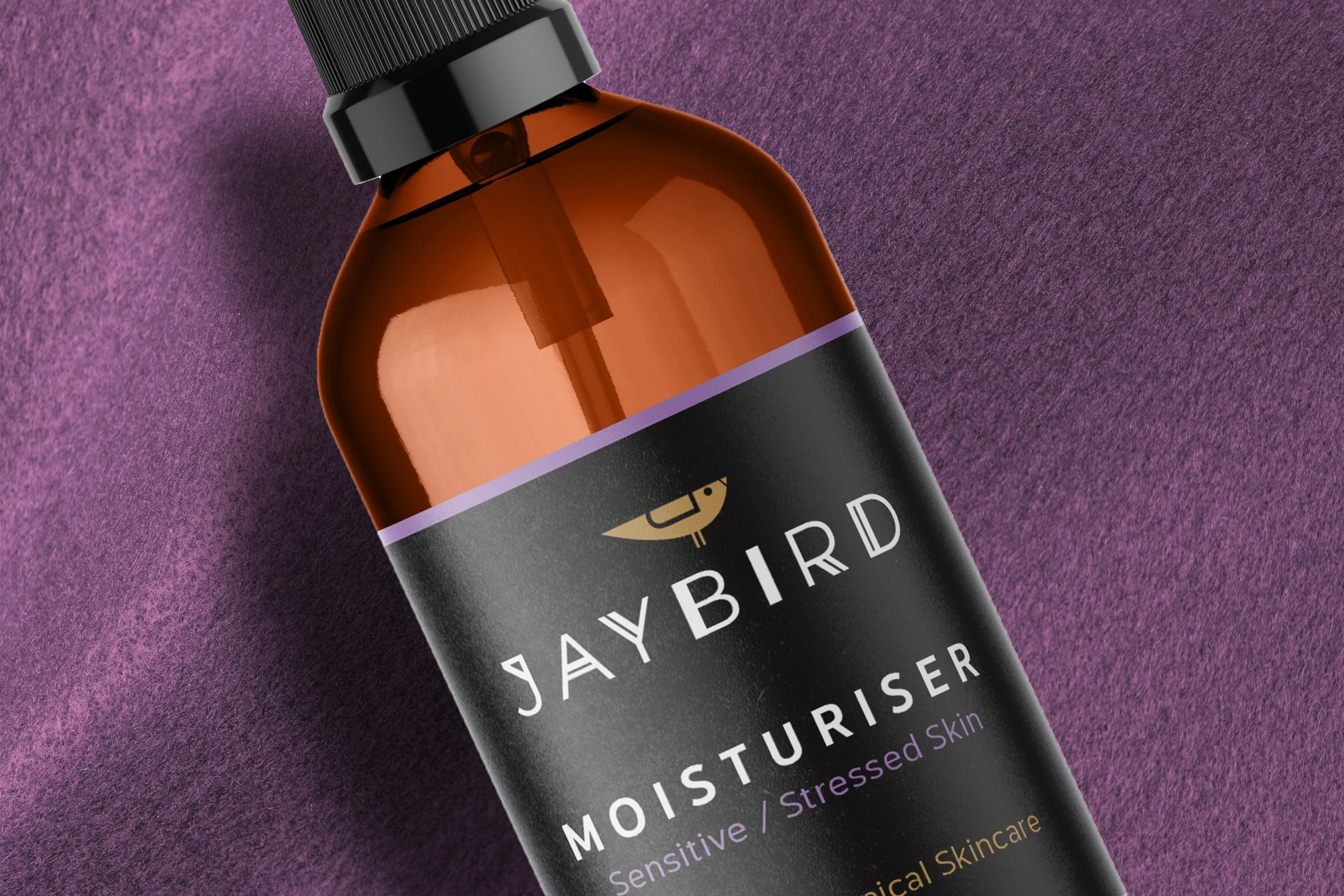
When the client approached redhotblue, they had a brand name and product range but no established branding. With an assortment of bottle shapes and sizes, the label designs needed to be adaptable across multiple formats. A key priority was to showcase the natural and native Australian ingredients while maintaining a professional look that conveyed dermatological credibility in a competitive online market. With four distinct ranges and multiple products within each, the branding and marketing strategy had to be both cohesive and flexible to resonate with a broad audience.
Project Highlights
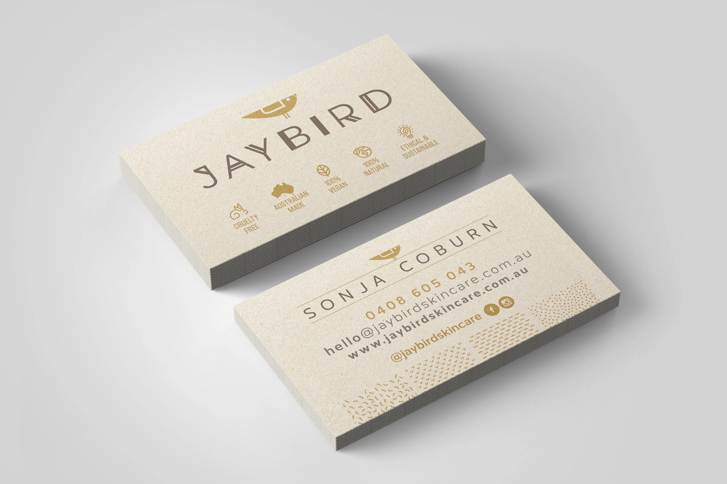
Redhotblue differentiated each skincare range with a unique set of graphic elements and colour palettes, inspired by nature. Each product ‘family’ was designed to stand out on its own, while looking good as part of the whole range. The diverse lettering used in the logo represents the brand’s inclusivity and the audience’s varied skin concerns. While the bird’s wing subtly forms the capital ‘J’ in the brand name. Customers arrive problem first, so the products have been positioned as solution-first, making it easy for customers to identify treatments suited to their needs. The brand’s overall visual identity balances boutique charm and professional polish, designed to foster trust with the brand’s digital audience in the absence of a physical storefront.


The Brief
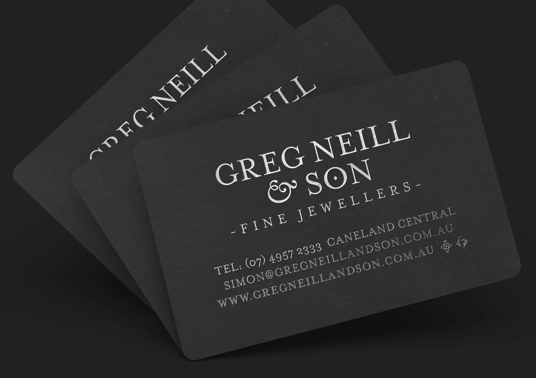
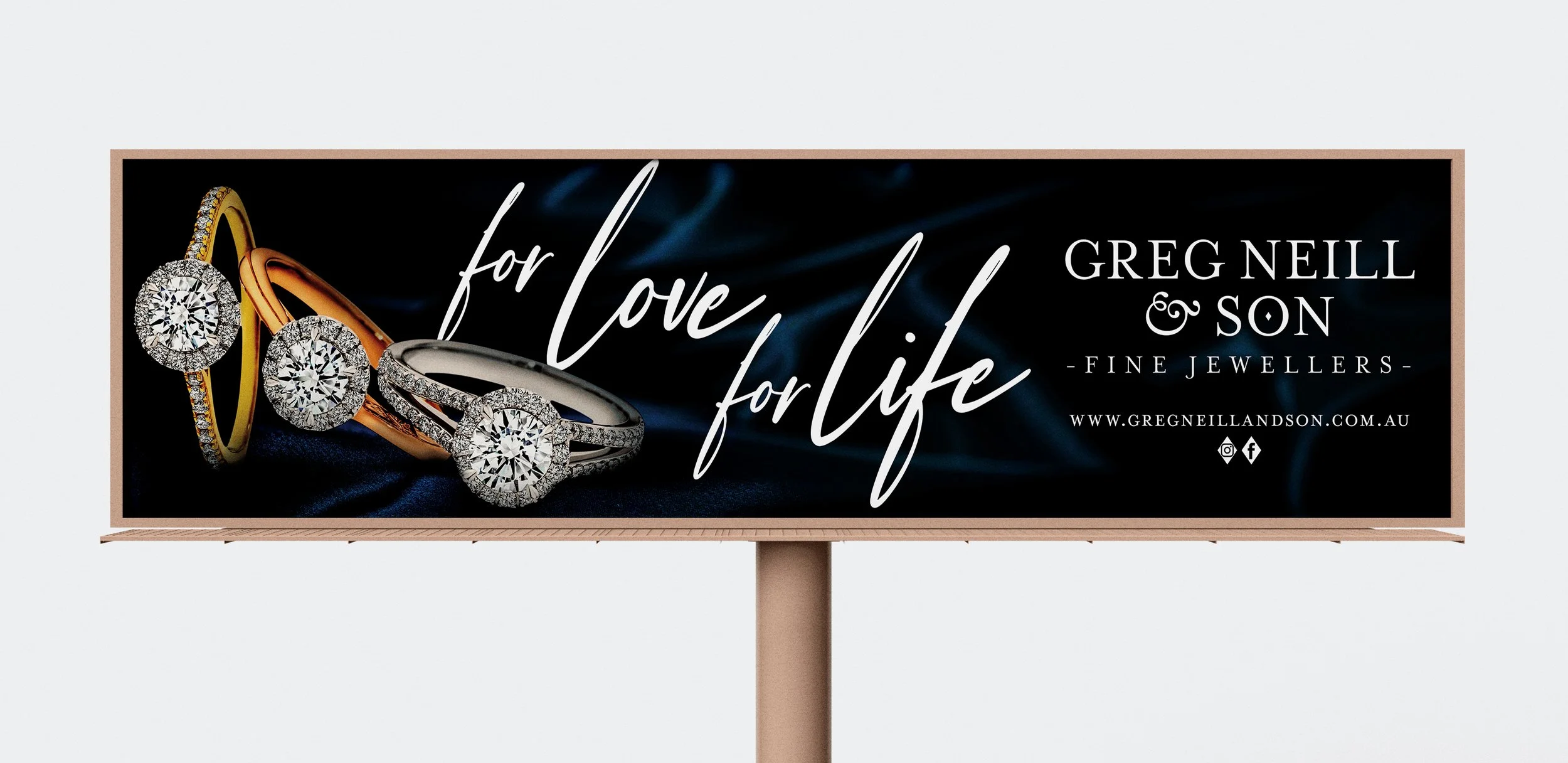
As the region’s longest standing independent jeweller, Greg Neill & Son sought a fresh marketing direction that reflected their reputation for exceptional service and bespoke fine jewellery. Their challenge was to showcase the true quality of their products without the generic “ring-on-hand” visuals used by competitors. While confident in their premium pricing, they found that traditional advertising photographs often failed to capture the detail and value of their custom hand-made products.
Project Highlights
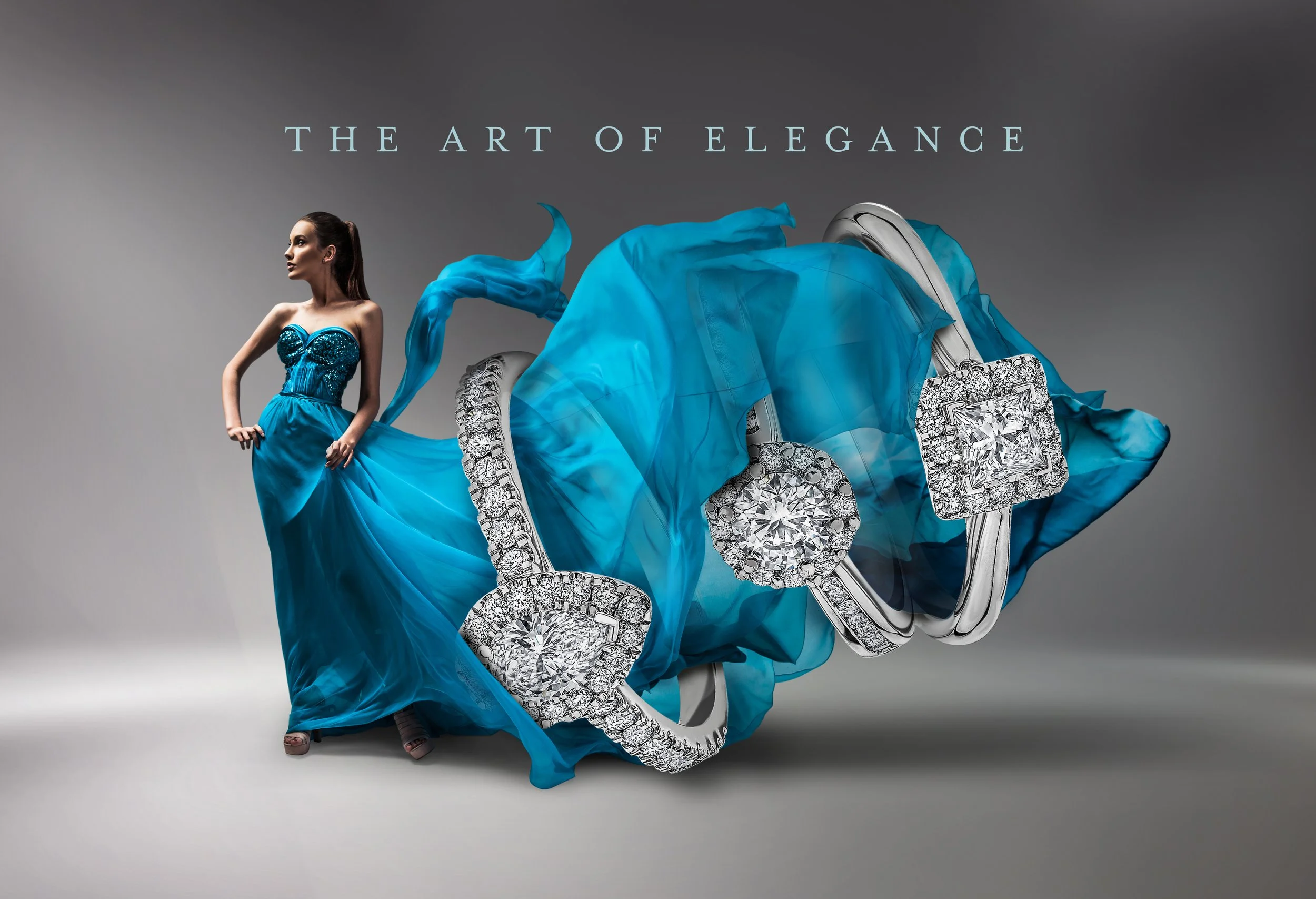
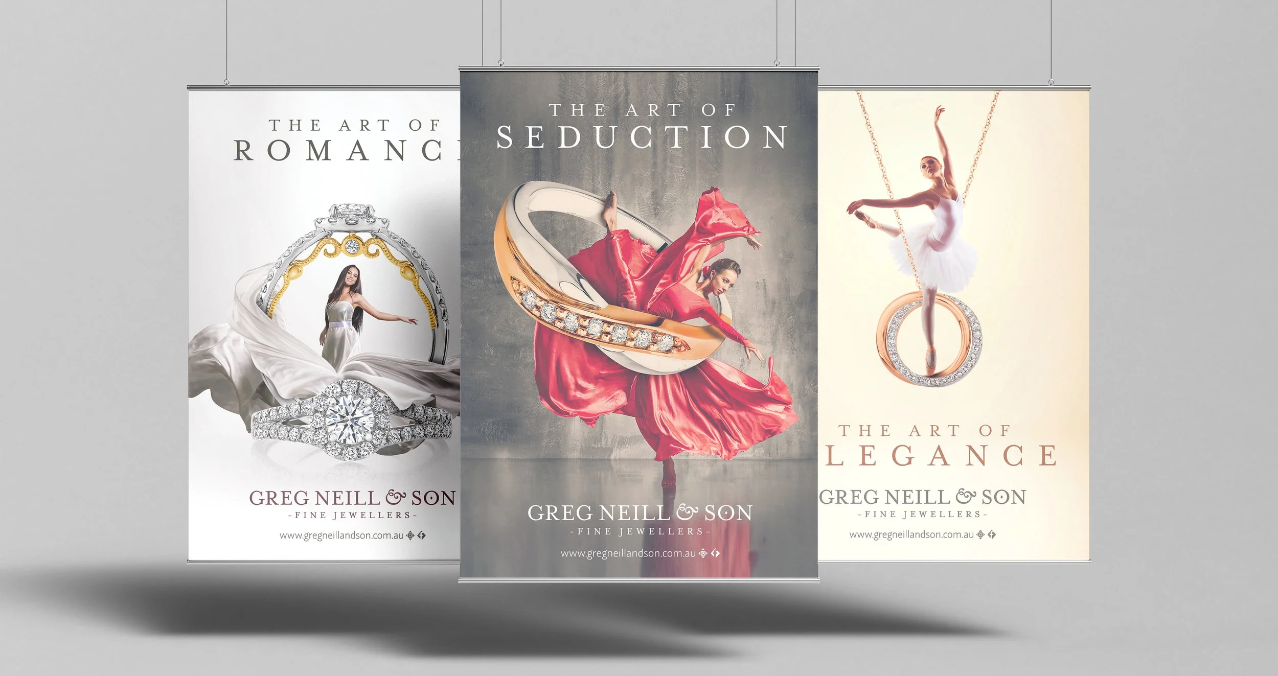
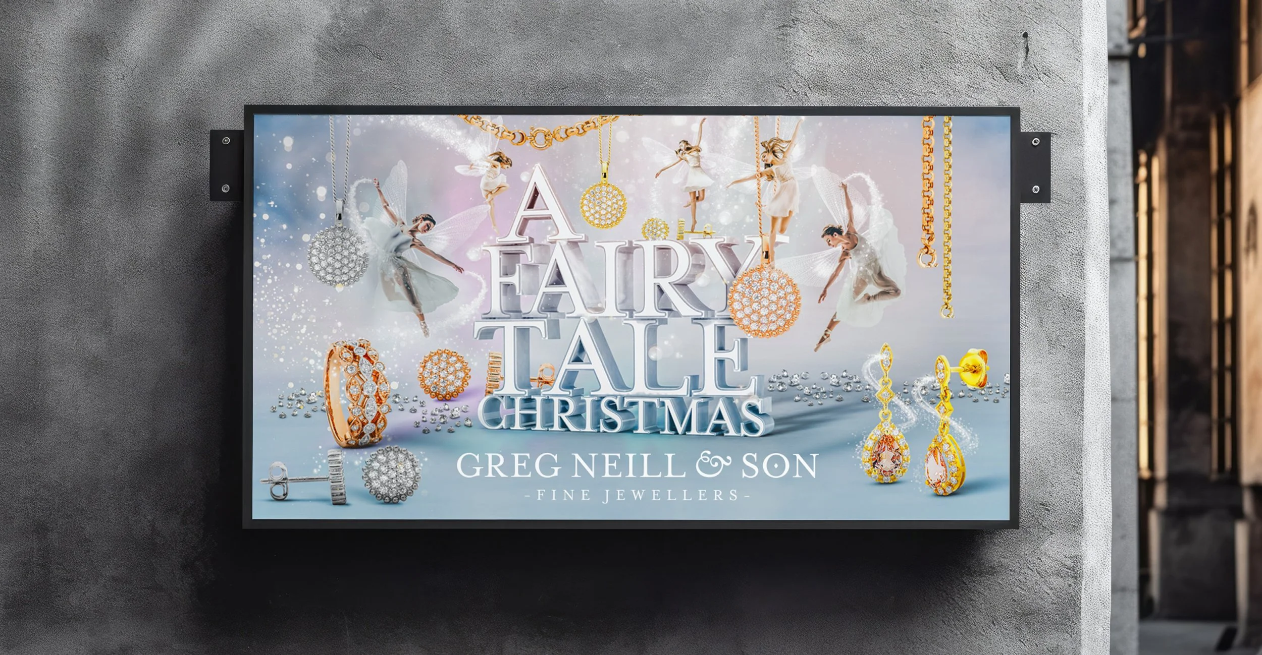
The project began with a logo redesign and typographic refinement. Moving away from the predictable imagery of a ring on a hand, we reversed the dynamic between person and jewellery, placing the jewellery as the hero and the human form as a supporting element. The creative was inspired by the elegance of ballet dancers, whose precision, refinement, and artistry reflect the values of Greg Neill & Son. This theatrical approach evolved into the campaign title “The Art Of”, broadening the concept beyond ballet to embrace other timeless expressions of beauty. The campaign’s flexibility allowed it to be extended into seasonal promotions such as Mother’s Day and Christmas, ensuring a consistent brand presence.


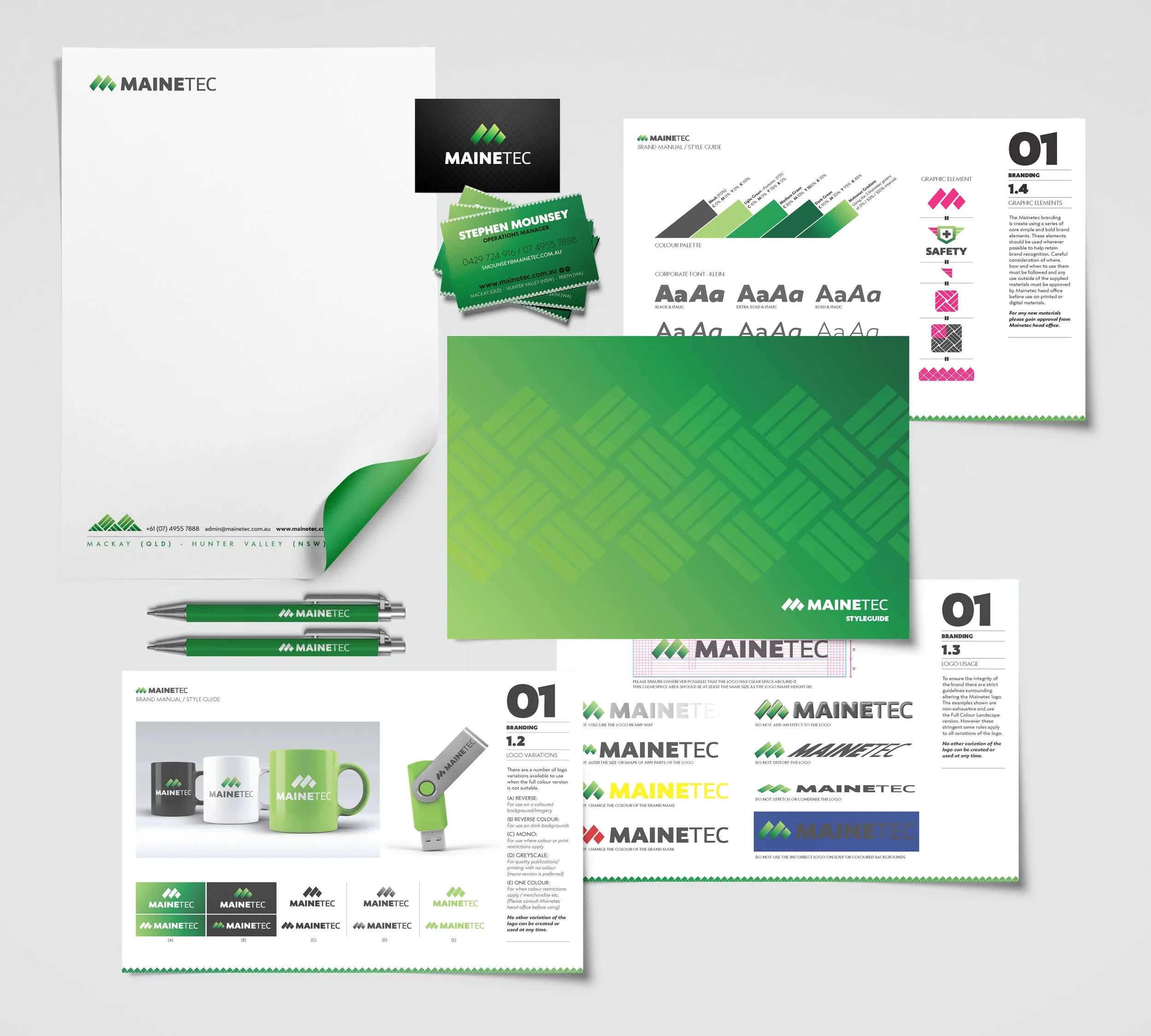
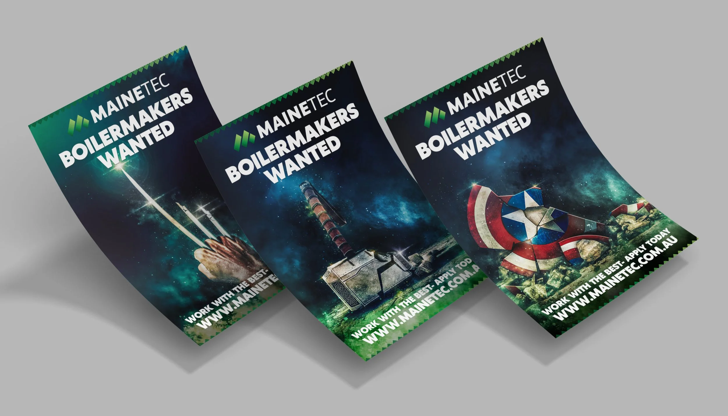
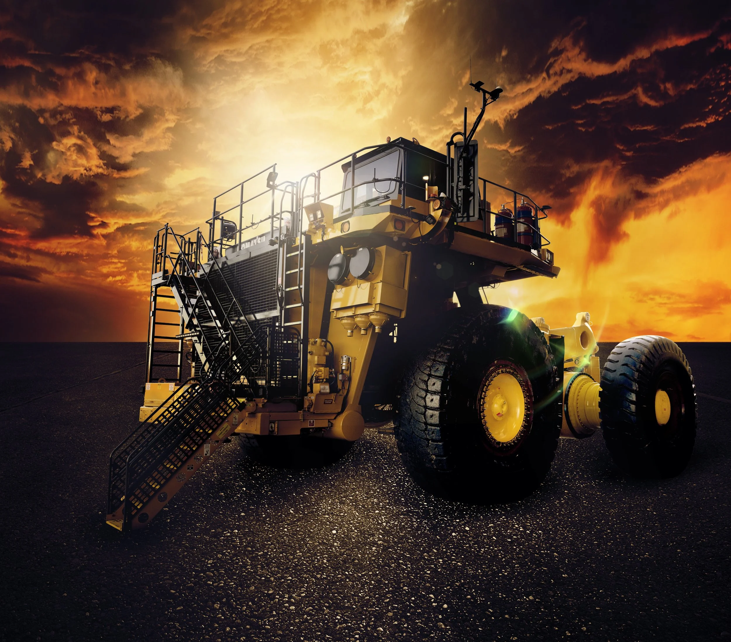
The Brief
Mainetec (formerly IMES) sought a marketing partner who could position them with strength and clarity in the highly competitive mining industry, particularly against rivals with confusingly similar names such as MES. With a reputation for innovation and ambitions for national and eventually global expansion, it was essential to create a brand and marketing strategy that differentiated them while capturing their technical expertise and forward-thinking vision.
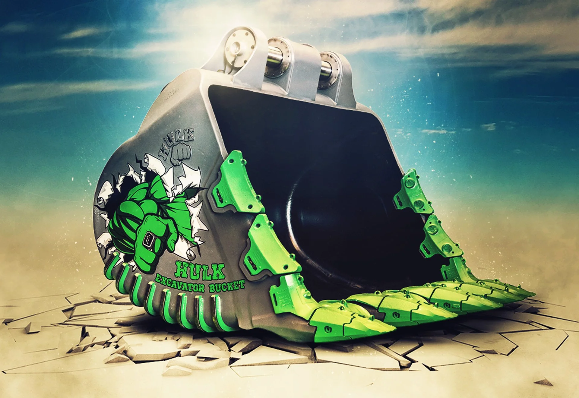
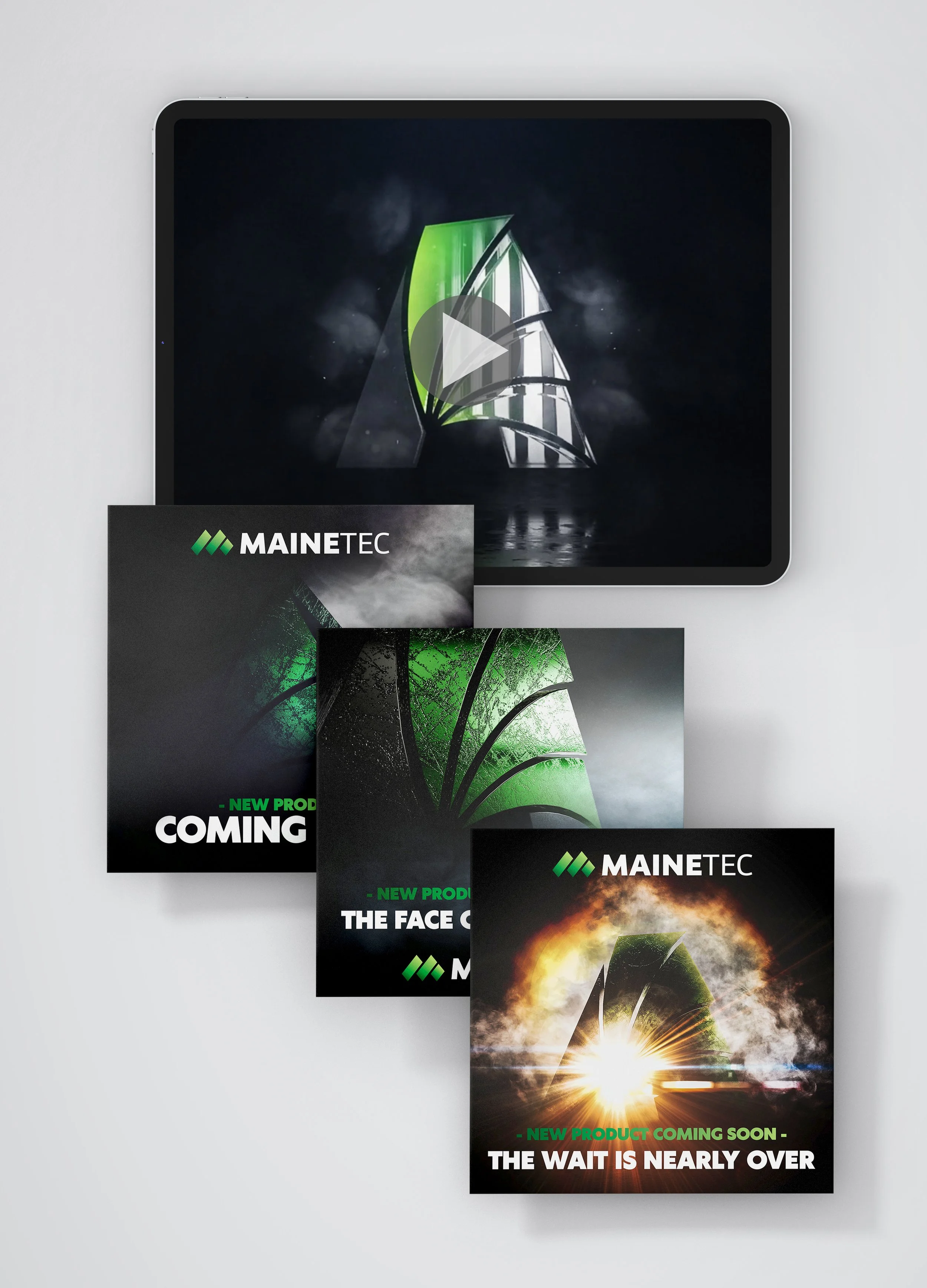
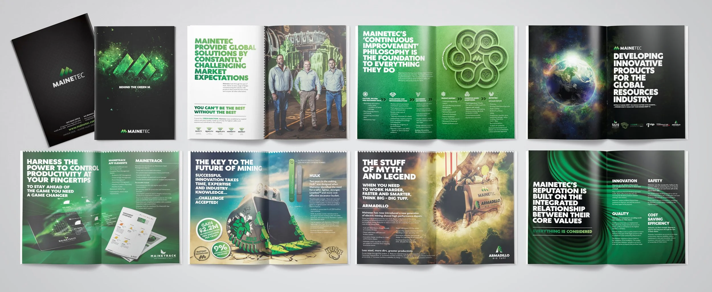
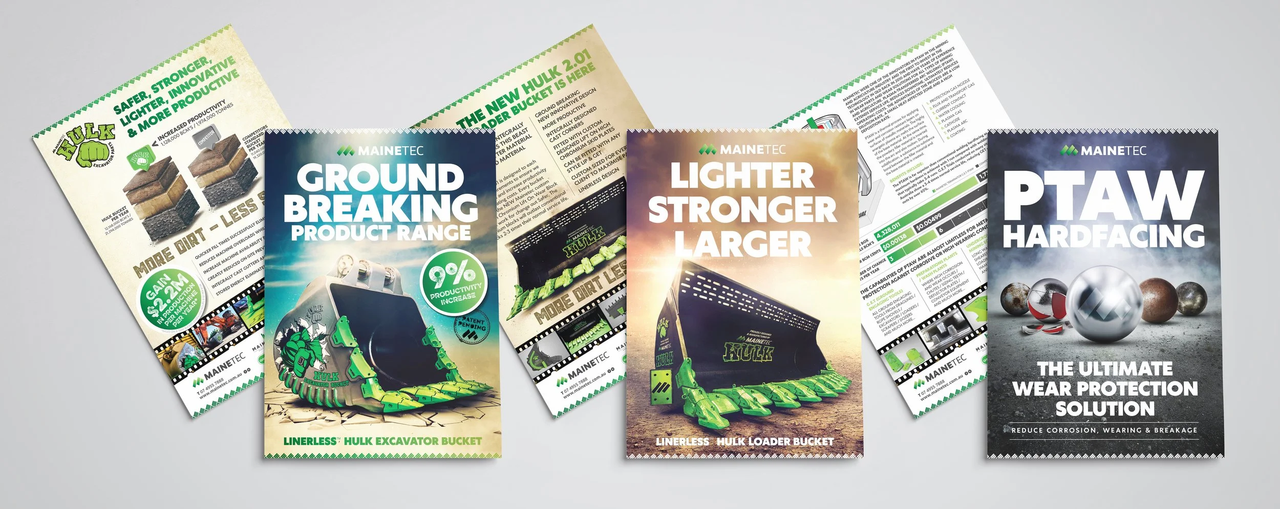
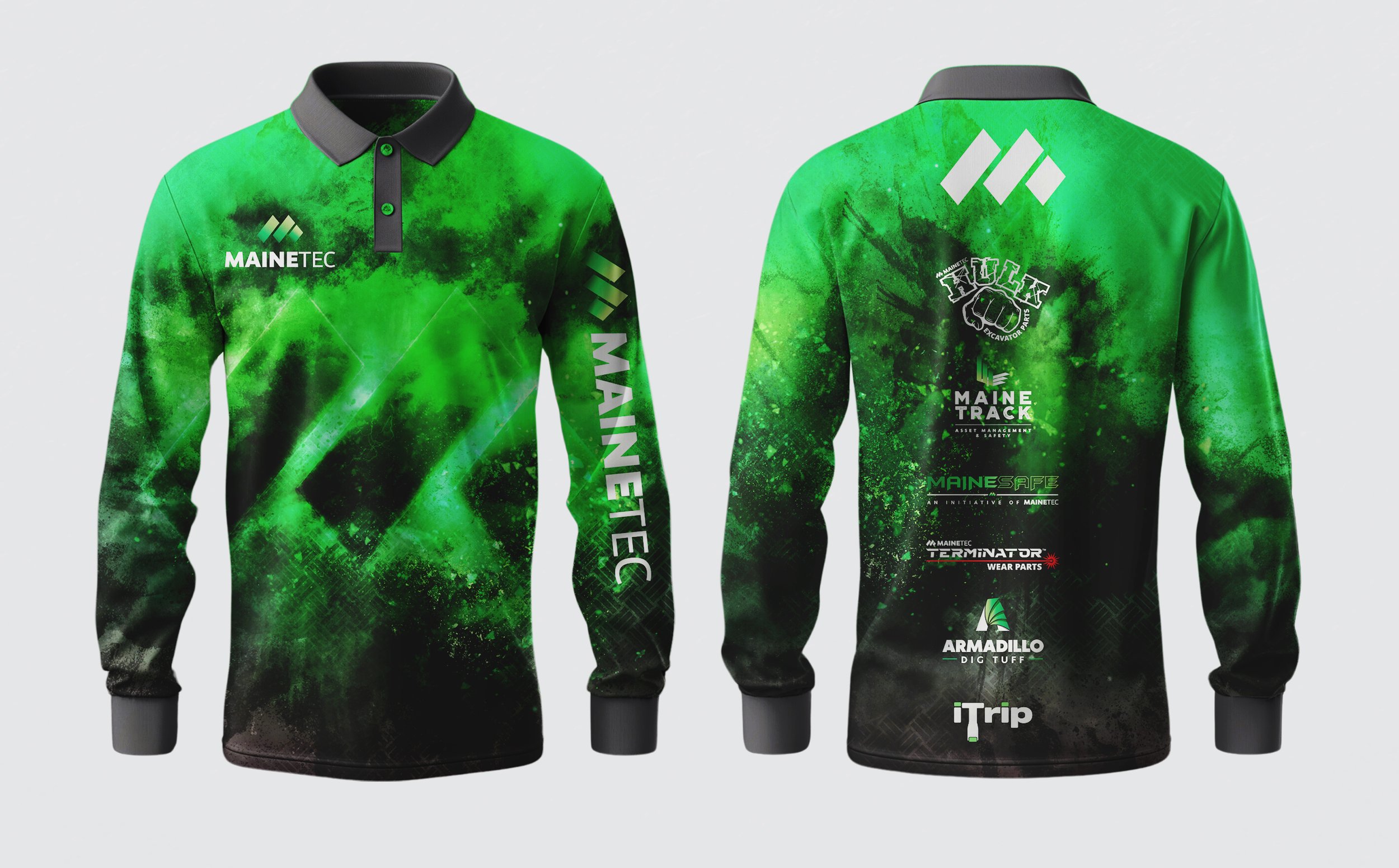
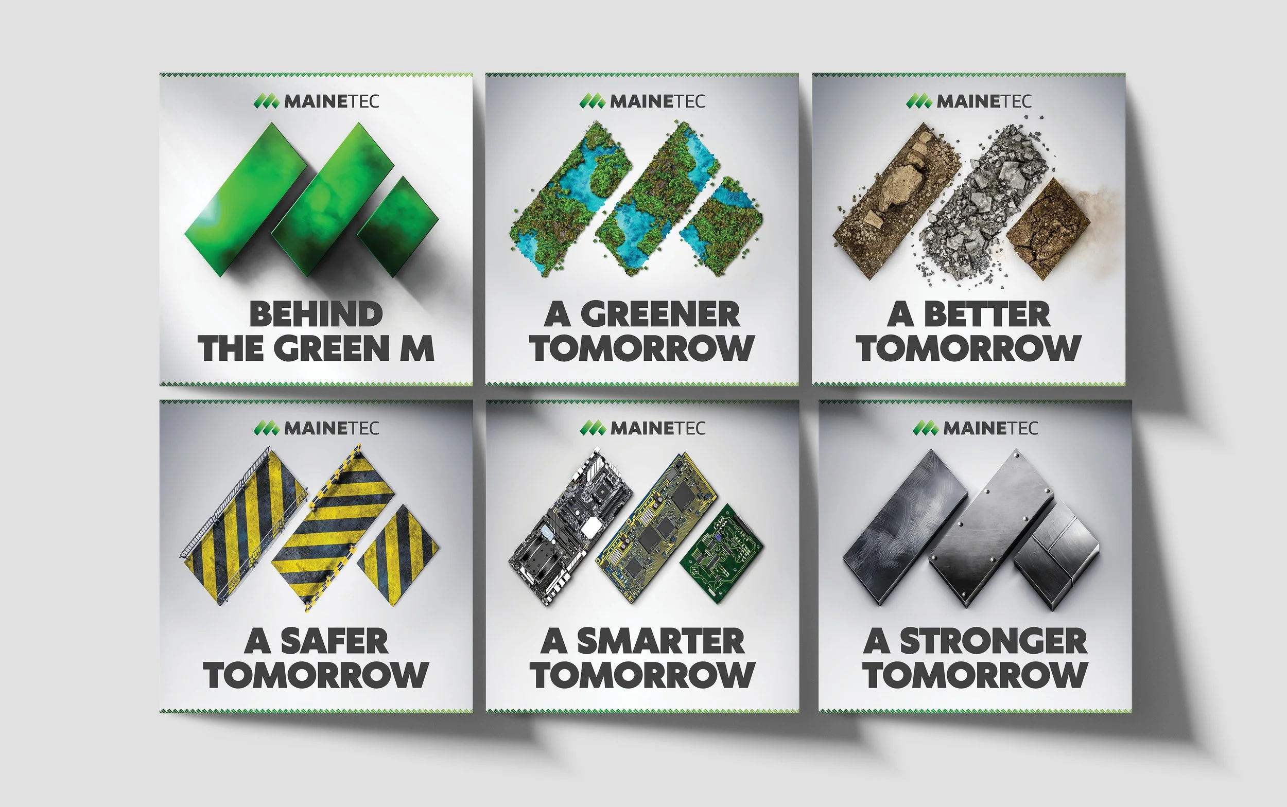
Project Highlights
Beginning with a brand consultation, redhotblue guided Mainetec through the decision to adopt a new name inspired by their origins in Maine, Australia, and a rebrand that better aligned with their long-term goals. From there, we developed a bold and memorable cinematic, poster-style tone of voice and brand personality, drawing inspiration from the epic names of their products, such as the Hulk Excavator Bucket. We enhanced their product renders and delivered a complete marketing suite, including the design and development of a bespoke website. The result was a cohesive, future-focused identity that not only elevated the brand but also supported Mainetec’s growth right through to its successful sale.
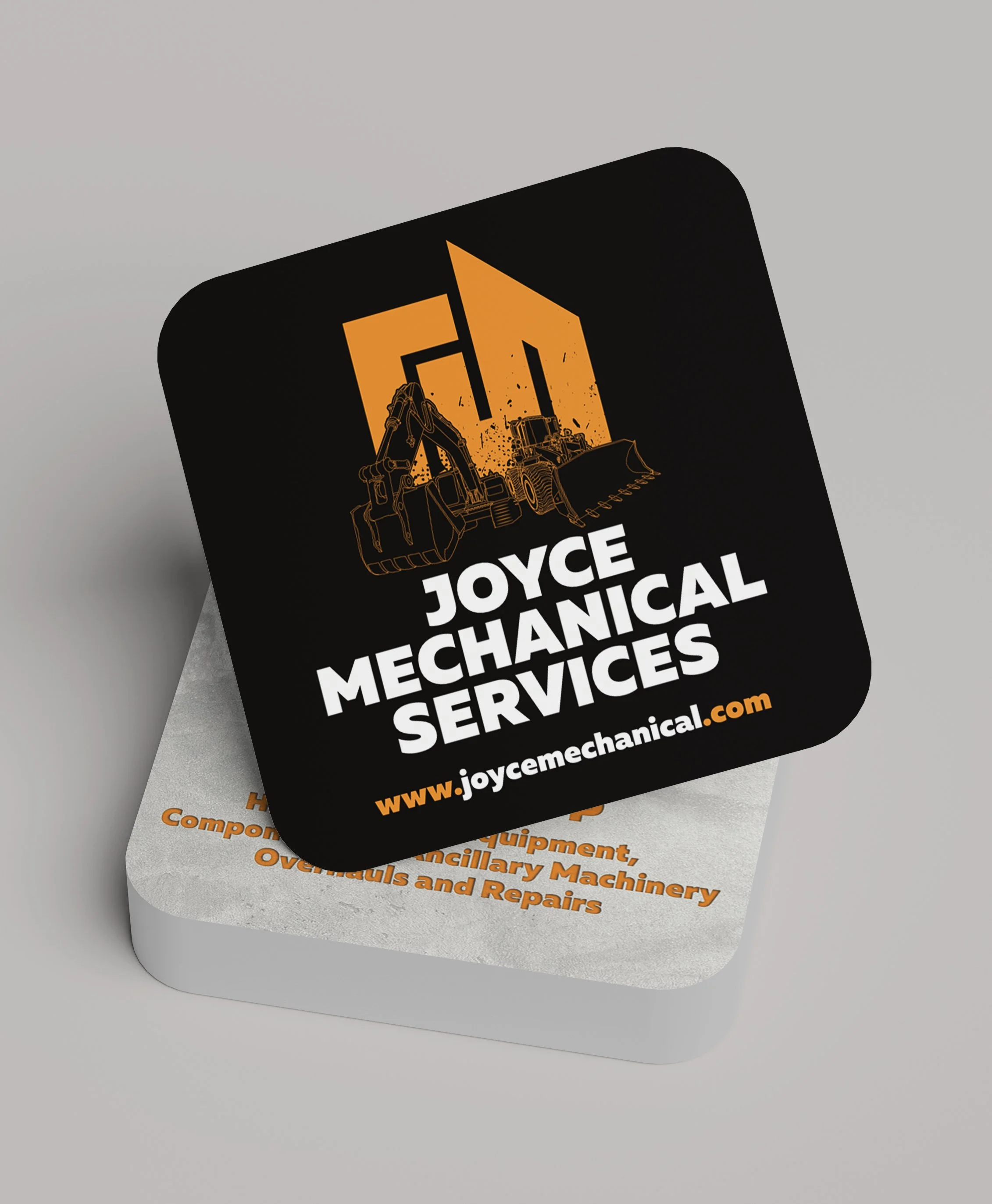
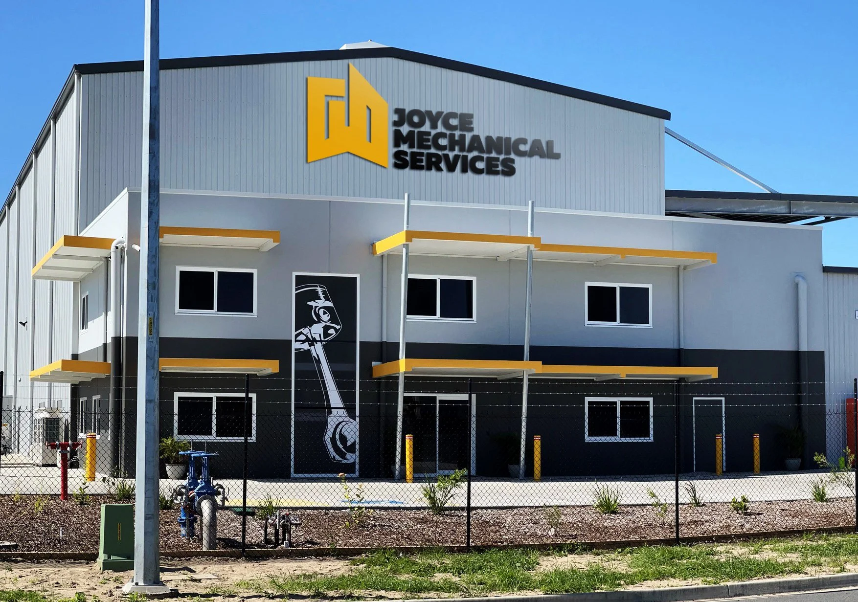
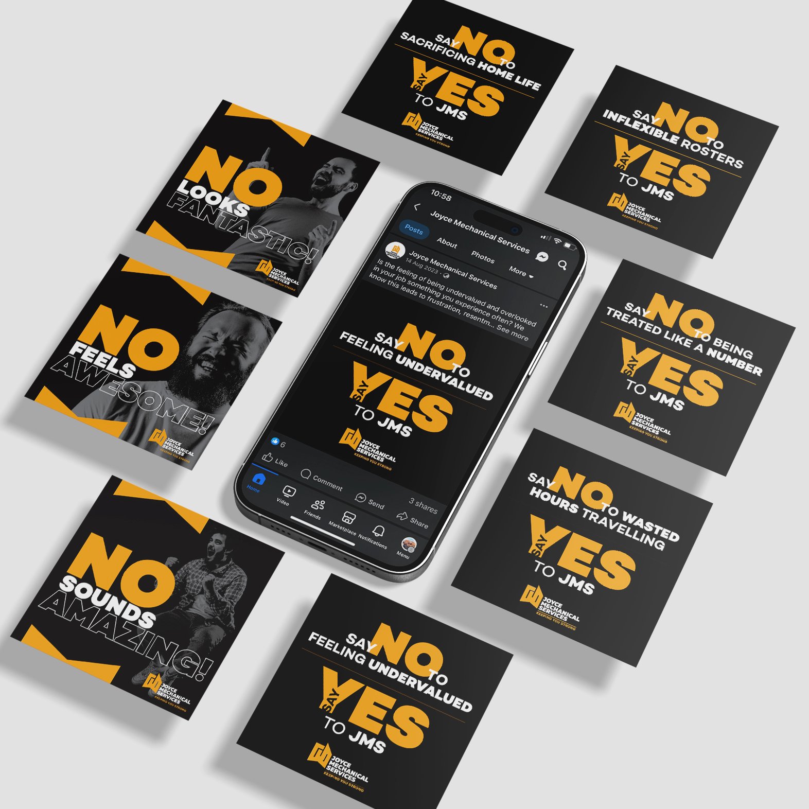
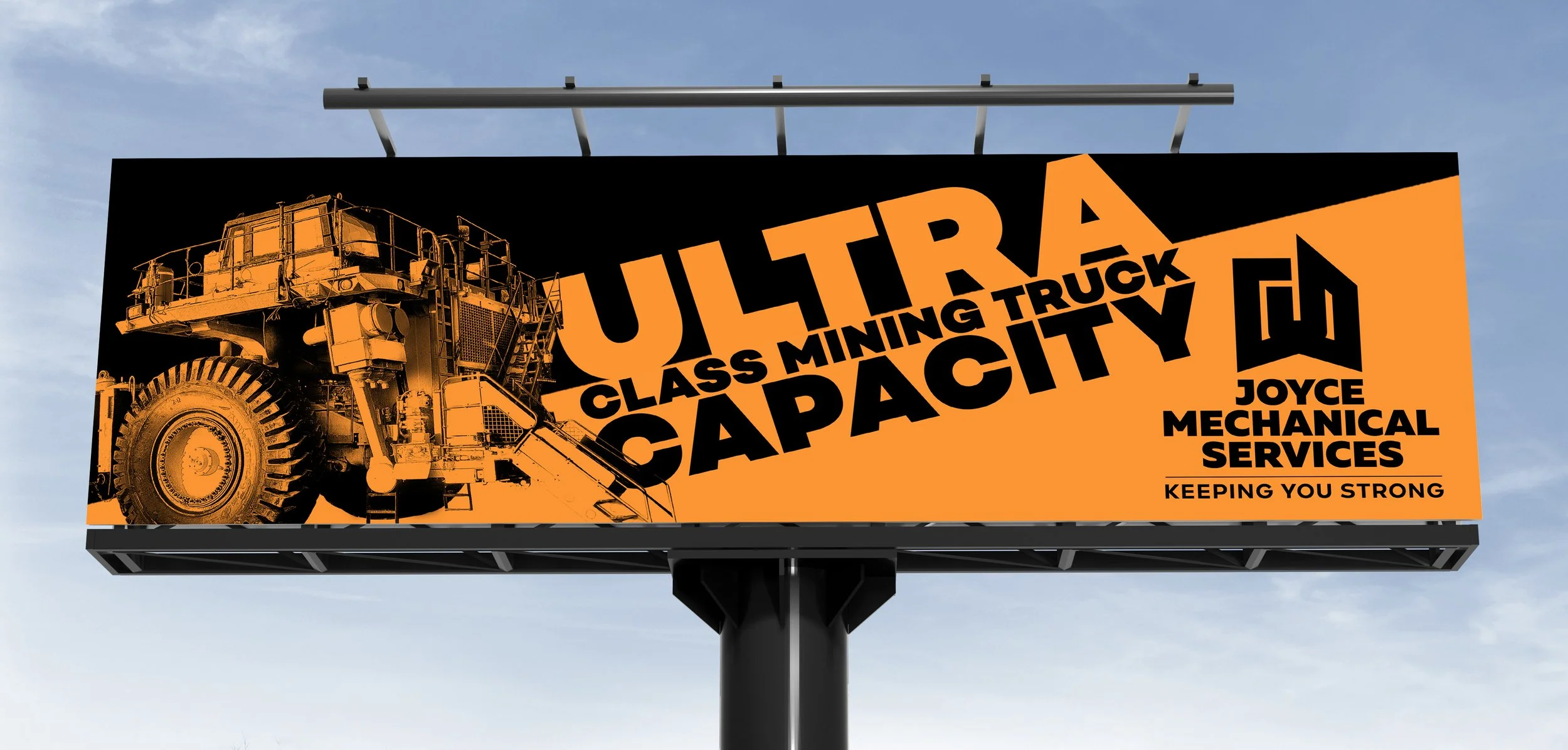
The Brief
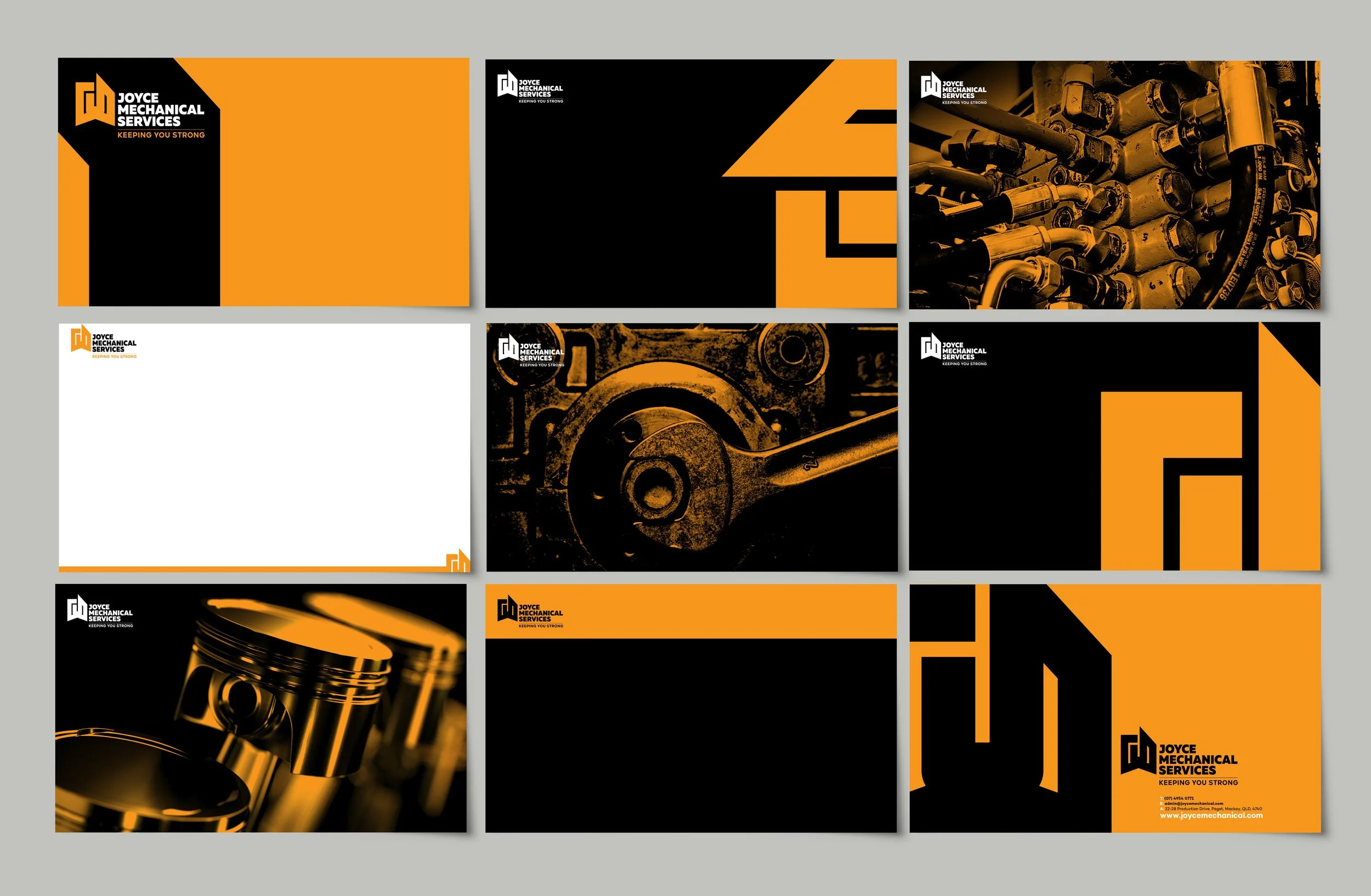
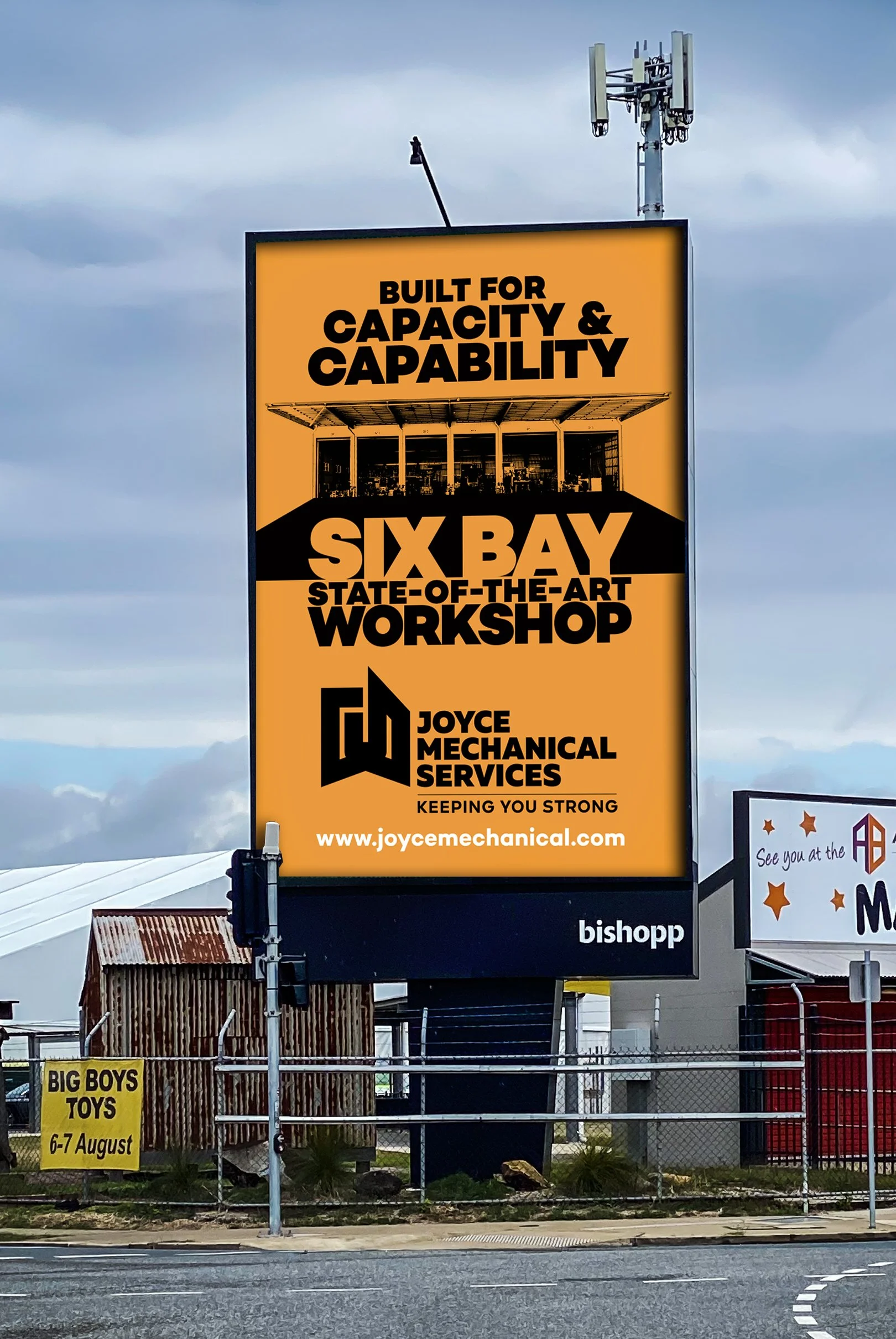
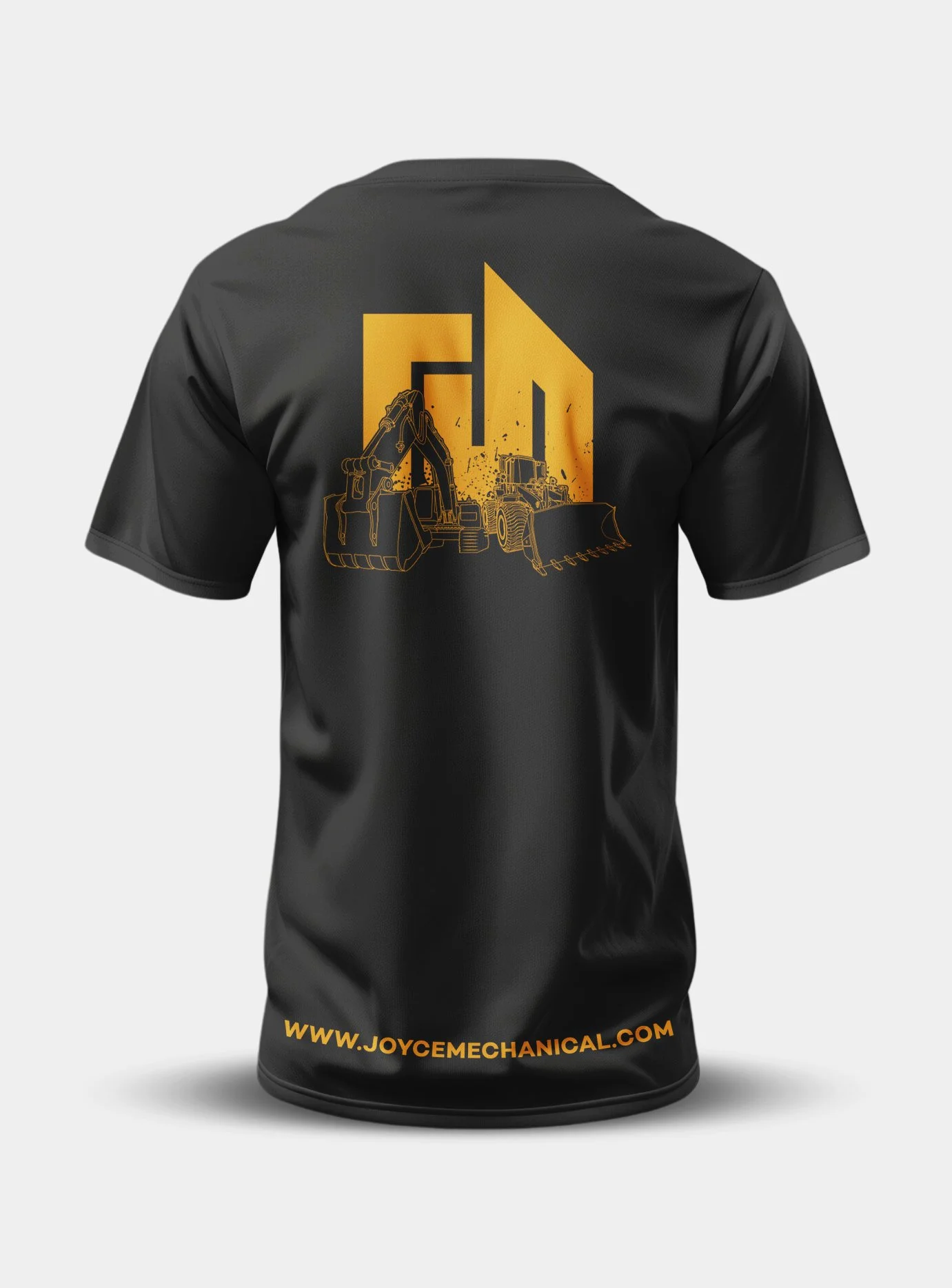
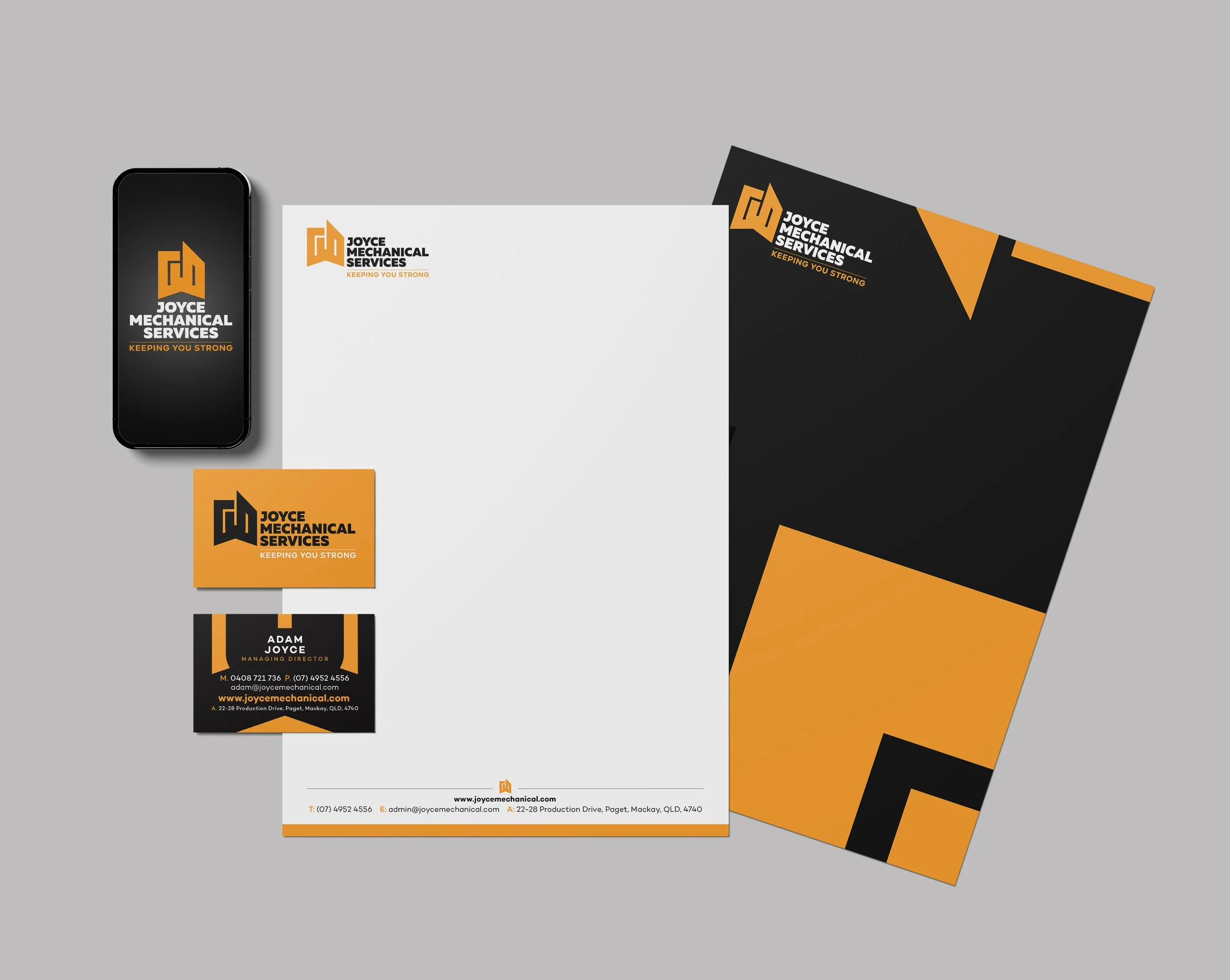
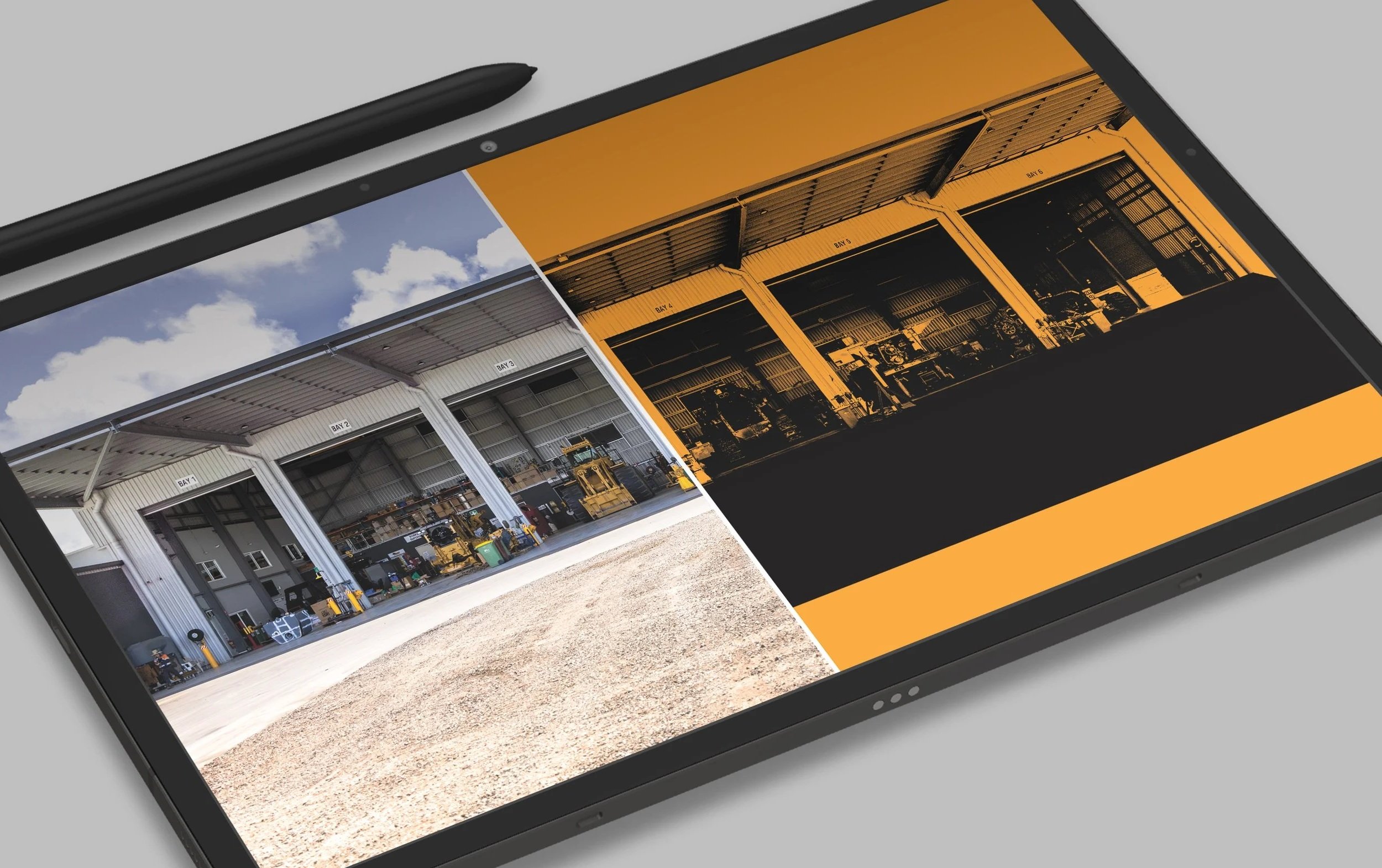
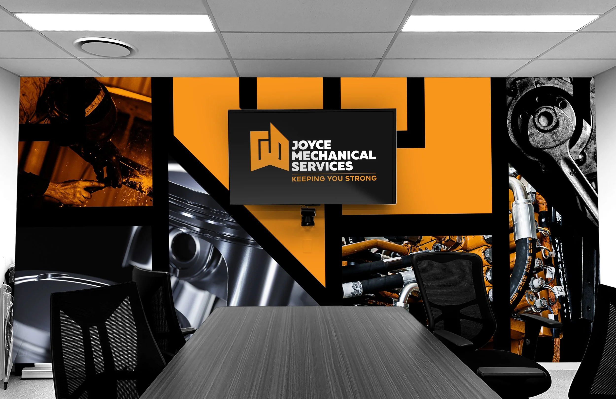
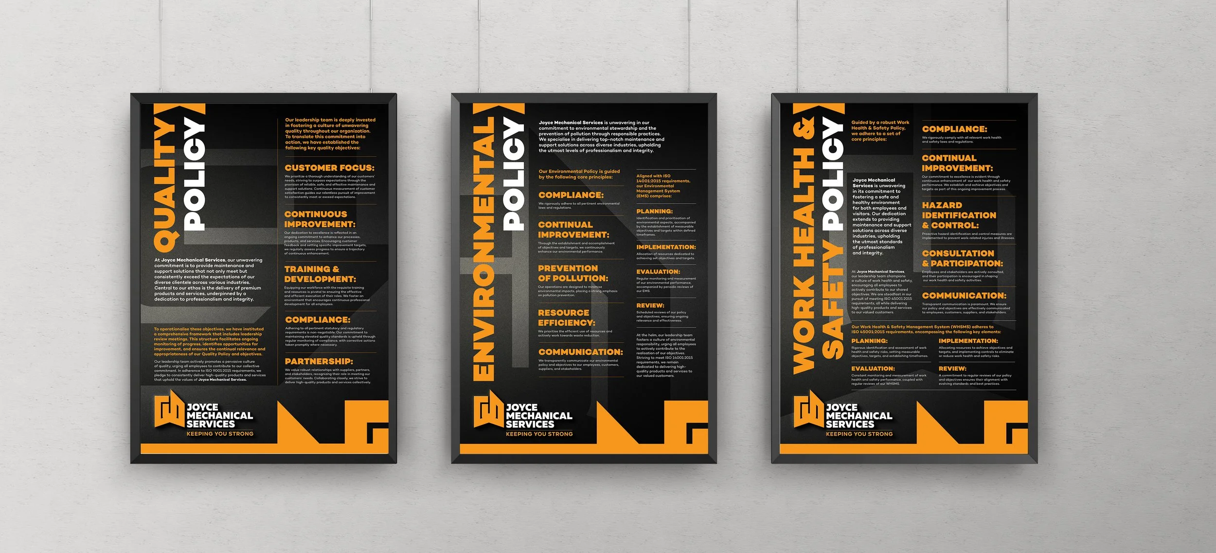
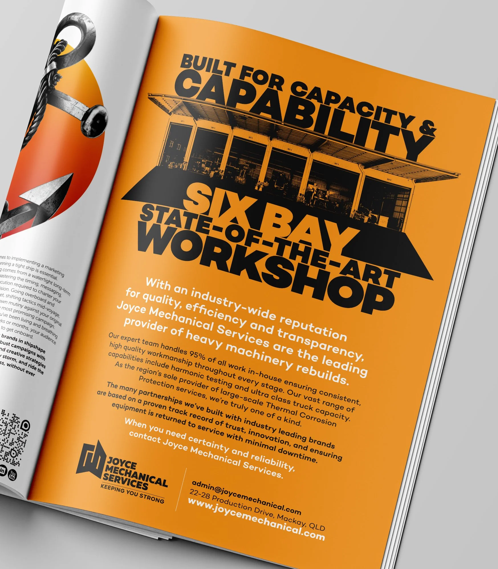
Joyce Mechanical Services reached out to redhotblue to reshape perceptions of their capabilities and attract new clients, particularly larger organisations. Previously, their work was generated via word of mouth, leaving the brand without a distinct identity and often underestimated in scale and expertise. Redhotblue’s task was to develop a brand that highlighted JMS’s strengths including their broad capabilities, knowledgeable team, trusted reputation, and proven reliability.
Project Highlights
To deliver on the brief, redhotblue identified the need for a rebrand. The creative focused on proof and facts to demonstrate capability, while the messaging avoided subjective claims and used concise language and bold typography to build credibility. The positioning statement ‘Keeping you strong’ was created to reflect both the support JMS provides its clients and the enduring strength of its own team. A striking black and yellow palette was selected to visually represent strength and confidence. Black was used as the dominant tone for the logo and corporate branding to convey weight, reliability, and industry strength; while campaigns and advertising leveraged yellow to stand out with confidence in a competitive market. Angled graphics with harsh shadows reinforced the themes of strength and determination, creating a cohesive visual language that match the brand’s promise.

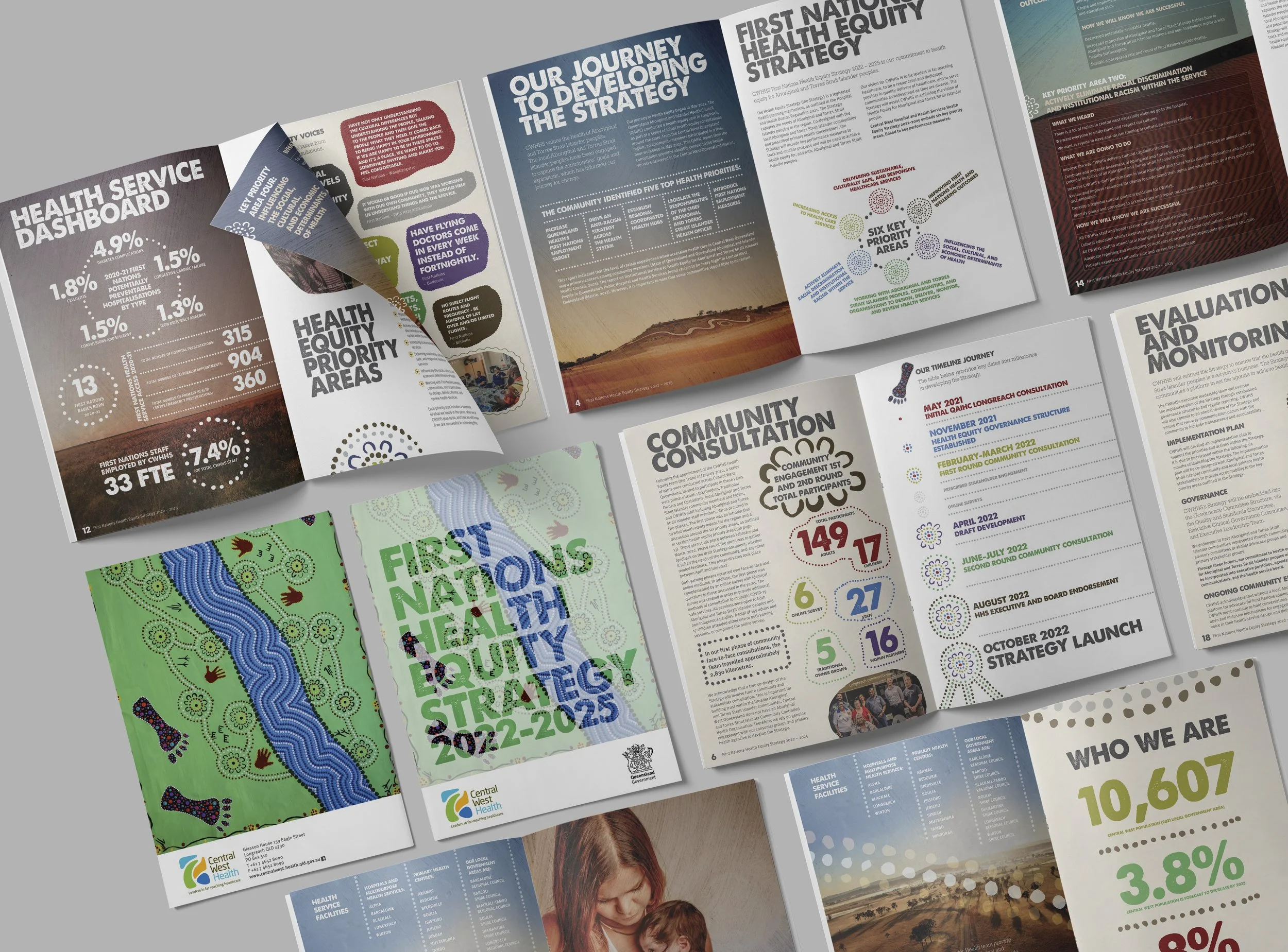
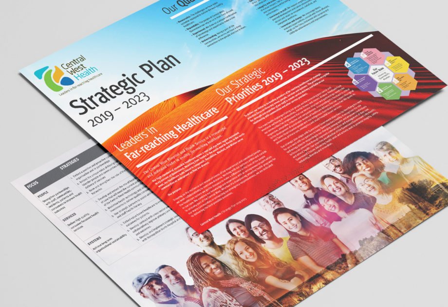
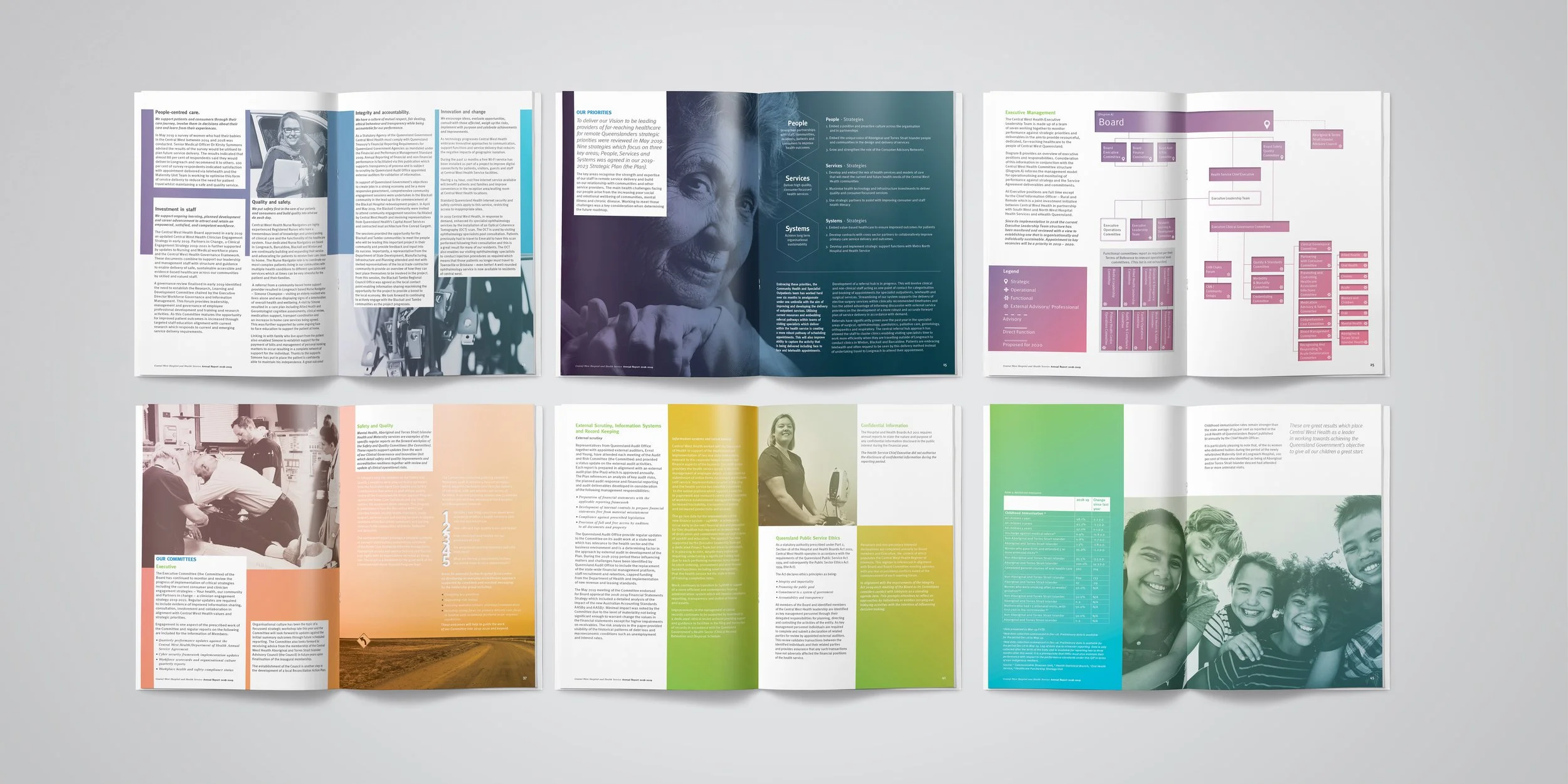
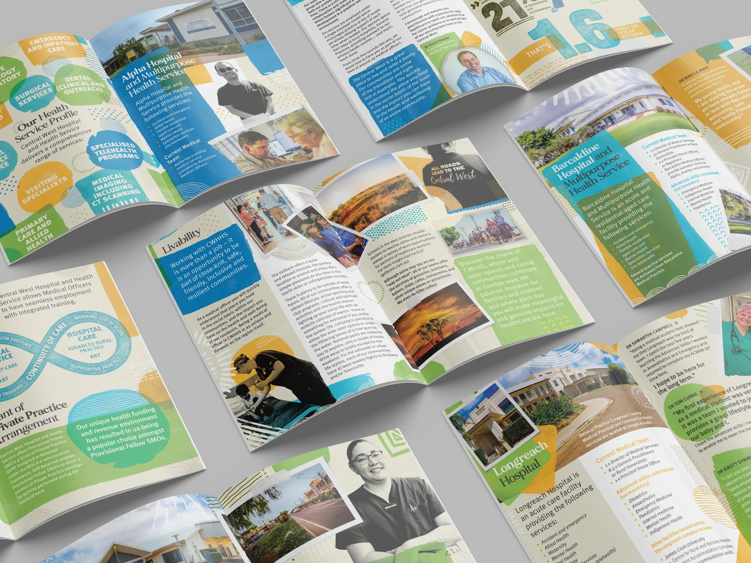
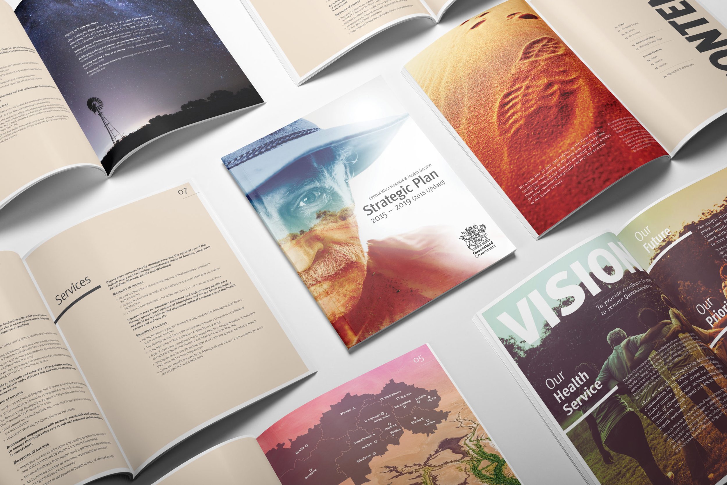
The Brief
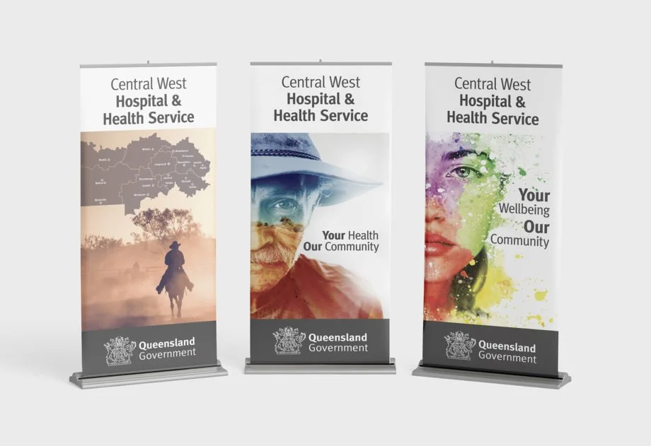
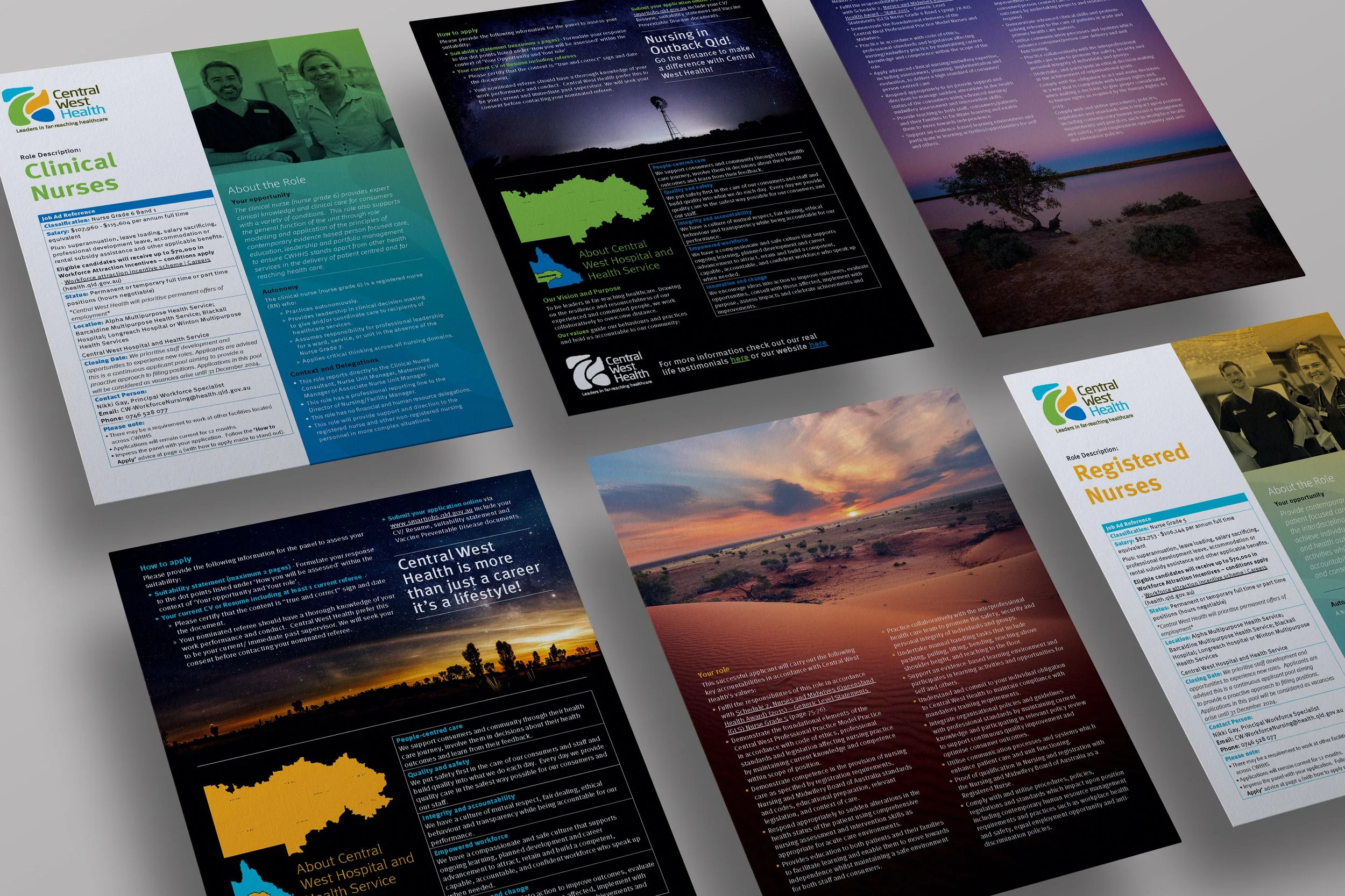
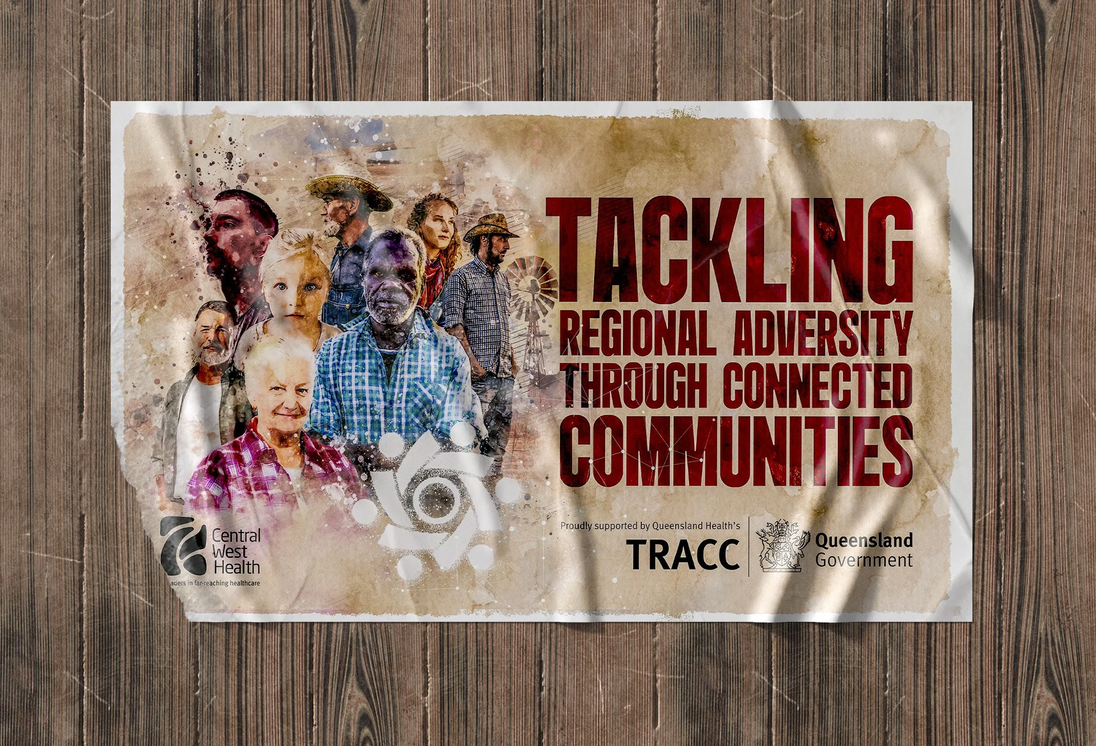
Redhotblue was initially engaged to create the look, feel, and sample pages for Central West Hospital & Health Service’s annual report. The concept was so well received that our team was then asked to design and deliver the full report. Since then, redhotblue has delivered a broad range of marketing materials across various campaigns. The focus has been on building awareness and driving education, tailored to internal audiences such as clinical staff, and external audiences in the wider community. Central West’s projects call for clear, engaging messaging to replace previous blocks of copy that failed to resonate. Every communication is also underpinned by a commitment to diversity and community representation.
Project Highlights
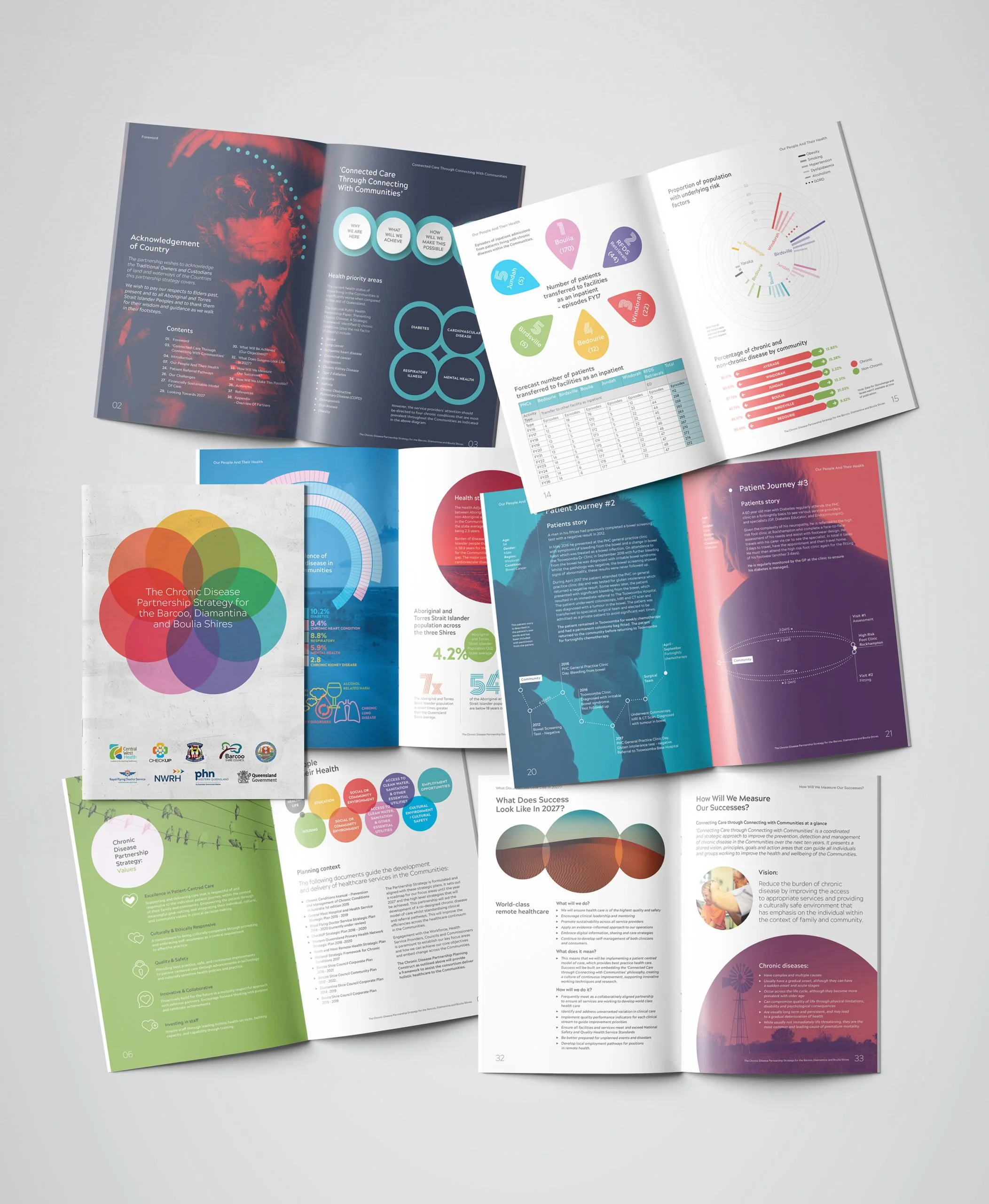
Redhotblue’s ability to consistently interpret the vision of the Board of Directors has been central to our ongoing relationship with Central West Hospital & Health Service. One notable example of our work for this organisation is the Partnership Strategy brochure, where we distilled pages of complex data into clear, one-page infographics, transforming heavy text and statistics into engaging, reader-friendly content. This approach reassured locals by making important information more accessible, a success reflected in direct feedback from the community. Diversity is also embedded in the creative, both in the people showcased and the design elements themselves. In the First Nation’s Health Equity campaign, graphic motifs and colour palettes were inspired by original artwork created by a local Indigenous artist. Through consultation with community elders, we received permission to integrate the artwork, which became a collaborative success, with all parties proud of the outcome.

The Brief
Redhotblue was engaged to design and deliver a series of high-impact social awareness and education campaigns with the backing of PHN Northern Queensland, DV Taskforce Mackay, and Queensland Police. Each campaign required a tailored creative approach to shift community attitudes, spark behavioural change, and address sensitive issues with clarity and impact.
Project Highlights
We developed three distinct campaigns that addressed urgent social issues.
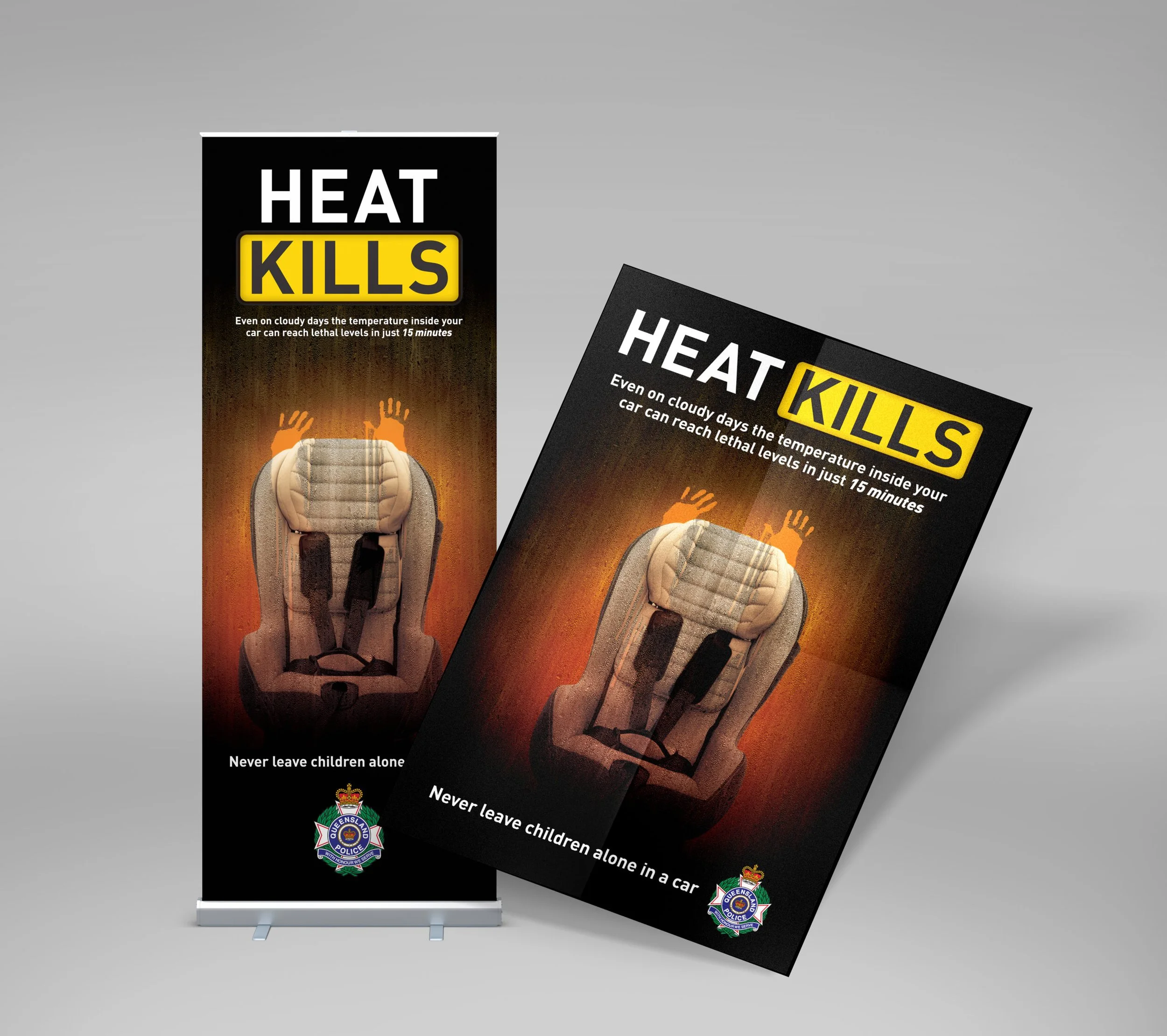
The Heat Kills campaign for Queensland Police used powerful, confronting imagery to highlight the dangers of leaving children in hot cars, earning gold at the QLD Multimedia Awards. Real photography, an empty booster seat, and a child’s handprint on the glass created a haunting scene where someone might imagine their own child in that position. The aim was to grab attention and create awareness without assigning blame.
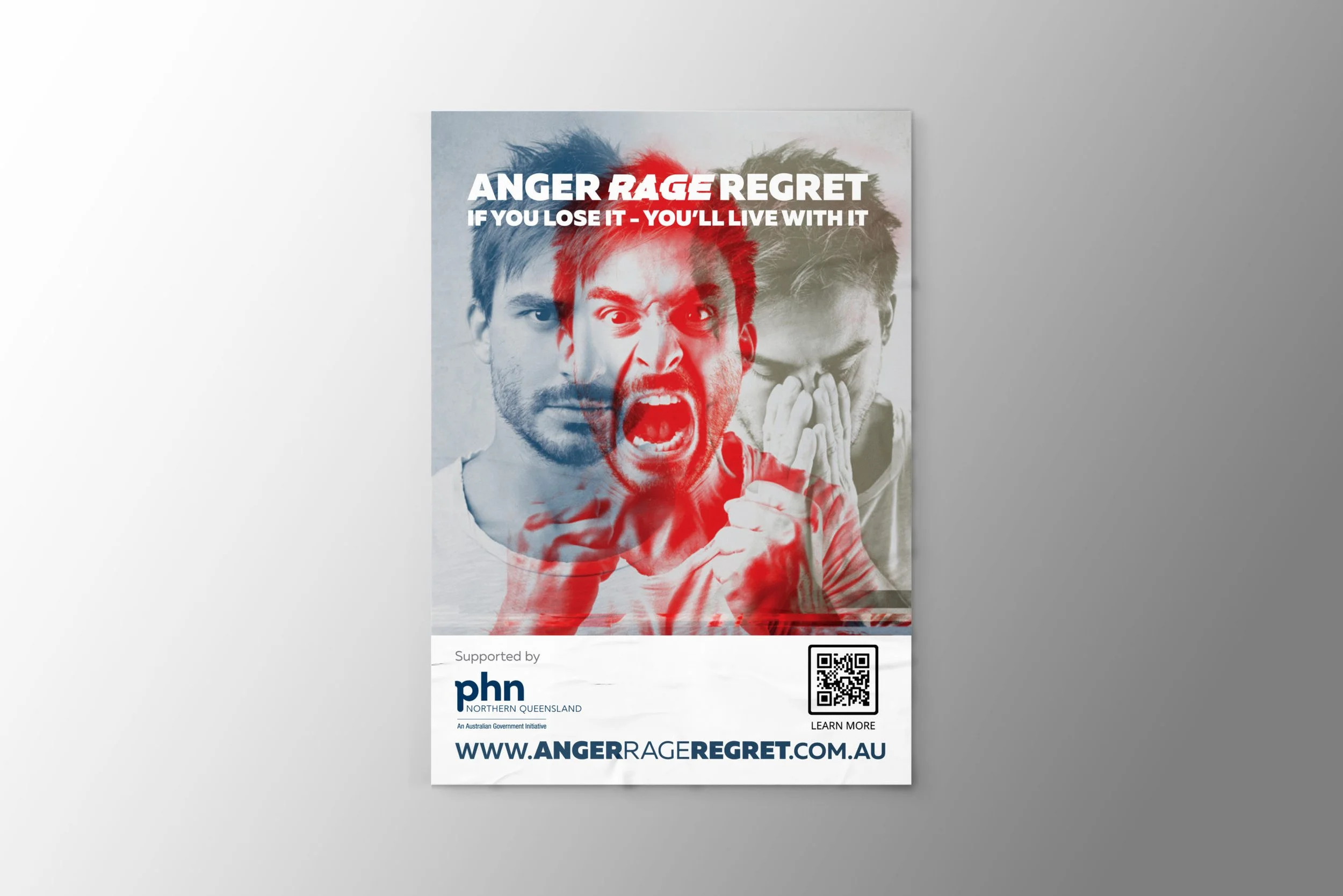
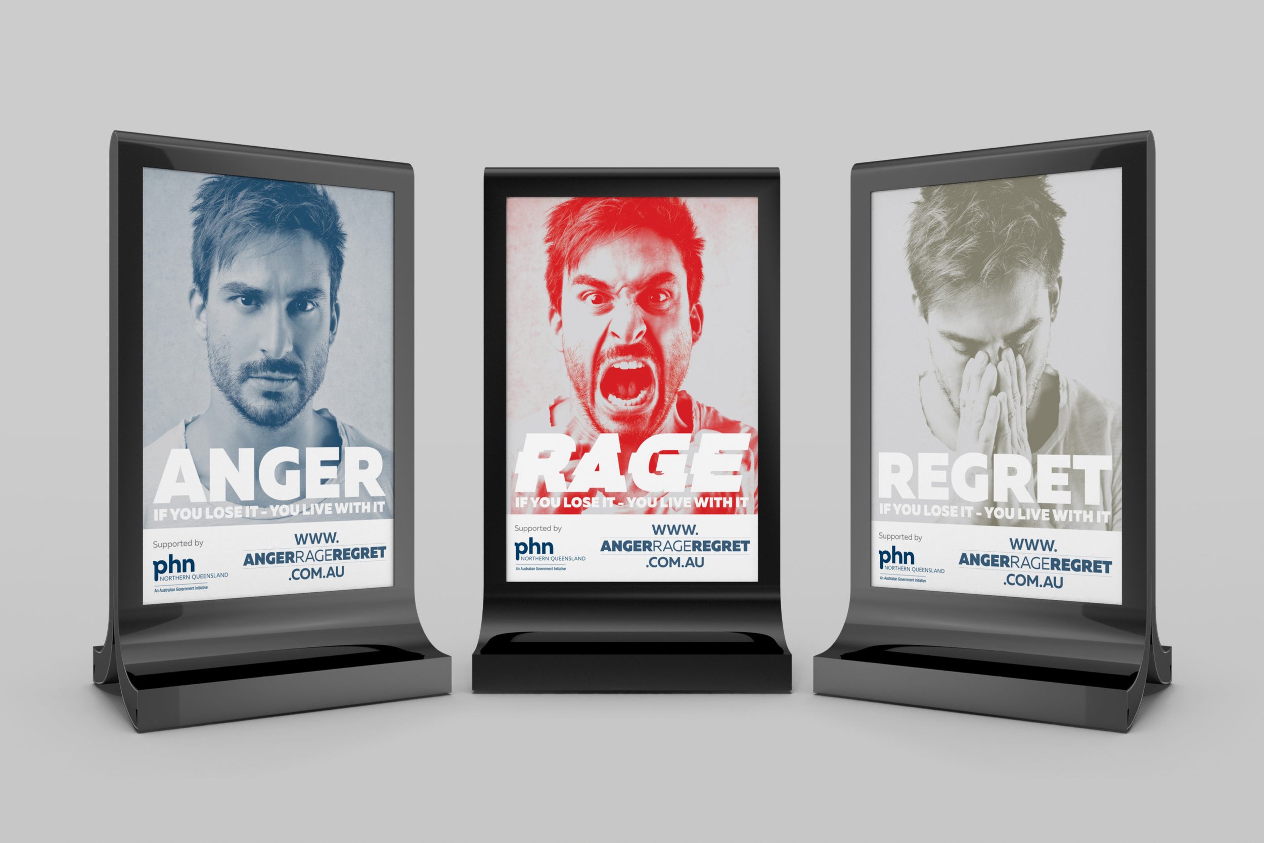
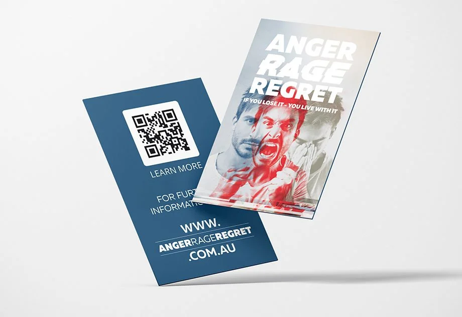
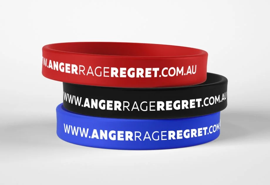
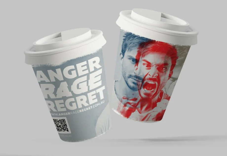
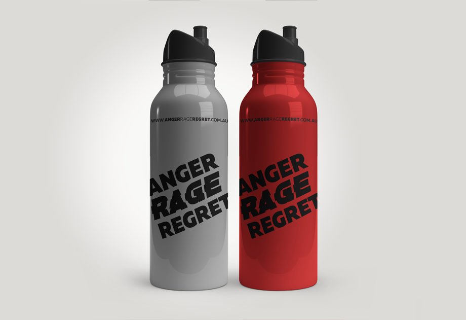
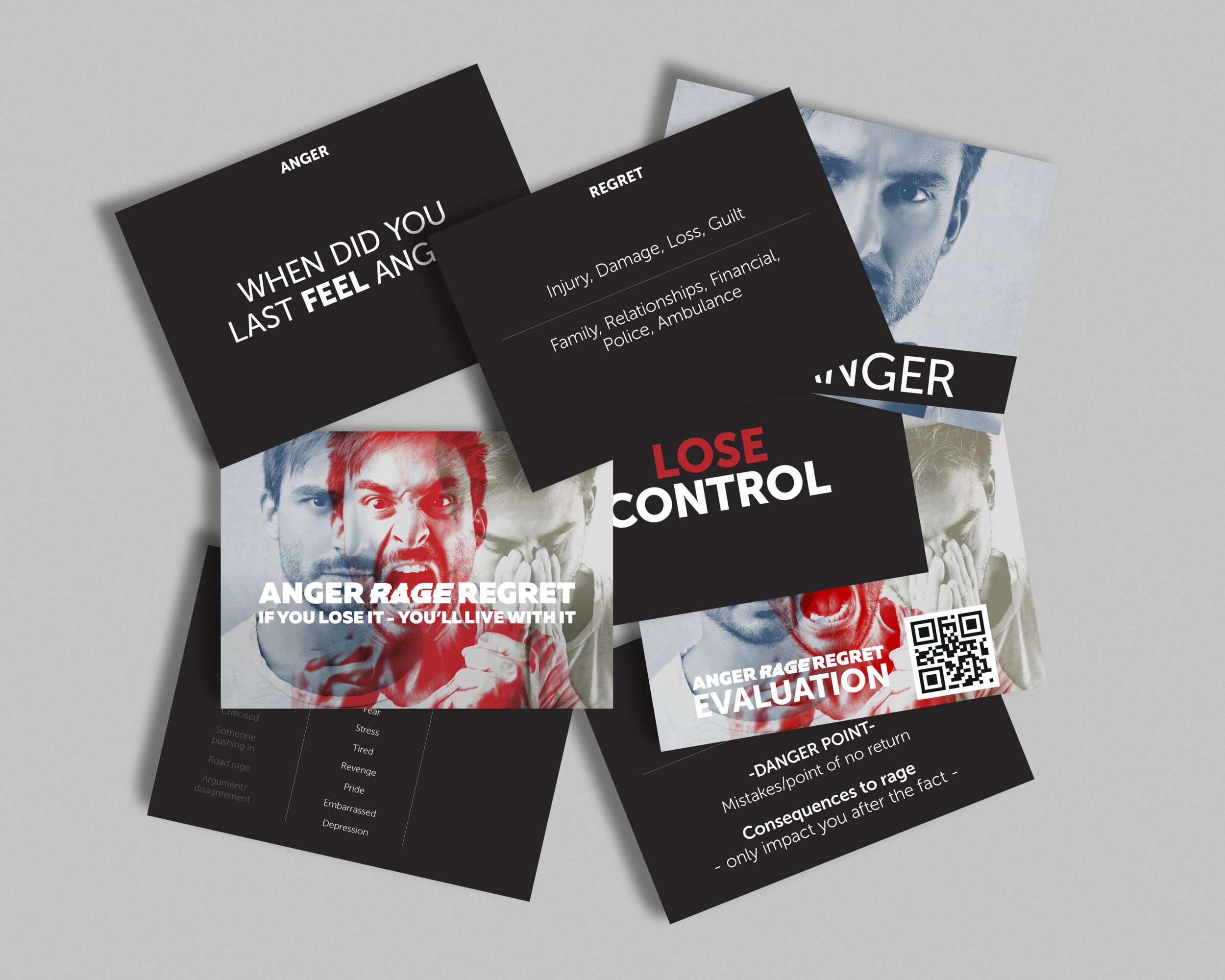
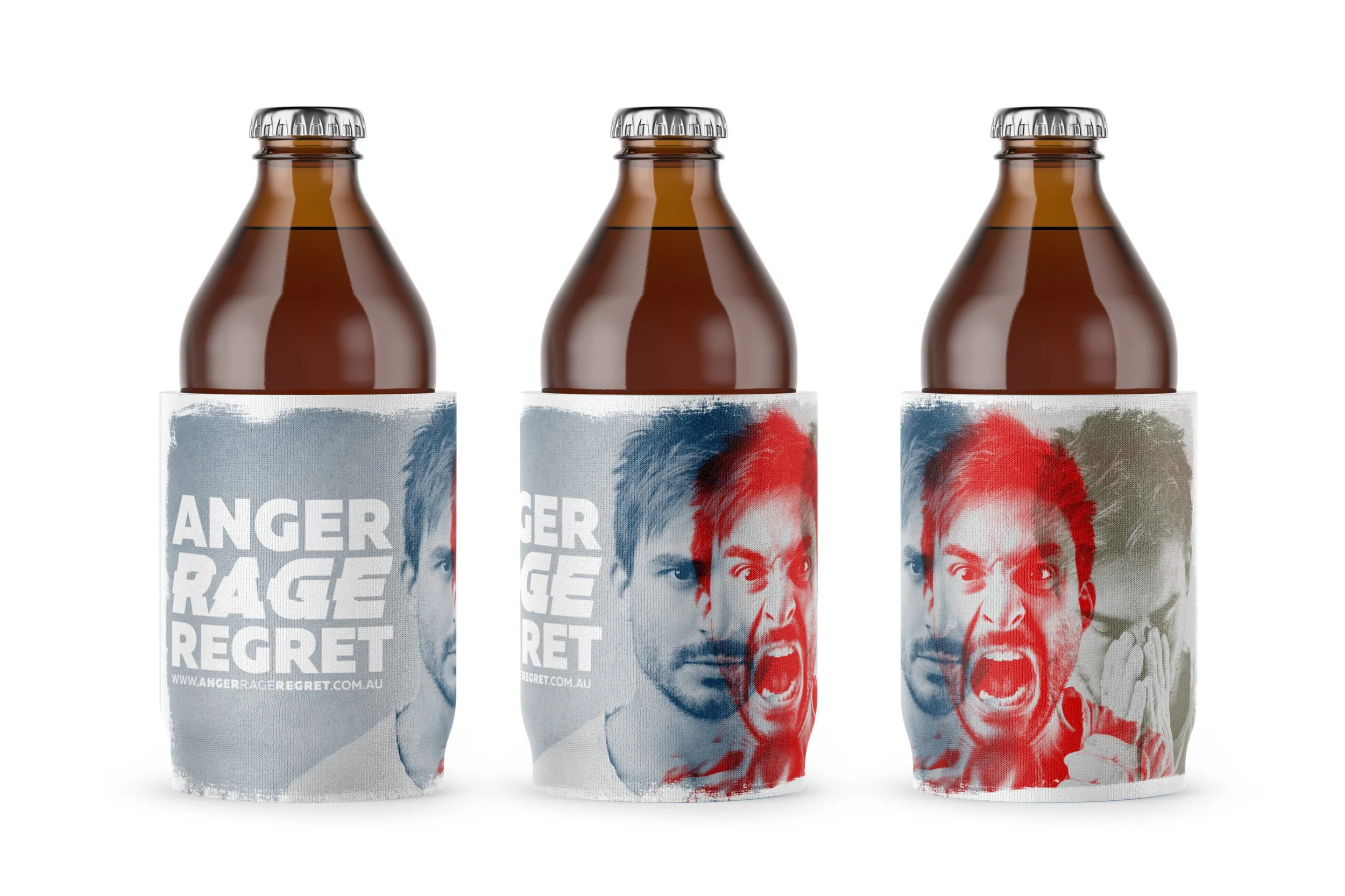
The Anger Rage Regret campaign for PHN Northern Queensland targeted young males, drawing attention to the emotional impulse and lasting consequences of assaults outside licensed venues. We removed the context because anger can occur anywhere and we wanted the focus to be on the feeling, not the trigger. The image shows the emotional transition between anger, rage, regret – often referred to as the red mist - which can occur in a matter of seconds.
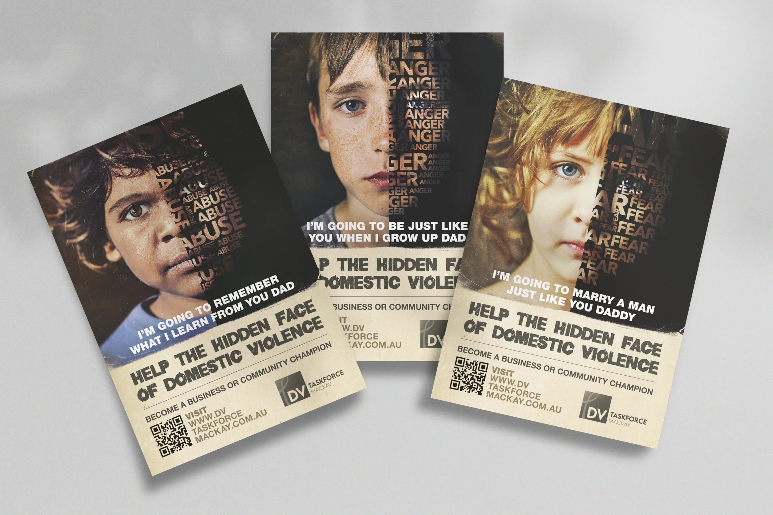
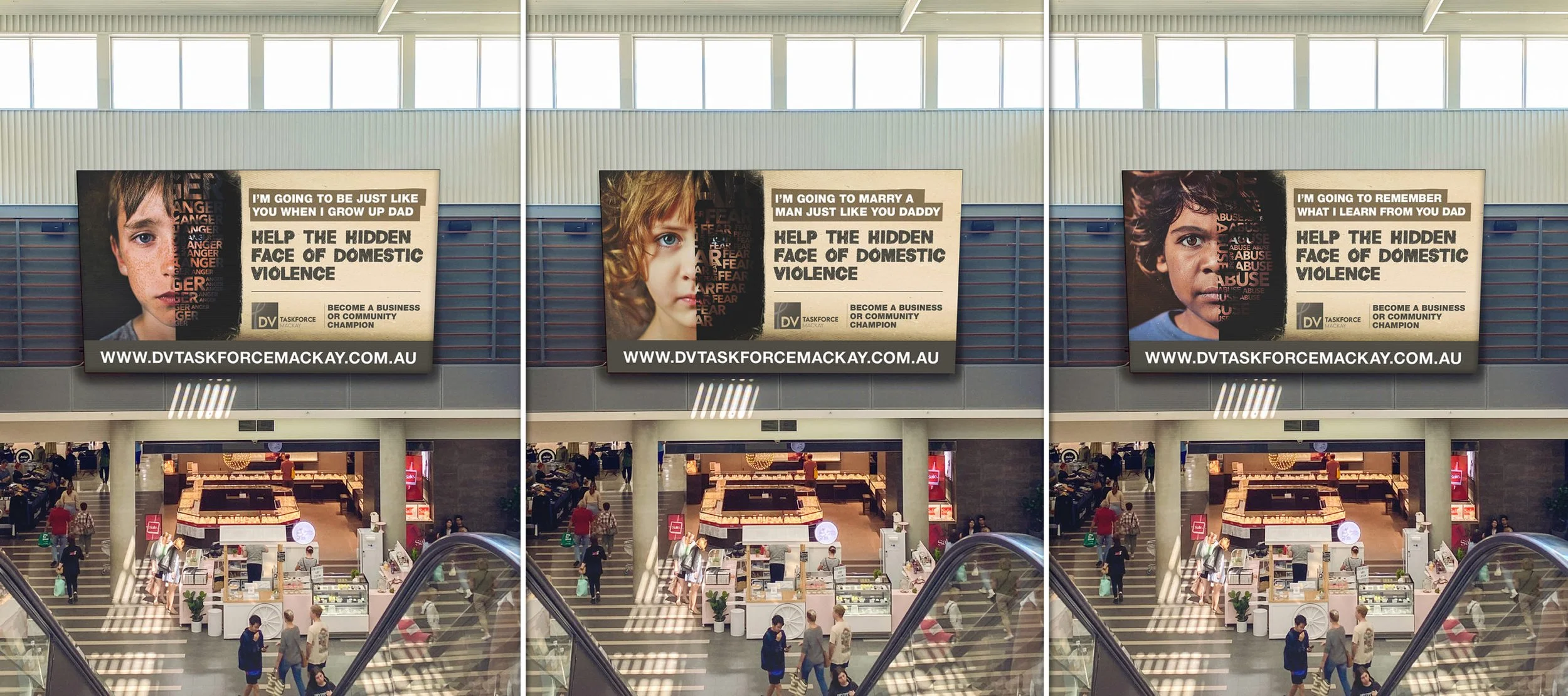
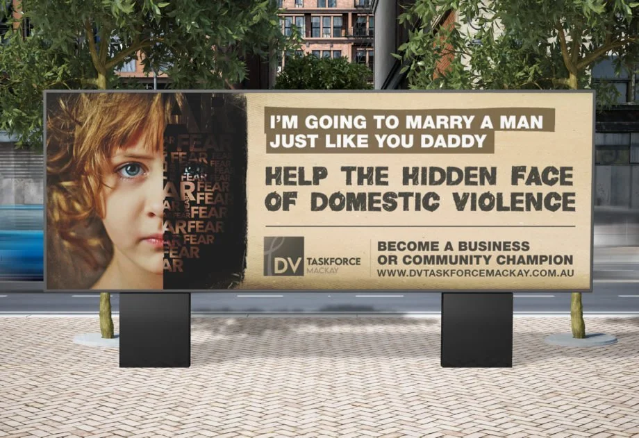
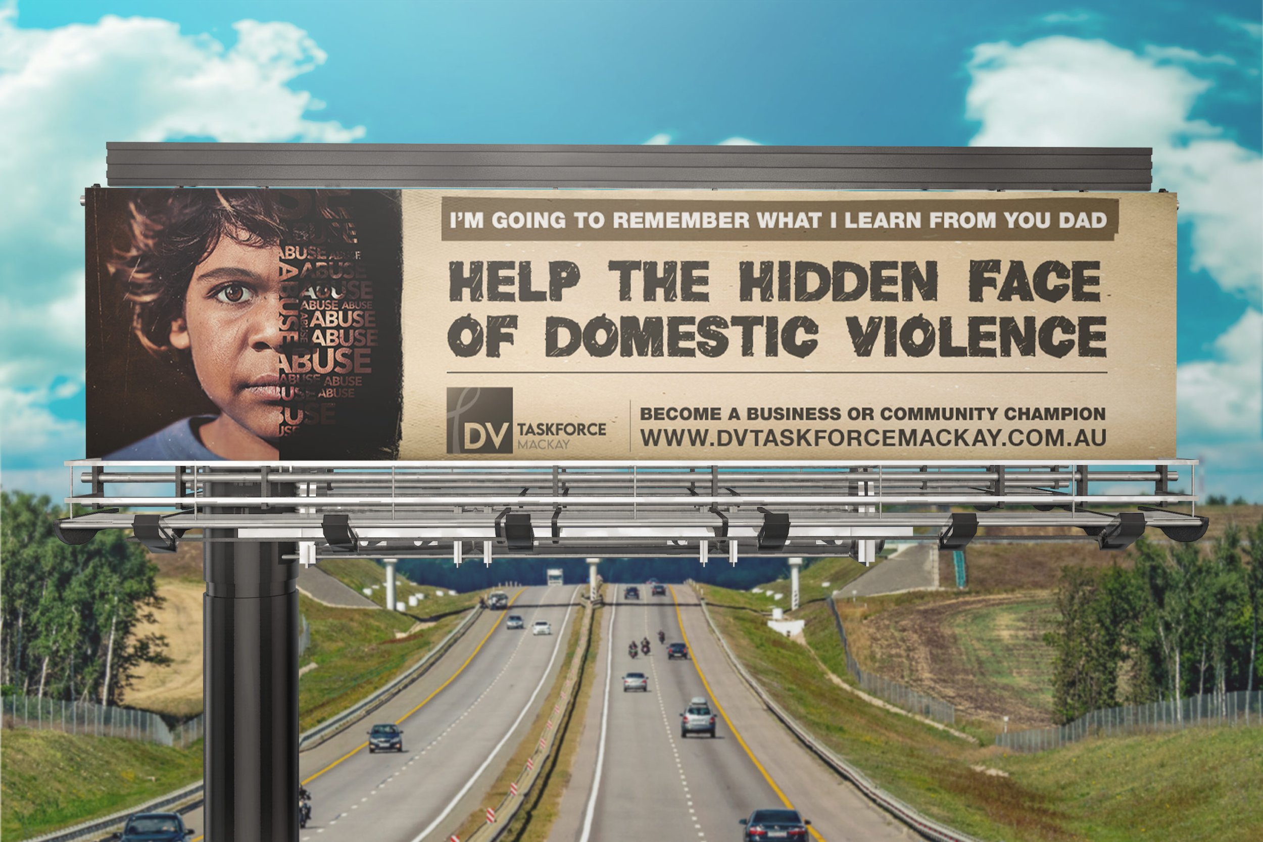
The Hidden Faces of Domestic Violence campaign for DV Taskforce Mackay shed light on the impact of domestic violence on children. Innocent portraits of children were contrasted with gritty textures, symbolising damage that can remain hidden until later in life. From concept development and messaging to billboards, video, and advertising, these campaigns showcased the power of creative communication to drive awareness influence real change.
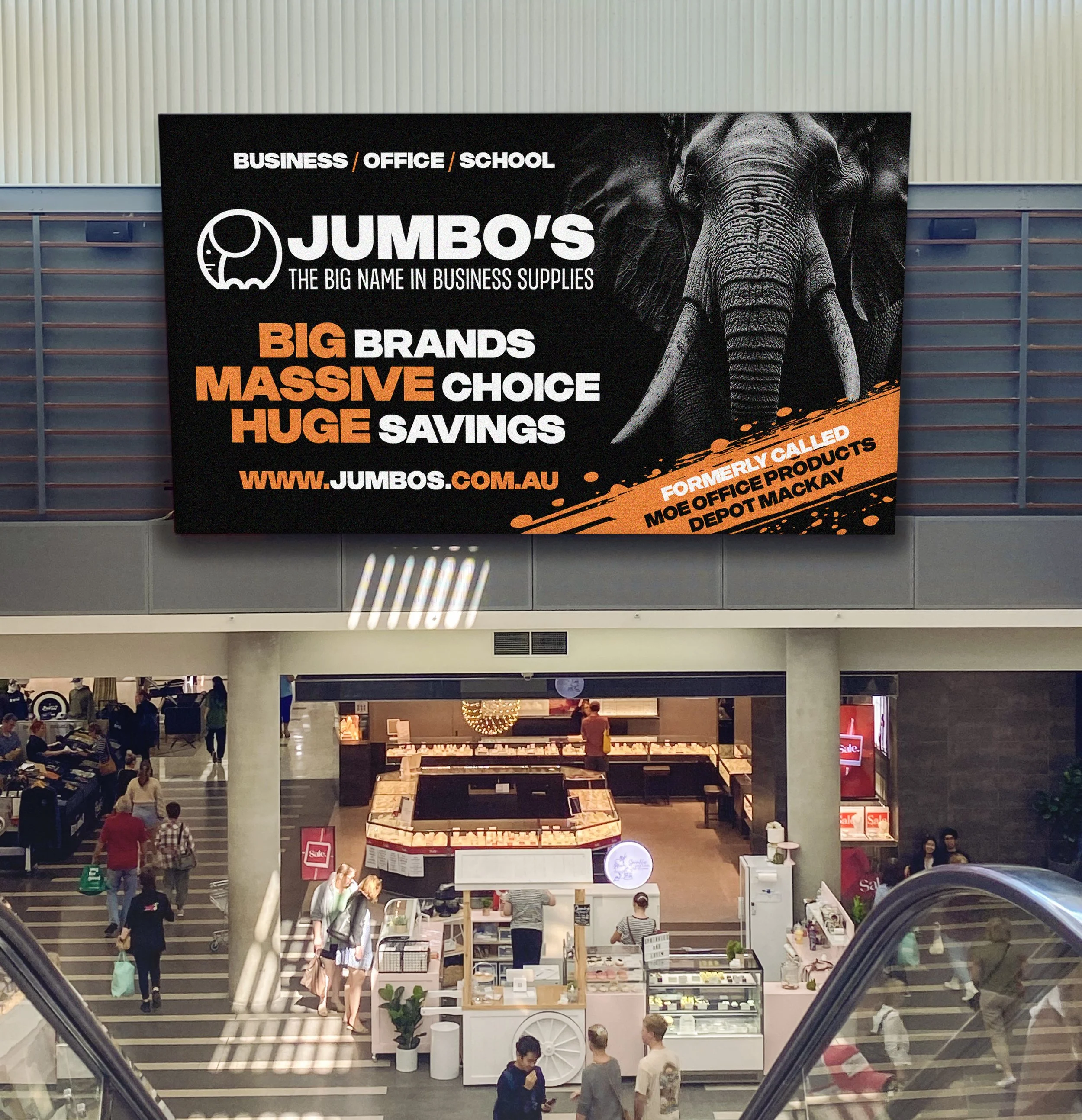
The Brief
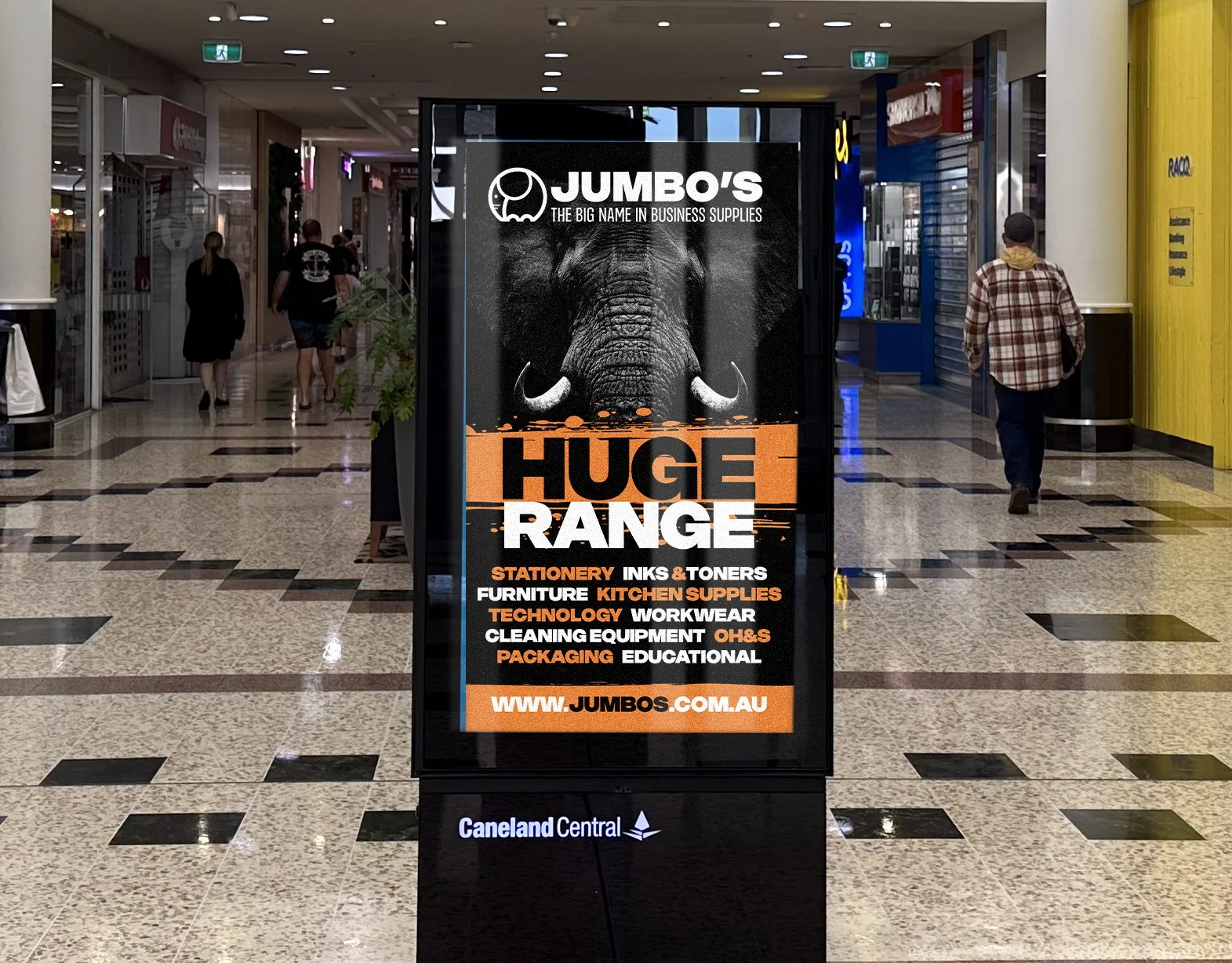
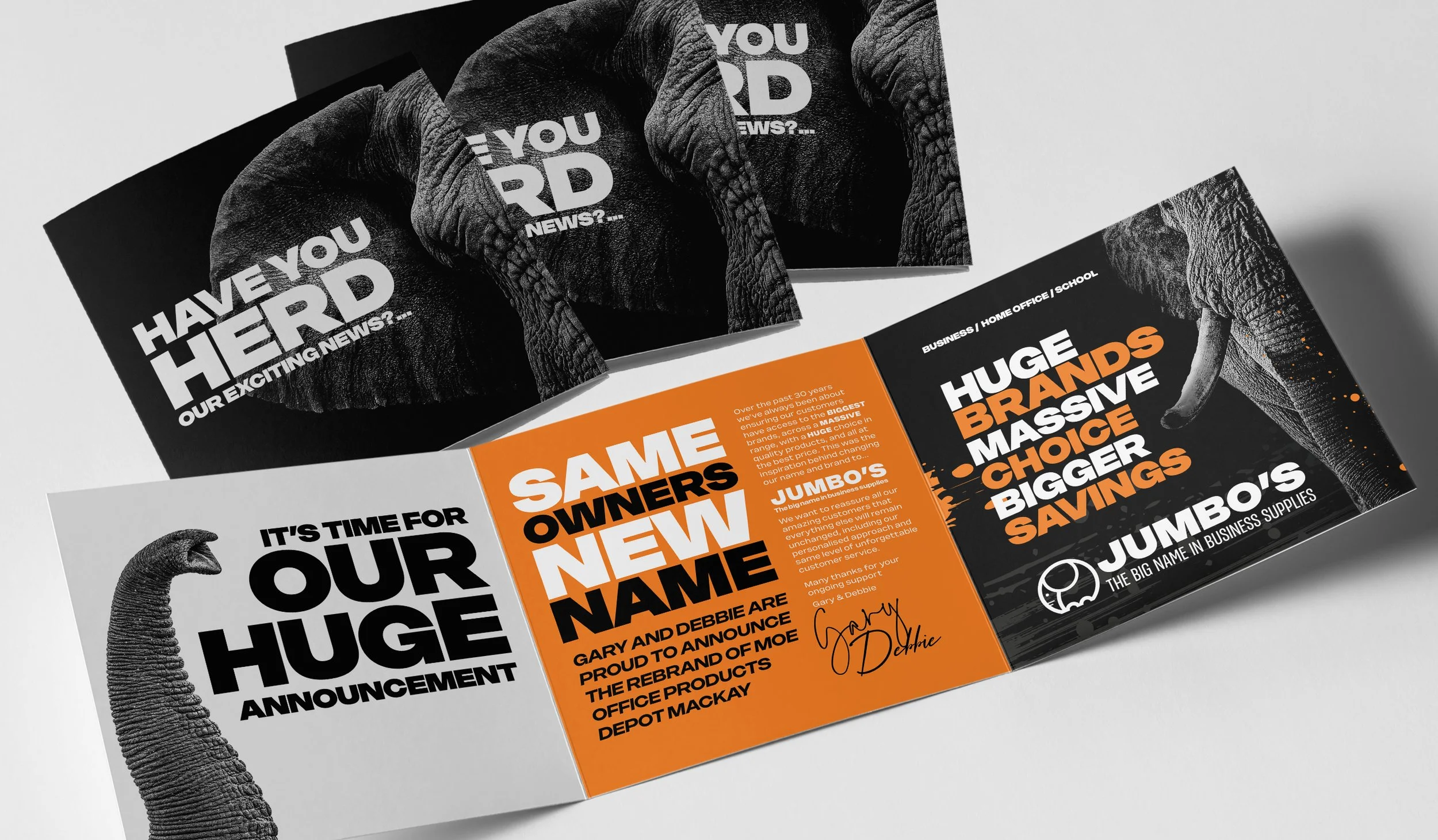
Formerly MOE (Mackay Office Equipment) and part of Office National, this long-standing local business of 40 years needed a complete rebrand after separating from its national affiliation. They engaged redhotblue to differentiate from competitors, overcome the limitations of being labelled as an office equipment store, and broaden public perception of their extensive range. Ultimately, the objective was to create a memorable new identity that reassured the community they could continue to rely on the same service and products they’d trusted for decades.
Project Highlights
The name Jumbo’s was strategically chosen to differentiate the business from other office supply companies that rely on the word ‘office’ to define their brand and scope. Moving away from the conventions of Jumbo’s competitors allowed us to create a unique and memorable identity. The business offers far more than people expect from an office store – e.g. milk, PPE clothing, and toilet rolls – so the new name and elephant brandmark (icon) are the perfect representation of their huge range. The addition of a clear, industry-specific tagline, also supports the name and enhances searchability. To build local intrigue, we launched a month-long gorilla campaign which incorporated a series of images of elephant parts, bold typeface, and reference to HUGE, HERD, and BIG. The pre-launch campaign was followed by the rollout of bold, refined branding across company vehicles, the building, and all corporate stationery, garnering fantastic feedback from the brand’s customers.


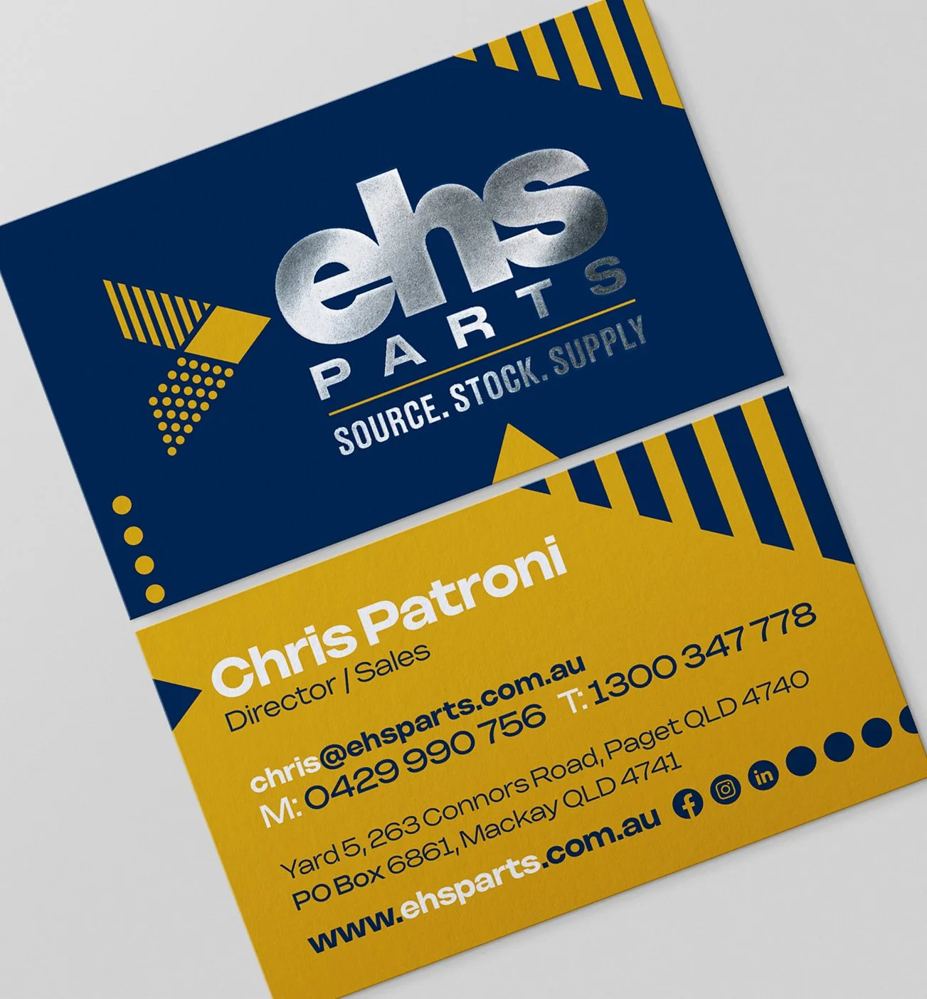
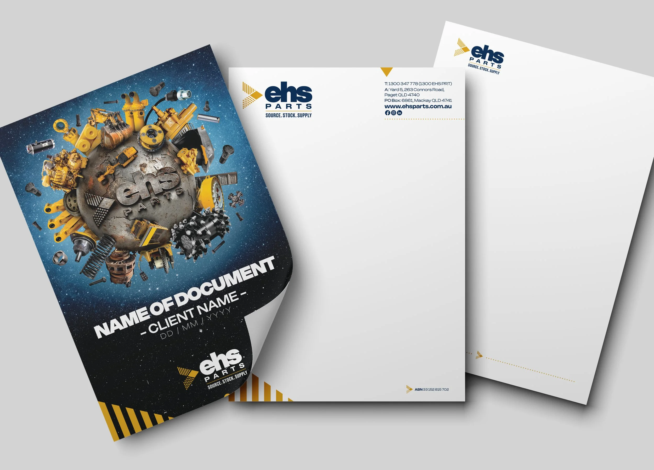
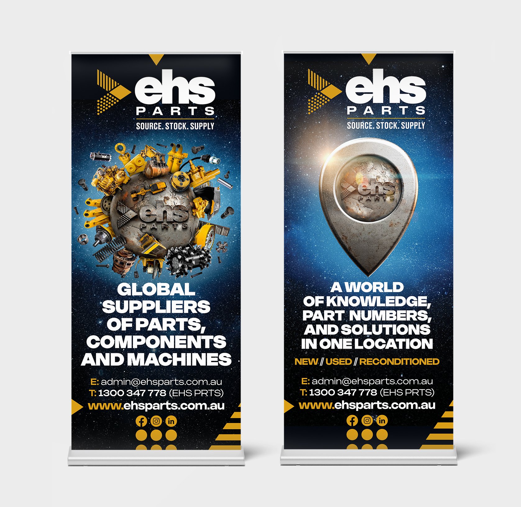
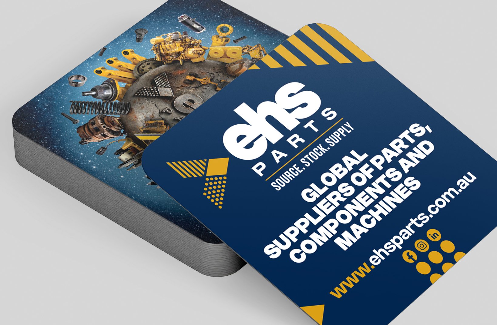
The Brief
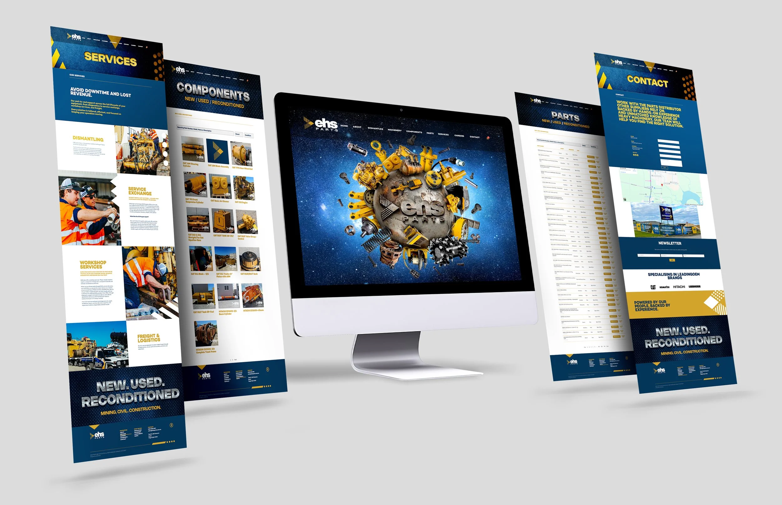
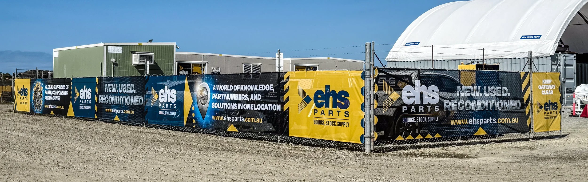
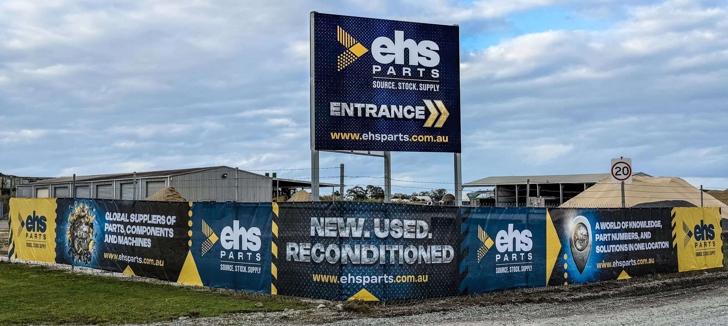
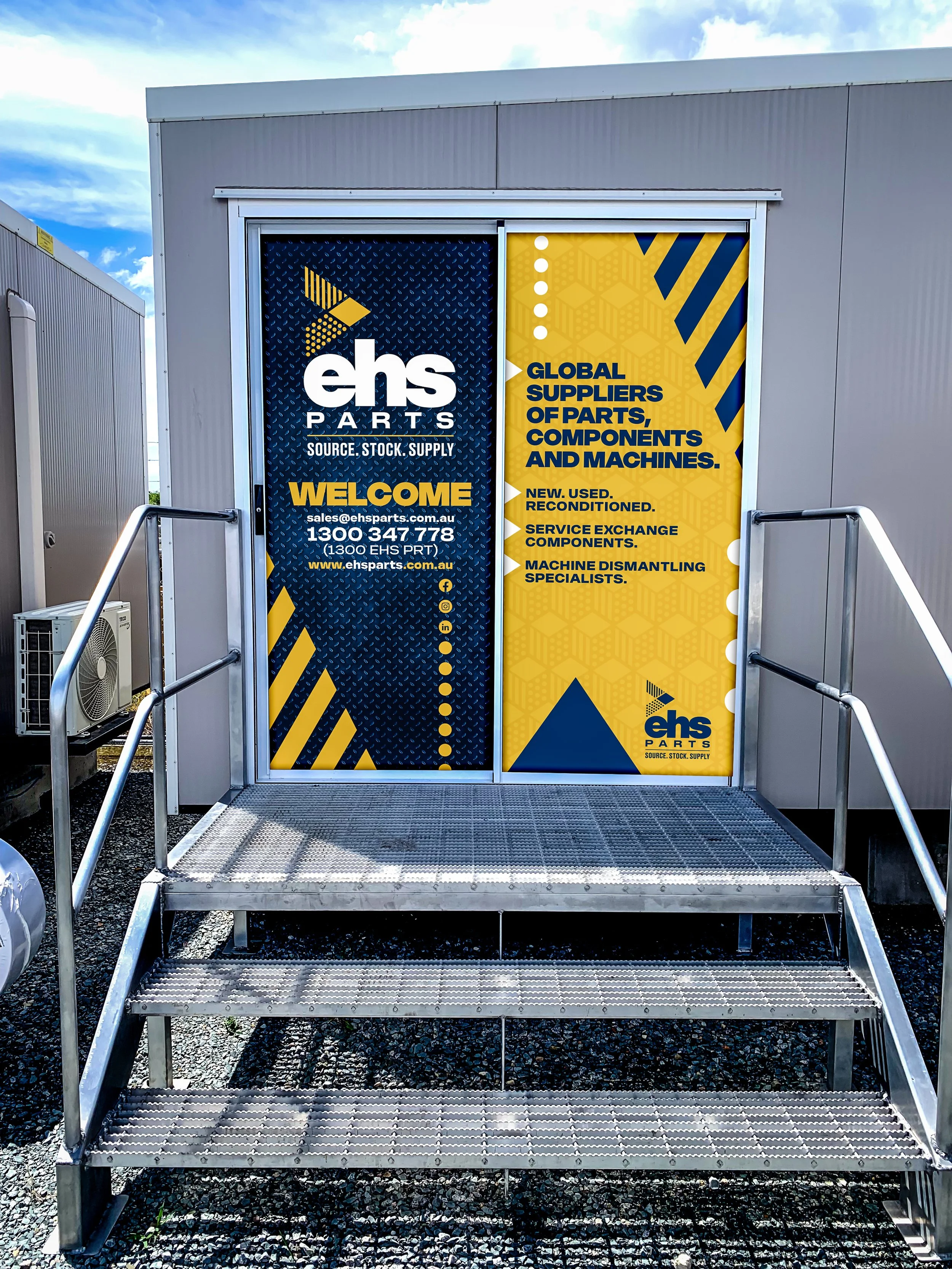
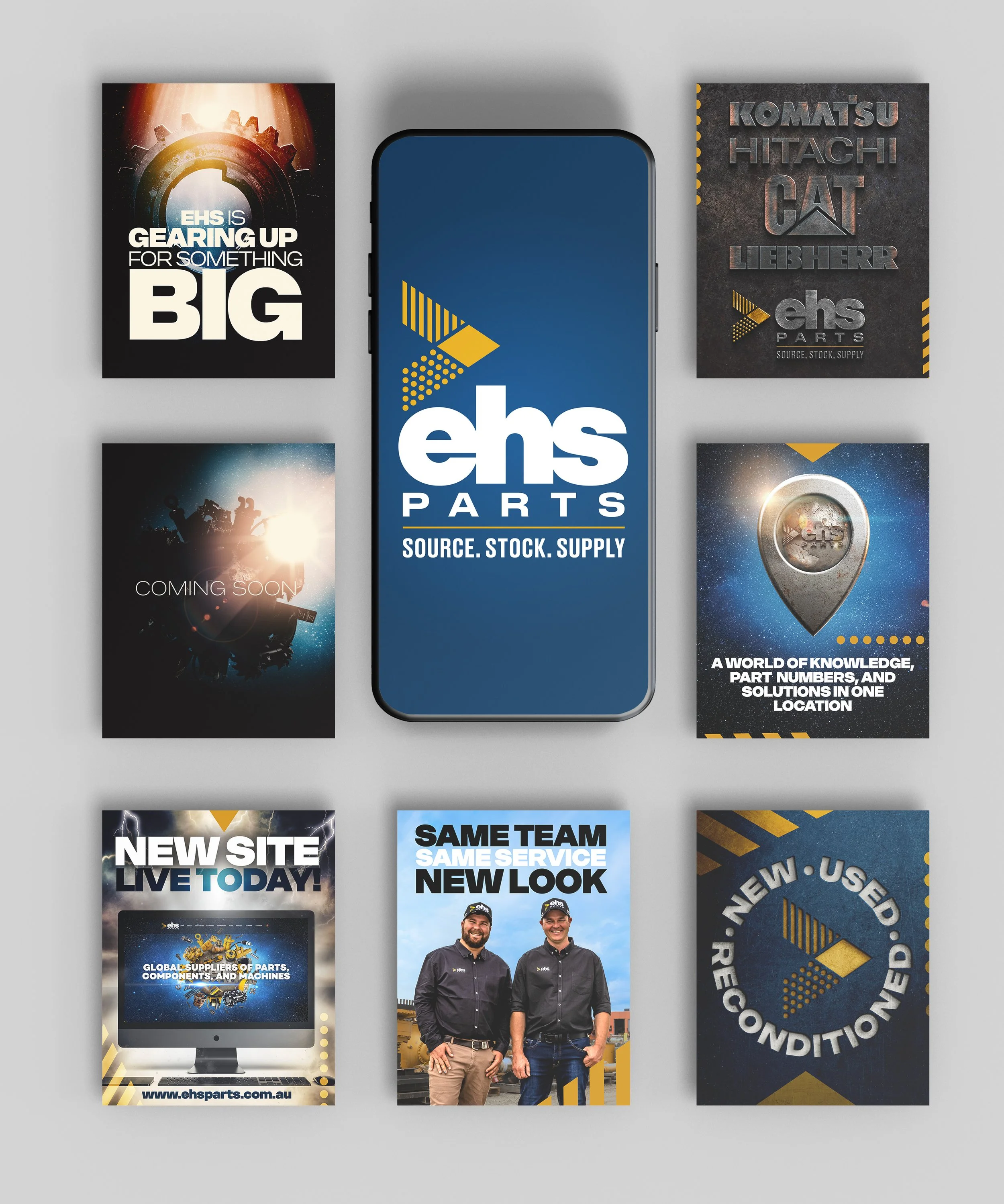
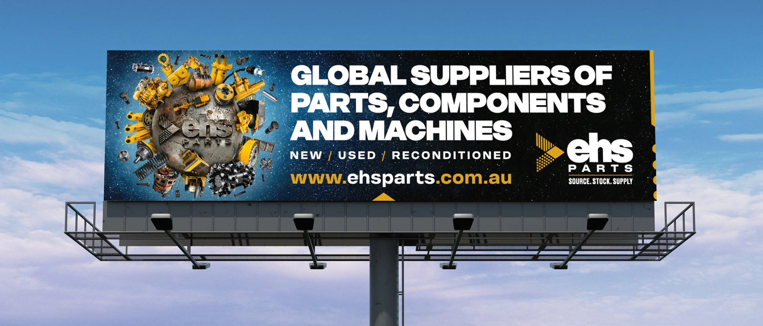
EHS approached redhotblue with the goal of reaching their ideal clients across the mining, civil, and construction industries. They wanted to build stronger awareness of their extensive product range and reposition EHS as a larger, more established brand than was currently perceived. They also wanted to resolve the confusion and crossover between the EHS logo and other brands, which diluted their presence in the market.
Project Highlights
Instead of focusing on what EHS does, we shifted the message to how they help, positioning EHS as the clear answer to their audience’s needs. The globe became the hero of the rebrand, symbolising both their diverse product range and worldwide reach, while the arrow brand-mark reflected the three core layers of machines, parts, and components. A montage-style creative approach condensed multiple messages into one powerful hero graphic, supported by the location marker and the tagline source, stock, supply. Together, these elements established EHS as a strong, unified brand with a global presence.